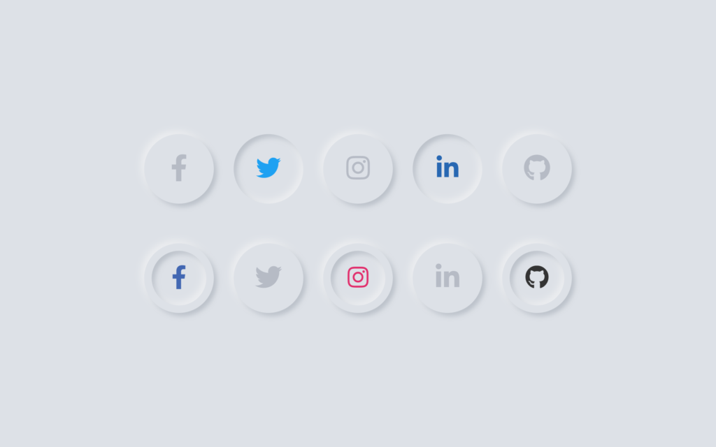
Let’s create a Neumorphic Social Button using HTML and CSS. Neumorphism is a design trend that combines skeuomorphism and flat design, creating soft, extruded shapes that give elements a 3D look.
We’ll use HTML to structure the button and CSS to style it with a neumorphic effect, making it look like it’s softly embedded into the background.
Let’s dive into building the Neumorphic Social Button. Whether you’re a beginner or an experienced developer, this project offers a great way to practice your web design skills and create a trendy, modern button. Let’s add some smooth, 3D-style buttons to our projects!
HTML :
This HTML code creates a webpage with a neumorphic design theme, showcasing social media buttons in two rows. It links to external stylesheets for Font Awesome icons and jQuery for scripting. The buttons are styled using CSS (from style.css), and they appear as circular icons with a 3D shadow effect. When clicked, jQuery adds or removes the shadow-1/shadow-2 and fill-color classes to the clicked icon, altering its appearance (likely changing shadow depth and icon color). The two rows (first and second) are separately interactive, with each icon’s behavior defined within its row.
<!DOCTYPE html>
<html lang="en">
<head>
    <meta charset="UTF-8">
    <meta name="viewport" content="width=device-width, initial-scale=1.0">
    <link rel="stylesheet" href="./style.css">
    <script src="https://code.jquery.com/jquery-3.4.1.js"></script>
    <link rel="stylesheet" href="https://cdnjs.cloudflare.com/ajax/libs/font-awesome/5.15.3/css/all.min.css"/>
    <title>Neumorphic Social button</title>
</head>
<body>
   <div class="center">
     <div class="icons first">
       <li><a href="#"><span class="fab fa-facebook-f"></span></a></li>
       <li><a href="#"><span class="fab fa-twitter"></span></a></li>
       <li><a href="#"><span class="fab fa-instagram"></span></a></li>
       <li><a href="#"><span class="fab fa-linkedin-in"></span></a></li>
       <li><a href="#"><span class="fab fa-github"></span></a></li>
    </div>
    <div class="icons second">
       <li><a href="#"><span class="fab fa-facebook-f"></span></a></li>
       <li><a href="#"><span class="fab fa-twitter"></span></a></li>
       <li><a href="#"><span class="fab fa-instagram"></span></a></li>
       <li><a href="#"><span class="fab fa-linkedin-in"></span></a></li>
       <li><a href="#"><span class="fab fa-github"></span></a></li>
    </div>
   </div>
 <script>
    $('.first li').click(function(){
      $(this).toggleClass("shadow-1").siblings();
      $(this).toggleClass("fill-color").siblings();
    });
    $('.second li').click(function(){
      $(this).toggleClass("shadow-2").siblings();
      $(this).toggleClass("fill-color").siblings();
    });
 </script>
</body>
</html>
CSS :
This CSS code creates a centered, full-height layout with a light grey background (#dde1e7). It removes default margins and paddings from all elements and ensures consistent box-sizing. The code styles a list of circular icons, setting their size, alignment, and shadow effects to create a 3D-like appearance.
The icons’ colors are set according to their position in the list, likely representing different social media platforms or actions, with additional styling for specific classes that modify the icon’s size, shadow, and position within the circle.
*{
  margin: 0;
  padding: 0;
  box-sizing: border-box;
}
body{
  display: flex;
  align-items: center;
  justify-content: center;
  min-height: 100vh;
  text-align: center;
  background: #dde1e7;
  width: 100%;
}
.icons{
  display: flex;
  margin: 40px 0;
}
li{
  position: relative;
  list-style: none;
  height: 70px;
  width: 70px;
  margin: 0 10px;
  border-radius: 50%;
  background: #dde1e7;
  cursor: pointer;
  box-shadow: -3px -3px 7px #ffffff73,
              3px 3px 5px rgba(94,104,121,0.288);
}
li a{
  line-height: 70px;
  font-size: 27px;
  color: #b6bbc5;
}
.first li.shadow-1{
  box-shadow: inset -3px -3px 7px #ffffff73,
              inset 3px 3px 5px rgba(94,104,121,0.288);
}
.first li.shadow-1 a{
  font-size: 25px;
}
.second li.shadow-2 a{
  position: absolute;
  top: 50%;
  left: 50%;
  transform: translate(-50%, -50%);
  height: 55px;
  width: 55px;
  line-height: 55px;
  border-radius: 50%;
  background: #dde1e7;
  font-size: 24px;
  box-shadow: inset -3px -3px 7px #ffffff73,
              inset 3px 3px 5px rgba(94,104,121,0.288);
}
li:nth-child(1).fill-color a{
  color: #4267B2;
}
li:nth-child(2).fill-color a{
  color: #1DA1F2;
}
li:nth-child(3).fill-color a{
  color: #E1306C;
}
li:nth-child(4).fill-color a{
  color: #2867B2;
}
li:nth-child(5).fill-color a{
  color: #333;
}
In conclusion, creating a Neumorphic Social Button using HTML and CSS has been an exciting and informative project. By combining HTML for structure and CSS for styling, we’ve crafted a modern, 3D-like button that embodies the neumorphism design trend. This project is perfect for adding a soft, elegant touch to your web designs.
If your project has problems, don’t worry. Just click to download the source code and face your coding challenges with excitement. Have fun coding!
