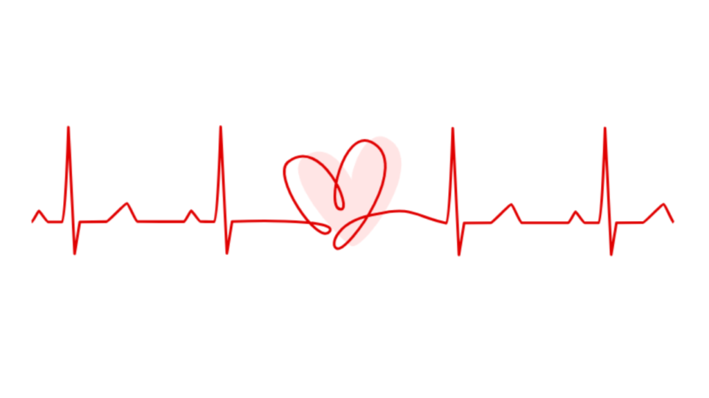
Let’s create a Heart Rate Animation Part 2 using HTML and CSS. In this part, we can enhance the animation by adding more dynamic movement or additional visual effects to simulate a heartbeat or pulse.
We’ll keep it creative yet straightforward, using HTML to structure the elements and CSS to style and animate the heart rate animation.
Let’s dive into building the Heart Rate Animation Part 2. Whether you’re a beginner or an experienced developer, this project offers a fun opportunity to experiment with CSS animations and create a captivating visual effect.
HTML :
This HTML code creates a webpage with an animated heart rate line. It includes an SVG element with two paths: one representing a heart shape filled with pink color and the other representing a line. The line animates across the screen to simulate a heart rate, while the heart shape appears to blink in synchronization.
<!DOCTYPE html>
<html lang="en" >
<head>
  <meta charset="UTF-8">
  <title> 💖 Heart Rate line animation </title>
  <link rel="stylesheet" href="./style.css">

</head>
<body>
<!-- partial:index.partial.html -->
<svg xmlns="http://www.w3.org/2000/svg" id="svg5" version="1.1" viewBox="0 0 502.98 108.61">
  <path id="heart" d="M213.35 29.43c19.41-15.19 33.68 10.86 37.73 18.82-.28-13.61 11.64-40.98 25.94-34.01 32.3 15.74-15.88 83.8-26.4 81.76-13.24-9-51.35-53.3-37.27-66.57Z" style="fill:#ff9999;stroke:#ff9999;stroke-width:1.5;stroke-linecap:butt;stroke-linejoin:miter;stroke-miterlimit:4;stroke-dasharray:none;stroke-opacity:1"/>
  <path  pathLength="1" id="line" d="M5.32 78.13c.96-.01 5-8.5 5.54-8.54.58-.05 6.1 8.51 7.1 8.51 3.66 0 9.29.06 10.71.05 2.53-.01 4.82-72.88 4.82-72.88l4.76 97.28 3.97-24.45 20.45-.22C64 77.86 77.1 63.66 78.36 63.8c1.31.15 6.68 14.08 7.94 14.07 2.3-.03 33.32.04 35.76.02.96 0 5-8.5 5.53-8.53.59-.05 6.1 8.51 7.1 8.5 3.66 0 9.3.07 10.72.06 2.53-.02 4.81-72.89 4.81-72.89l4.77 97.28 3.97-24.44s83.34-3.33 74.69 7.67c-8.65 11-45.3-42.94-31.65-53.58 25.6-19.96 49.96 36.94 40.26 36.5-12.2-.53 1.8-62.32 23.41-51.7 32.24 15.86-17.56 84.92-26.4 81.77-5.73-2.05-.68-21.68 31.4-26.58 26.65-6.42 29.5 2.35 52.62 7.11 2.53-.02 4.82-72.89 4.82-72.89l4.76 97.28 3.97-24.44 20.45-.22c1.31-.02 14.41-14.22 15.68-14.07 1.32.15 6.7 14.08 7.95 14.07 2.29-.03 33.32.04 35.76.02.95 0 5-8.5 5.53-8.54.58-.04 6.1 8.52 7.1 8.52 3.66 0 9.3.06 10.72.05 2.53-.02 4.81-72.89 4.81-72.89l4.77 97.28 3.97-24.44 20.45-.23c1.31-.01 14.4-14.22 15.68-14.07 1.32.16 6.69 14.09 7.94 14.07" />
</svg>
<!-- partial -->

</body>
</html>
CSS :
This CSS code is responsible for styling an animated heart rate line. It ensures that the webpage content is centered both horizontally and vertically. The SVG element’s overflow is set to visible to display the animated elements properly. The heart rate line is styled with a red stroke and animated to move along its path in a dashed pattern. Meanwhile, the heart shape pulsates with a blinking effect, transitioning between visible and invisible states, creating a dynamic and visually appealing animation.
body {
  height: 100vh;
  display: flex;
  justify-content: center;
  align-items: center;
}
svg {
  overflow: visible;
}
svg path#line {
  fill: none;
  stroke: #e00000;
  stroke-width: 2;
  stroke-linecap: butt;
  stroke-linejoin: round;
  stroke-miterlimit: 4;
  stroke-dasharray:none;
  stroke-opacity: 1;
  stroke-dasharray: 1;
  stroke-dashoffset: 1;
  animation: dash 4s linear infinite;
}
svg path#heart {
  transform-origin: 50% 50%;
  animation: blink 4s linear infinite;
}

@keyframes dash {
  0% {
    stroke-dashoffset: 1;
  }
  80% {
    stroke-dashoffset: 0;
  }
  100% {
    stroke-dashoffset: 0;
  }
}

@keyframes blink {
  0% {
    opacity: 0;
    transform: scale(0);
  }
  60% {
    opacity: 0;
    transform: scale(0);
  }
  70% {
    opacity: 1;
    transform: scale(1.2);
  }
  75% {
    opacity: 1;
    transform: scale(1.0);
  }
  80% {
    opacity: 1;
    transform: scale(1.2);
  }
  85% {
    opacity: 1;
    transform: scale(1.0);
  }
  100% {
    opacity: 0;
    transform: scale(1.0);
  }
}
In short, creating the Heart Rate Animation Part 2 using HTML and CSS has been a delightful exploration into adding dynamic visual effects to web elements. By leveraging CSS animations, we’ve enhanced the heartbeat animation to create a captivating and immersive experience.
If your project has problems, don’t worry. Just click to download the source code and face your coding challenges with excitement. Have fun coding!
