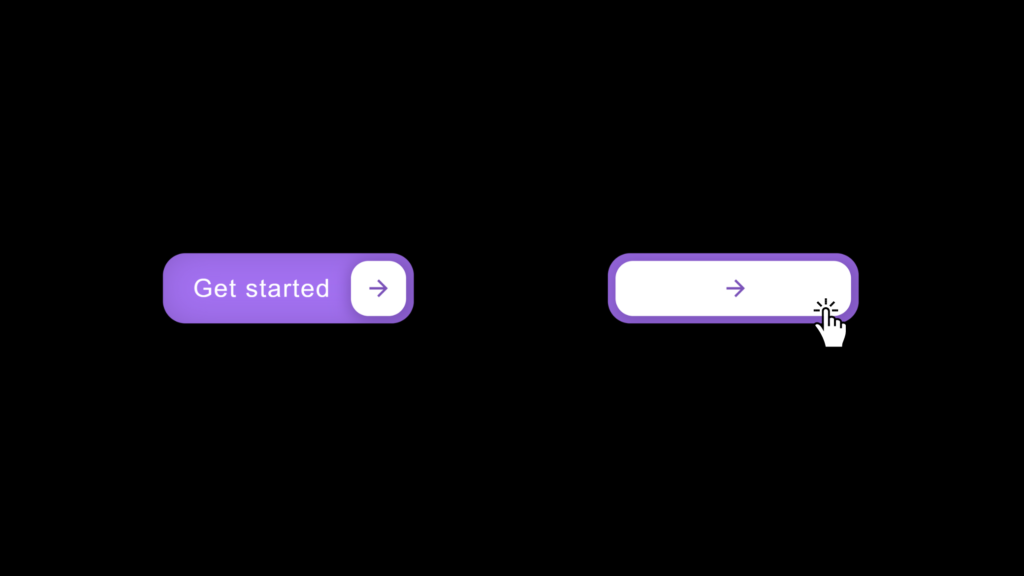
Let’s create a Button Hover Effect using HTML and CSS. This project will feature a stylish button that changes its appearance when the user hovers over it, adding a dynamic and interactive feel to your web design.
We’ll use HTML to structure the button and CSS to style it and create the hover effect, utilizing transitions and animations to achieve a smooth and appealing interaction.
Let’s get started on building the Button Hover Effect. Whether you’re a beginner or an experienced developer, this project offers a great way to practice your web design skills and create engaging buttons for your website. Let’s make buttons more interactive and visually appealing!
HTML :
This HTML code creates a simple webpage with a button labeled “Get started” that includes an icon. When the button is hovered over, a special effect will occur, as defined by the linked CSS file (style.css). The icon is created using SVG (Scalable Vector Graphics) within the button. The page’s metadata sets the character encoding to UTF-8 and optimizes the view for different screen sizes.
<!DOCTYPE html>
<html lang="en" >
<head>
  <meta charset="UTF-8">
  <title>Button hover effect - @codingstella</title>
  <meta name="viewport" content="width=device-width, initial-scale=1">
  <link rel="stylesheet" href="./style.css">
</head>
<body>
  <button class="cssbuttons-io-button">
    Get started
    <div class="icon">
      <svg
        height="24"
        width="24"
        viewBox="0 0 24 24"
        xmlns="http://www.w3.org/2000/svg"
      >
        <path d="M0 0h24v24H0z" fill="none"></path>
        <path
          d="M16.172 11l-5.364-5.364 1.414-1.414L20 12l-7.778 7.778-1.414-1.414L16.172 13H4v-2z"
          fill="currentColor"
        ></path>
      </svg>
    </div>
  </button>
</body>
</html>
CSS :
This CSS code styles a button with a modern design and interactive effects. The * { box-sizing: border-box; } rule ensures consistent box-sizing across all elements. The body is centered on the screen with a black background, using the “Poppins” font.
The .cssbuttons-io-button class styles the button with a purple background, white text, rounded corners, and a shadow effect. The button has padding and aligns its content (text and icon) flexibly. The icon within the button is styled with a white background, circular shape, and positioned to the right with a shadow. When the button is hovered over, the icon expands to almost cover the entire button width, and the SVG icon slightly shifts to the right. When the button is clicked, the icon slightly scales down for a subtle interaction effect.
* {
  box-sizing: border-box;
}

body {
  font-family: "Poppins", sans-serif;
  display: flex;
  align-items: center;
  justify-content: center;
  margin: 0;
  min-height: 100vh;
  background: #000000;
}

.cssbuttons-io-button {
  background: #a370f0;
  color: white;
  font-family: inherit;
  padding: 0.35em;
  padding-left: 1.2em;
  font-size: 17px;
  font-weight: 500;
  border-radius: 0.9em;
  border: none;
  letter-spacing: 0.05em;
  display: flex;
  align-items: center;
  box-shadow: inset 0 0 1.6em -0.6em #714da6;
  overflow: hidden;
  position: relative;
  height: 2.8em;
  padding-right: 3.3em;
  cursor: pointer;
}

.cssbuttons-io-button .icon {
  background: white;
  margin-left: 1em;
  position: absolute;
  display: flex;
  align-items: center;
  justify-content: center;
  height: 2.2em;
  width: 2.2em;
  border-radius: 0.7em;
  box-shadow: 0.1em 0.1em 0.6em 0.2em #7b52b9;
  right: 0.3em;
  transition: all 0.3s;
}

.cssbuttons-io-button:hover .icon {
  width: calc(100% - 0.6em);
}

.cssbuttons-io-button .icon svg {
  width: 1.1em;
  transition: transform 0.3s;
  color: #7b52b9;
}

.cssbuttons-io-button:hover .icon svg {
  transform: translateX(0.1em);
}

.cssbuttons-io-button:active .icon {
  transform: scale(0.95);
}
In conclusion, creating a Button Hover Effect using HTML and CSS has been a straightforward and enjoyable project. By combining HTML for structure and CSS for styling and animations, we’ve crafted a dynamic and interactive button that enhances the user experience with a smooth hover effect.
If your project has problems, don’t worry. Just click to download the source code and face your coding challenges with excitement. Have fun coding!
