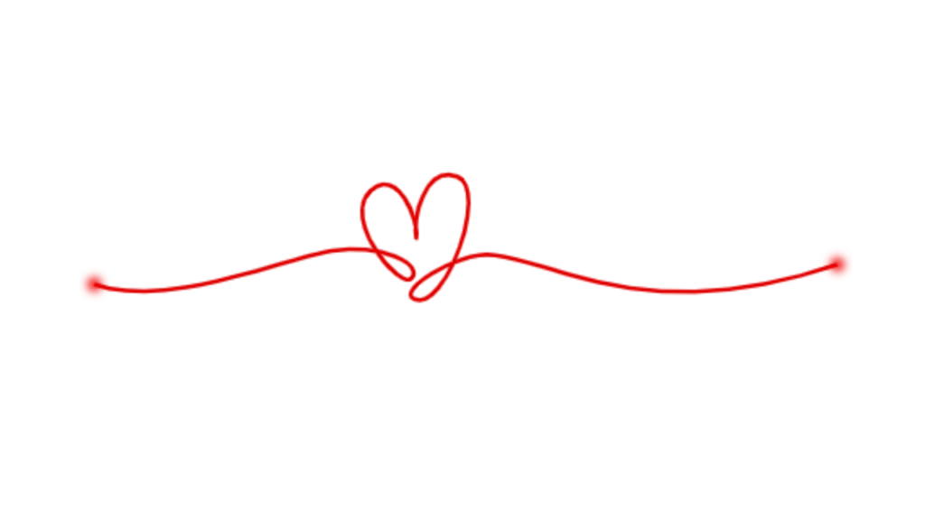
Let’s start with Part 1 of creating a Heart Rate Animation using HTML and CSS. This part will focus on setting up the basic structure and styling for the animation. For Part 2 Click Here
We’ll keep it simple yet visually appealing, using HTML to create the structure of the animation and CSS to style it.
Let’s dive in and begin crafting the Heart Rate Animation Part 1. Whether you’re new to web development or looking to enhance your skills, this project will be a great opportunity to learn and create something beautiful!
HTML :
This HTML document creates a webpage featuring an animated heart rate line. It includes an SVG element with two groups of paths. One path represents the heart rate line, while the other represents a point on the line. The line animates across the screen, while the point has a blur effect applied to it.
<!DOCTYPE html>
<html lang="en" >
<head>
  <meta charset="UTF-8">
  <title> 💖 Heart Rate line animation </title>
  <link rel="stylesheet" href="./style.css">

</head>
<body>
<!-- partial:index.partial.html -->
<svg xmlns="http://www.w3.org/2000/svg" id="svg5" version="1.1" viewBox="-5 -5 278 56">
  <filter id="blur">
   <feGaussianBlur stdDeviation="1.6" />
</filter>
  <g id="layer1" transform="translate(29.1 -127.42)">
    <path id="line" d="M-28.73 167.2c26.43 9.21 68.46-9.46 85.45-12.03 18.45-2.78 32.82 4.86 28.75 9.83-3.82 4.66-25.77-21.18-14.81-31.5 9.54-8.98 17.64 10.64 16.42 17.06-1.51-6.2 2.95-26.6 14.74-22.11 11.7 4.46-4.33 49.03-15.44 44.08-6.97-3.1 15.44-16.26 26.1-16 23.03.56 55.6 27.51 126.63 3.36" pathLength="1" />
  </g>
  <g id="layer2" transform="translate(29.1 -127.42)">
    <path filter="url(#blur)" id="point" d="M-28.73 167.2c26.43 9.21 68.46-9.46 85.45-12.03 18.45-2.78 32.82 4.86 28.75 9.83-3.82 4.66-25.77-21.18-14.81-31.5 9.54-8.98 17.64 10.64 16.42 17.06-1.51-6.2 2.95-26.6 14.74-22.11 11.7 4.46-4.33 49.03-15.44 44.08-6.97-3.1 15.44-16.26 26.1-16 23.03.56 55.6 27.51 126.63 3.36" pathLength="1" />
  </g>
</svg>
<!-- partial -->

</body>
</html>
CSS :
This CSS code is used to style an animated heart rate line on a webpage. It ensures the content is centered both horizontally and vertically within the viewport. The heart rate line is defined within an SVG element and styled with a red stroke. It animates using a dash effect, moving along its path for 3 seconds in a linear motion, repeating infinitely. Additionally, a point on the line is styled with a thicker red stroke and a blur effect, synchronized with the animation of the line.
body {
  height: 100vh;
  display: flex;
  justify-content: center;
  align-items: center;
}
svg #line {
  fill: none;
  stroke: #e00000;
  stroke-width: 1.5;
  stroke-linecap: butt;
  stroke-linejoin: round;
  stroke-miterlimit: 4;

  stroke-opacity: 1;
  stroke-dasharray: 1;
  stroke-dashoffset: 1;
  animation: dash 3s linear infinite;
}
svg #point {
  fill: none;
  stroke: #f00000;
  stroke-width: 5;
  stroke-linecap: round;
  stroke-linejoin: round;
  stroke-miterlimit: .1;
  stroke-opacity: 1;
  stroke-dasharray: .0001, .9999;
  stroke-dashoffset: 1;
  animation: dash 3s linear infinite;
}

@keyframes dash {
  0% {
    stroke-dashoffset: 1;
  }
  80% {
    stroke-dashoffset: 0;
  }
  100% {
    stroke-dashoffset: 0;
  }
}
In short, creating Part 1 of the Heart Rate Animation using HTML and CSS has laid the foundation for an engaging visual experience. By setting up the structure and styling, we’ve established the groundwork for the animation’s design. Whether you’re a beginner or an experienced developer, this project offers a great opportunity to learn and experiment with creative web design techniques.
If your project has problems, don’t worry. Just click to download the source code and face your coding challenges with excitement. Have fun coding!
