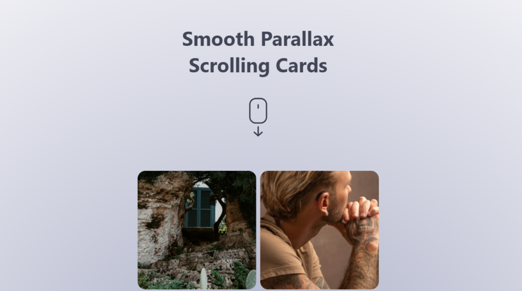
Let’s create Smooth Parallax Scrolling Cards using HTML, CSS, and JavaScript. This project will feature cards that smoothly animate and scroll with a parallax effect as the user scrolls down the webpage.
We’ll keep it sleek and modern, using HTML for the card structure, CSS for styling and animations, and JavaScript to handle the smooth scrolling effect.
Let’s dive into building the Smooth Parallax Scrolling Cards. Whether you’re a beginner or an experienced developer, this project offers a dynamic way to showcase content and add visual interest to your website. Let’s make scrolling through content a delightful experience!
HTML :
This HTML document sets up a webpage with smooth parallax scrolling cards. It includes a header with a title and a scroll icon, followed by a series of cards each containing an image. These cards create a parallax effect as you scroll down the page. The page also includes a space divider. Additionally, it links external CSS and JavaScript files for styling and functionality, respectively.
<!DOCTYPE html>
<html lang="en" >
<head>
  <meta charset="UTF-8">
  <title> Smooth Parallax Scrolling Cards </title>
  <link rel="stylesheet" href="./style.css">

</head>
<body>
<!-- partial:index.partial.html -->
<div class="header">
  <h2>Smooth Parallax Scrolling Cards</h2>
  <svg
    class="scroll-icon"
    id="fi_7663989"
    viewBox="0 0 91 91"
    fill="currentColor"
    xmlns="http://www.w3.org/2000/svg"
    data-name="Layer 1"
  >
    <path
      d="m45.33 90a1.5 1.5 0 0 1 -1.5-1.5v-20.3a1.5 1.5 0 0 1 3 0v20.26a1.5 1.5 0 0 1 -1.5 1.54z"
    ></path>
    <path
      d="m45.33 90a1.5 1.5 0 0 1 -1-.38l-9-7.88a1.5 1.5 0 1 1 2-2.25l9 7.88a1.49 1.49 0 0 1 .15 2.11 1.52 1.52 0 0 1 -1.15.52z"
    ></path>
    <path
      d="m45.33 90a1.5 1.5 0 0 1 -1-2.63l9-7.88a1.5 1.5 0 1 1 2 2.25l-9 7.88a1.47 1.47 0 0 1 -1 .38z"
    ></path>
    <path
      d="m50.86 60.73h-11.07a15.13 15.13 0 0 1 -15.11-15.11v-29a15.13 15.13 0 0 1 15.11-15.16h11.07a15.12 15.12 0 0 1 15.14 15.11v29.05a15.12 15.12 0 0 1 -15.14 15.11zm-11.07-56.27a12.12 12.12 0 0 0 -12.11 12.11v29.05a12.13 12.13 0 0 0 12.11 12.11h11.07a12.12 12.12 0 0 0 12.14-12.11v-29a12.12 12.12 0 0 0 -12.14-12.16z"
    ></path>
    <path
      d="m45.33 26.37a1.5 1.5 0 0 1 -1.5-1.5v-7.53a1.5 1.5 0 0 1 3 0v7.53a1.5 1.5 0 0 1 -1.5 1.5z"
    ></path>
  </svg>
</div>
<div class="cards">
  <div class="card">
    <div class="card__image-wrapper">
      <img
        class="card__image"
        src="https://source.unsplash.com/random/1"
        alt=""
      />
    </div>
  </div>
  <div class="card">
    <div class="card__image-wrapper">
      <img
        class="card__image"
        src="https://source.unsplash.com/random/2"
        alt=""
      />
    </div>
  </div>
  <div class="card">
    <div class="card__image-wrapper">
      <img
        class="card__image"
        src="https://source.unsplash.com/random/3"
        alt=""
      />
    </div>
  </div>
  <div class="card">
    <div class="card__image-wrapper">
      <img
        class="card__image"
        src="https://source.unsplash.com/random/4"
        alt=""
      />
    </div>
  </div>
  <div class="card">
    <div class="card__image-wrapper">
      <img
        class="card__image"
        src="https://source.unsplash.com/random/5"
        alt=""
      />
    </div>
  </div>
  <div class="card">
    <div class="card__image-wrapper">
      <img
        class="card__image"
        src="https://source.unsplash.com/random/6"
        alt=""
      />
    </div>
  </div>
  <div class="card">
    <div class="card__image-wrapper">
      <img
        class="card__image"
        src="https://source.unsplash.com/random/7"
        alt=""
      />
    </div>
  </div>
  <div class="card">
    <div class="card__image-wrapper">
      <img
        class="card__image"
        src="https://source.unsplash.com/random/8"
        alt=""
      />
    </div>
  </div>
    <div class="card">
    <div class="card__image-wrapper">
      <img
        class="card__image"
        src="https://source.unsplash.com/random/9"
        alt=""
      />
    </div>
  </div>
    <div class="card">
    <div class="card__image-wrapper">
      <img
        class="card__image"
        src="https://source.unsplash.com/random/10"
        alt=""
      />
    </div>
  </div>
</div>
<div class="space"></div>
<!-- partial -->
  <script  src="./script.js"></script>

</body>
</html>
CSS :
This CSS code styles a webpage with a header, grid-based card layout, and responsive design. It sets up the cards to display in two columns on larger screens and a single column on smaller screens. Each card has a square shape with rounded corners and contains an image. The header is centered vertically and includes a title and a scroll icon. The body has zero padding and margin, with a radial gradient background. Additionally, it adjusts font sizes and background gradients for smaller screens using media queries.
.cards {
  display: grid;
  grid-template-columns: 300px 300px;
  gap: 10px;
}

.card {
  width: 100%;
  aspect-ratio: 1;
  overflow: hidden;
  border-radius: 20px;
}

.card__image-wrapper {
  height: 600px;
  will-change: transform;
}

.card__image {
  width: 100%;
  height: 100%;
  object-fit: cover;
}

body {
  padding: 0 20px;
  margin: 0;
  display: flex;
  flex-direction: column;
  align-items: center;
  justify-content: center;
  background: rgb(150, 159, 204);
  background: radial-gradient(
    circle,
    hsl(230, 20%, 70%) 0%,
    rgba(239, 239, 244, 1) 100%
  );
}

.header {
  height: 50vh;
  min-height: 450px;
  display: flex;
  flex-direction: column;
  align-items: center;
}

.scroll-icon {
  width: 100px;
  color: rgb(57, 61, 80);
  margin-top: 50px;
}

h2 {
  font-family: Inter, system-ui, Avenir, Helvetica, Arial, sans-serif;
  font-size: 50px;
  text-align: center;
  color: rgb(65, 69, 85);
  max-width: 500px;
  margin: 80px 0 0;
}

.space {
  height: 40vh;
}

@media (max-width: 500px) {
  .cards {
    width: 100%;
    display: grid;
    grid-template-columns: 1fr;
    gap: 10px;
  }

  h2 {
    font-size: 38px;
  }

  .scroll-icon {
    width: 100px;
  }

  body {
    background: radial-gradient(
      circle,
      hsl(230, 20%, 70%) 50%,
      rgba(239, 239, 244, 1) 100%
    );
  }
}
JavaScript:
This JavaScript code defines a ParallaxCard class responsible for creating a parallax effect on cards as the user scrolls. It calculates the scroll progress and adjusts the position of the card’s image wrapper accordingly to achieve the parallax effect. The initCardParallax function initializes the parallax effect for all card elements on the page, updating them continuously as the user scrolls.
class ParallaxCard {
  constructor(cardEl) {
    this.cardEl = cardEl
    this.imageWrapper = cardEl.querySelector('.card__image-wrapper')

    this.heightDiff = this.imageWrapper.clientHeight - this.cardEl.clientHeight
  }

  update() {
    const boundingRect = this.cardEl.getBoundingClientRect()
    const topOffset = boundingRect.y
    const progress = topOffset / window.innerHeight
    const offset = this.heightDiff * progress * -1
    this.imageWrapper.style.transform = `translate(0, ${offset}px)`
  }
}

function initCardParallax() {
  const cardEls = document.querySelectorAll('.card')
  const cards = Array.from(cardEls).map((cardEl) => new ParallaxCard(cardEl))

  function update() {
    cards.forEach((card) => card.update())
  }

  function onScroll() {
    requestAnimationFrame(update)
  }

  window.addEventListener('scroll', onScroll)
  requestAnimationFrame(update)
}

initCardParallax()
In conclusion, developing Smooth Parallax Scrolling Cards has been an engaging journey into modern web design. Through the combination of HTML, CSS, and JavaScript, we’ve created a visually captivating effect that enhances user experience by adding depth and interactivity to the webpage.
If your project has problems, don’t worry. Just click to download the source code and face your coding challenges with excitement. Have fun coding!
