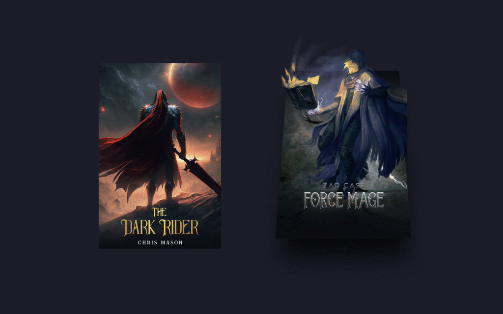
Let’s create a 3D Card Hover Effect using HTML and CSS! 🃏✨ This stylish effect makes cards tilt and pop out when hovered, giving them a realistic 3D look that grabs attention.
We’ll use:
- HTML to structure the card content.
- CSS for styling, shadows, and the 3D hover animations using transforms and transitions.
This project is perfect for portfolios, product showcases, or any design where you want elements to stand out with interactive depth. Let’s dive in and make your cards come alive with a smooth 3D hover effect!
HTML :
This HTML code creates two 3D hover-effect cards, each made up of a background cover image, a title image, and a character image layered on top. The .card div wraps everything, .wrapper holds the main cover image, and the title and character images are placed separately to allow stylish positioning and animations via CSS (style.css). When styled, hovering over a card will likely make the elements pop out or move, giving a 3D effect.
<!DOCTYPE html>
<html lang="eng" >
<head>
  <meta charset="UTF-8">
  <title>3D Card Hover Effect | @coding.stella</title>
  <link rel="stylesheet" href="./style.css">

</head>
<body>

  <div class="card">
    <div class="wrapper">
      <img src="./Images/dark_rider-cover.jpg" class="cover-image" />
    </div>
    <img src="./Images/dark_rider-title.png" class="title" />
    <img src="./Images/dark_rider-character.webp" class="character" />
  </div>

  <div class="card">
    <div class="wrapper">
      <img src="./Images/force_mage-cover.jpg" class="cover-image" />
    </div>
    <img src="./Images/force_mage-title.png" class="title" />
    <img src="./Images/force_mage-character.webp" class="character" />
  </div>

</body>
</html>
CSS :
This CSS styles the 3D card hover effect by setting card dimensions, positioning, and a dark background. Each .card uses perspective to create depth, while .wrapper holds the background cover image and tilts with shadows when hovered. Gradient overlays (::before and ::after) add lighting effects, and the .title image moves upward in 3D space on hover. The .character image starts hidden and fades in while moving forward, giving the illusion that elements are popping out toward the viewer for a dynamic 3D animation.
:root {
  --card-height: 300px;
  --card-width: calc(var(--card-height) / 1.5);
}
* {
  box-sizing: border-box;
}
body {
  width: 100vw;
  height: 100vh;
  margin: 0;
  display: flex;
  justify-content: center;
  align-items: center;
  background: #252432;
}

.card {
  width: var(--card-width);
  height: var(--card-height);
  position: relative;
  display: flex;
  justify-content: center;
  align-items: flex-end;
  padding: 0 36px;
  perspective: 2500px;
  margin: 0 50px;
  cursor: pointer;
}

.cover-image {
  width: 100%;
  height: 100%;
  object-fit: cover;
}

.wrapper {
  transition: all 0.5s;
  position: absolute;
  width: 100%;
  z-index: -1;
}

.card:hover .wrapper {
  transform: perspective(900px) translateY(-5%) rotateX(25deg) translateZ(0);
  box-shadow: 2px 35px 32px -8px rgba(0, 0, 0, 0.75);
  -webkit-box-shadow: 2px 35px 32px -8px rgba(0, 0, 0, 0.75);
  -moz-box-shadow: 2px 35px 32px -8px rgba(0, 0, 0, 0.75);
}

.wrapper::before,
.wrapper::after {
  content: "";
  opacity: 0;
  width: 100%;
  height: 80px;
  transition: all 0.5s;
  position: absolute;
  left: 0;
}
.wrapper::before {
  top: 0;
  height: 100%;
  background-image: linear-gradient(
    to top,
    transparent 46%,
    rgba(12, 13, 19, 0.5) 68%,
    rgba(12, 13, 19) 97%
  );
}
.wrapper::after {
  bottom: 0;
  opacity: 1;
  background-image: linear-gradient(
    to bottom,
    transparent 46%,
    rgba(12, 13, 19, 0.5) 68%,
    rgba(12, 13, 19) 97%
  );
}

.card:hover .wrapper::before,
.wrapper::after {
  opacity: 1;
}

.card:hover .wrapper::after {
  height: 120px;
}
.title {
  width: 100%;
  transition: transform 0.5s;
}
.card:hover .title {
  transform: translate3d(0%, -50px, 100px);
}

.character {
  width: 100%;
  opacity: 0;
  transition: all 0.5s;
  position: absolute;
  z-index: -1;
}

.card:hover .character {
  opacity: 1;
  transform: translate3d(0%, -30%, 100px);
}
In short, creating a 3D Card Hover Effect using HTML and CSS is a simple yet impressive way to make your designs interactive and modern. With just a few lines of code, you can turn static cards into eye-catching UI elements. 🚀
If your project has problems, don’t worry. Just click to download the source code and face your coding challenges with excitement. Have fun coding!
