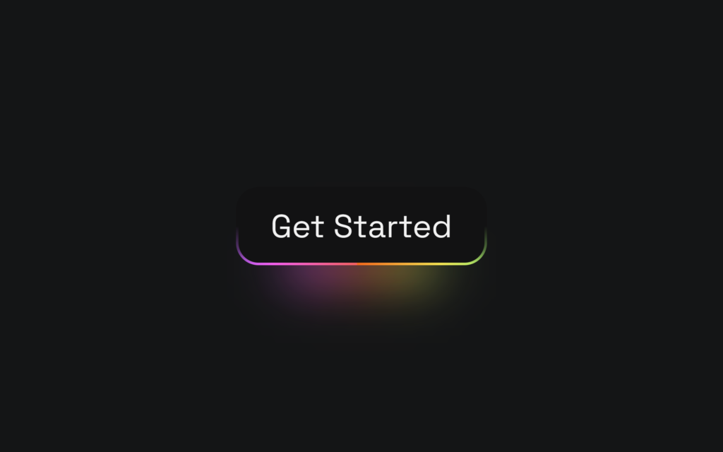
Let’s create a Fancy Glowing Button using HTML and CSS. This button will have a modern design with a glowing effect that enhances its visual appeal and interactivity.
We’ll use HTML to structure the button and CSS to style it, adding the glowing effect through CSS animations and box shadows.
Let’s get started on building the Fancy Glowing Button. Whether you’re a beginner or an experienced developer, this project offers a great way to practice your web design skills and create a visually appealing, interactive button. Let’s make buttons glow with style!
HTML :
This HTML code sets up a basic webpage structure with a glowing button. The <!DOCTYPE html> declares the document type. The <html> element specifies the language as English. The <head> section includes metadata like character set (UTF-8), viewport settings for responsive design, and a link to an external CSS file (style.css). The <title> sets the page title to “Fancy Glowing Button.” The <body> contains a single button element with the text “Get Started.”
<!DOCTYPE html>
<html lang="en">
<head>
    <meta charset="UTF-8">
    <meta name="viewport" content="width=device-width, initial-scale=1.0">
    <link rel="stylesheet" href="./style.css">
    <title>Fancy Glowing Button</title>
</head>
<body>

  <button>Get Started</button>

</body>
</html>
CSS :
This CSS code styles a webpage with a glowing button using custom properties (CSS variables) for scaling and color definitions. It imports the ‘Space Grotesk’ font from Google Fonts. The :root section defines variables for spacing and colors. The body is styled to center its content with a dark background.
The button is styled with a transparent border, specific font, size, rounded corners, padding, and gradient background that animates through multiple colors. The ::before pseudo-element adds a blurred glow beneath the button, using the same gradient colors.
The @keyframes rule defines the animation to move the gradient background, creating a glowing effect. A media query adjusts the scaling variable (--m) for screens smaller than 1000px, ensuring responsiveness.
@import url('https://fonts.googleapis.com/css?family=Space%20Grotesk:700|Space%20Grotesk:400');

:root {
/*  change this for scaling  */
  --m: 4rem;

  --red: #FF6565;
  --pink: #FF64F9;
  --purple: #6B5FFF;
  --blue: #4D8AFF;
  --green: #5BFF89;
  --yellow: #FFEE55;
  --orange: #FF6D1B;

}

body {
  background-color: #141516;
  display: flex;
  flex-direction: column;
  justify-content: center;
  align-items: center;
  height: 100vh;
  margin: 0;
}

button {
  border: calc(0.08 * var(--m)) solid transparent;
  position: relative;
  color: #F3F3F3;
  font-family: 'Space Grotesk';
  font-size: var(--m);
  border-radius: calc(0.7 * var(--m));
  padding: calc(0.5 * var(--m)) calc(1 * var(--m));
  display: flex;
  justify-content: center;
  cursor: pointer;

  background:linear-gradient(#121213, #121213), linear-gradient(#121213 50%, rgba(18, 18, 19, 0.6) 80%, rgba(18, 18, 19, 0)),  linear-gradient(90deg, var(--orange), var(--yellow), var(--green), var(--blue), var(--purple), var(--pink), var(--red));
  background-origin: border-box;
  background-clip: padding-box, border-box, border-box;
  background-size: 200%;
  animation: animate 2s infinite linear;
}

button::before {
  content: '';
  background: linear-gradient(90deg, var(--orange), var(--yellow), var(--green), var(--blue), var(--purple), var(--pink), var(--red));
  height: 30%;
  width: 60%;
  position: absolute;
  bottom: -20%;
  z-index: -5;
  background-size: 200%;
  animation: animate 2s infinite linear;
  filter: blur(calc(0.8 * var(--m)));
}

button:hover, button:hover::before {
  animation: animate 0.5s infinite linear;
}

@keyframes animate {
  0% {background-position: 0}
  100% {background-position: 200%}
}

@media screen and (max-width: 1000px) {
  :root {
    --m: 2rem;
  }
}
In conclusion, creating a Fancy Glowing Button using HTML and CSS has been a fun and rewarding project. By combining HTML for structure and CSS for styling and animations, we’ve crafted a modern, visually appealing button that enhances user interaction with a glowing effect.
If your project has problems, don’t worry. Just click to download the source code and face your coding challenges with excitement. Have fun coding!
