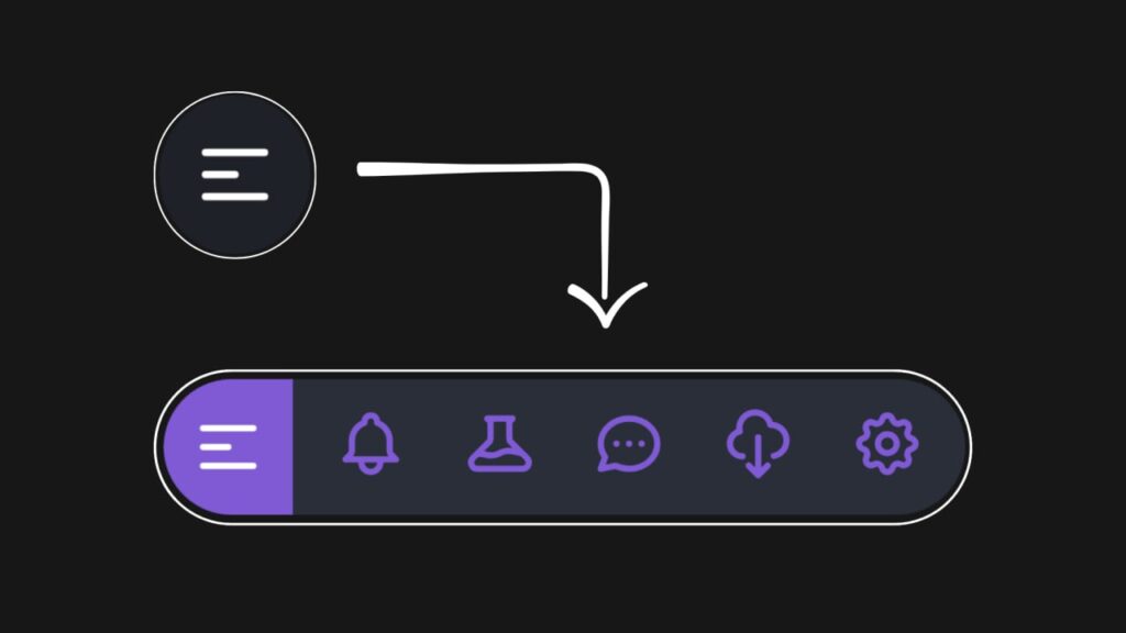
Let’s create a Slide-out Navigation using GSAP 3, HTML, CSS, and JavaScript. This project will feature a smooth, animated slide-out navigation menu that appears when triggered by a button, enhancing the user experience with dynamic, modern interactions.
We’ll use HTML to structure the menu, CSS for basic styling, and GSAP 3 in combination with JavaScript to control the animations for the slide-out effect.
Let’s dive into building the Slide-out Navigation with GSAP 3. Whether you’re a beginner or an experienced developer, this project offers a great way to practice creating sleek, responsive navigation with smooth animations. Let’s add some motion to our menus!
HTML :
This HTML creates a slide-out navigation menu with a clickable SVG button. When clicked, it reveals icons for different sections (like notifications or settings). The GSAP library is used to animate the menu sliding in and making the icons visible.
<!DOCTYPE html>
<html lang="en" >
<head>
  <meta charset="UTF-8">
  <title>Slide-out Navigation with GSAP 3</title>
  <link rel="stylesheet" href="./style.css">

</head>
<body>

<header>
  <!-- Menu button, using an SVG image as an icon -->
  <img class="activator" id="activator" src="//s.svgbox.net/hero-outline.svg?fill=fff#menu-alt-1" alt="">

  <!-- Navigation menu with icons, each linking to different sections -->
  <nav>
    <ul>
      <li><a href="#"><img src="//s.svgbox.net/hero-outline.svg?fill=805ad5#bell"></a></li>
      <li><a href="#"><img src="//s.svgbox.net/hero-outline.svg?fill=805ad5#beaker"></a></li>
      <li><a href="#"><img src="//s.svgbox.net/hero-outline.svg?fill=805ad5#chat"></a></li>
      <li><a href="#"><img src="//s.svgbox.net/hero-outline.svg?fill=805ad5#cloud-download"></a></li>
      <li><a href="#"><img src="//s.svgbox.net/hero-outline.svg?fill=805ad5#cog"></a></li>
    </ul>
  </nav>
</header>

  <!-- External JavaScript libraries for animations and GSAP functionality -->
  <script src='https://cdnjs.cloudflare.com/ajax/libs/gsap/3.5.1/gsap.min.js'></script>
  <script src='https://cdnjs.cloudflare.com/ajax/libs/gsap/3.5.1/CSSRulePlugin.min.js'></script>
  <script  src="./script.js"></script>

</body>
</html>
CSS :
This CSS styles a webpage to have a centered layout with dark-themed elements. The body fills the entire viewport, has no margins, and displays content using CSS grid. The header section contains a clickable element (with the class .activator) styled as a circular button that changes its background color on hover. The nav element has a rounded shape and uses clip-path for hidden content that can be revealed during animation. Inside nav, there is a horizontal list (ul) of links (a), each containing an image. The images are initially invisible and positioned slightly to the left, making them ready for animation when hovered or triggered by JavaScript.
body {
  margin: 0;
  height: 100vh;
  background: #171717;
  color: white;
  display: grid;
  place-content: center;
}

header {
  display: flex;
}

header .activator {
  padding: 1em;
  border-radius: 100%;
  cursor: pointer;
}

header .activator:hover {
  background: #1e2129;
}

img {
  width: 100%;
  max-width: 45px;
}

ul {
  list-style-type: none;
  margin: 0;
  padding: 0;
}

nav {
  background: #292e38;
  border-radius: 0 5em 5em 0;
  padding: 0.5em;
  clip-path: ellipse(50% 50% at -50% 50%);
}

nav ul {
  display: flex;
}

nav ul li a {
  display: block;
  padding: 0.5em;
  margin: 0 0.5em;
  border-radius: 50%;
}

nav ul li a:hover {
  background: #323844;
}

nav ul li a img {
  opacity: 0;
  transform: translateX(-10px);
}
JavaScript:
This code animates an HTML element using GSAP (GreenSock Animation Platform). It targets an element with the ID ‘activator’ and creates a timeline (tl) with animations: changing the background color and border radius of the activator, expanding a nav element using clipPath, and making images in the nav appear with opacity and a sliding effect. Initially, the animation is paused. When the activator is clicked, it toggles the animation, either playing it forward or reversing it based on the toggle state.
var card = document.getElementById('activator');
        var tl = gsap.timeline({defaults: {ease: "power2.inOut"}})

        var toggle = false;

        tl.to('.activator', {
            background: '#805ad5',
            'borderRadius': '5em 0 0 5em'
        });
        tl.to('nav', {
            'clipPath': 'ellipse(100% 100% at 50% 50%)'
        }, "-=.5")
        tl.to('nav img', {
            opacity: 1,
            transform: 'translateX(0)',
            stagger: .05
        }, "-=.5")
        tl.pause();

        card.addEventListener('click', () => {
            toggle = !toggle;
            if (toggle ? tl.play() : tl.reverse());
        })
In conclusion, creating a Slide-out Navigation using GSAP 3, HTML, CSS, and JavaScript has been an exciting and rewarding project. By combining these technologies, we’ve developed a sleek, modern menu with smooth, animated transitions that enhance user experience and interactivity.
If your project has problems, don’t worry. Just click to download the source code and face your coding challenges with excitement. Have fun coding!
