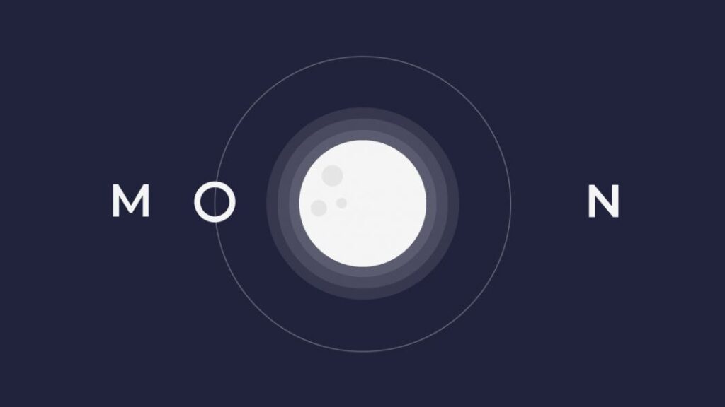
Hey everyone, welcome to today’s blog post! Today, we’re delving into the creation of a mesmerizing moon animation using only HTML and CSS. No need for images, icons, or external libraries – just the power of CSS at work!
This blog post is all about the joy of exploration and experimentation. While this particular animation might not have direct real-world application, it’s an incredible opportunity to play around with various CSS properties and enhance your skillset. If you’re new to CSS and looking to spruce up your abilities, this blog post is an ideal playground for your learning journey.
Join us as we embark on this creative endeavor – let’s dive into the world of CSS and craft something delightful together!
HTML :
This HTML code creates a container with letters ‘M’ and ‘N’. Inside, there’s a moon orbiting an ‘O’. The container has classes for styling, while ‘letter-M’ and ‘letter-N’ mark paragraphs for individual letters ‘M’ and ‘N’. The ‘moon’ div contains an ‘orbit’ div with a letter ‘O’.
<!DOCTYPE html>
<html lang="en">
  <head>
    <meta name="viewport" content="width=device-width, initial-scale=1.0" />
    <title>Moon Animation</title>
    <!-- Google Font -->
    <link
      href="https://fonts.googleapis.com/css2?family=Montserrat:wght@500&display=swap"
      rel="stylesheet"
    />
    <!-- Stylesheet -->
    <link rel="stylesheet" href="style.css" />
  </head>
  <body>
    <div class="container">
      <p class="letter letter-M">M</p>
      <div class="moon">
        <div class="orbit">
          <p>O</p>
        </div>
      </div>
      <p class="letter letter-N">N</p>
    </div>
  </body>
</html>
CSS :
This CSS code sets up a page with a Montserrat font, a dark background color, and a centered container. Paragraphs with classes ‘letter-M’ and ‘letter-N’ position their text letters. A ‘moon’ div with an ‘orbit’ spins using CSS animation. Media query adjusts font size for wider screens (>700px).
* {
  padding: 0;
  margin: 0;
  box-sizing: border-box;
  font-family: "Montserrat", sans-serif;
}
body {
  background-color: #21233c;
}
.container {
  height: 31.25em;
  width: 31.25em;
  position: absolute;
  transform: translate(-50%, -50%);
  top: 50%;
  left: 50%;
  color: #ffffff;
}
p.letter {
  font-size: 3.5em;
  position: absolute;
  transform: translateY(-50%);
  top: 50%;
}
.letter-M {
  left: 0.2em;
}
.letter-N {
  right: 0.2em;
}
.moon {
  background-color: #f5f5f5;
  height: 8em;
  width: 8em;
  border-radius: 50%;
  position: absolute;
  margin: auto;
  left: 0;
  right: 0;
  top: 0;
  bottom: 0;
  box-shadow: 0 0 0 0.6em rgba(255, 255, 255, 0.05),
    0 0 0 1.2em rgba(255, 255, 255, 0.05), 0 0 0 1.8em rgba(255, 255, 255, 0.05);
}
.moon:after {
  position: absolute;
  content: "";
  background-color: #e6e6e6;
  height: 0.9em;
  width: 0.9em;
  border-radius: 50%;
  top: 3.75em;
  left: 1.25em;
  box-shadow: 0.9em -2.1em 0 0.2em #e6e6e6, 1.5em -0.3em 0 -0.06em #e6e6e6;
}
.orbit {
  height: 18.75em;
  width: 18.75em;
  border-radius: 50%;
  position: absolute;
  left: -5.2em;
  bottom: -5.2em;
  animation: spin 8s infinite linear;
}
@keyframes spin {
  100% {
    transform: rotate(360deg);
  }
}
.orbit p {
  position: absolute;
  font-size: 3.5em;
  top: 0.25em;
  left: 0.25em;
}
@media screen and (min-width: 700px) {
  .container {
    font-size: 20px;
  }
}
In a nutshell, the HTML and CSS work together to make a cool moon animation. The moon spins and looks nice with shadows, thanks to CSS magic. The webpage ends up having a pretty, moving moon that catches your eye.
If you run into any hiccups with your moon animation, worry not. You can easily grab the source code for this project. Just hit the Download button to get started on your coding adventure. Happy coding!
