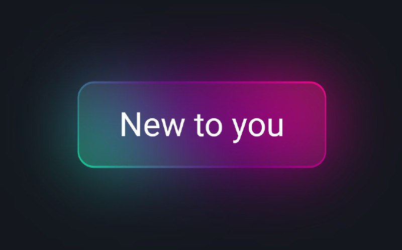
Hey coders! Today, we’re keeping it chill and simple as we create a ‘New to You’ button for YouTube using just HTML and CSS – no fancy graphics or external stuff.
Why bother with this button? Well, it’s not just about the button itself; it’s about having a bit of coding fun. Whether you’re a pro or just starting, this tutorial is a cool way to boost your skills.
We’re not getting too fancy; we’re just making a button and exploring a bit of design. The ‘New to You’ button is more than just a visual thing; it’s a chance to add a touch of cool to your coding style.
Join us in this laid-back coding adventure, where we’ll use HTML and CSS to make a button that looks good on any screen. Ready to spice up YouTube a bit? Let’s dive into the code!
HTML :
The given code snippet represents a gradient button. It includes a basic structure with a head section and a body section. The head section imports the “Roboto” font from Google Fonts and sets it as the default font for all elements. The body section contains a single anchor element with the text “New to you”.
<!DOCTYPE html>
<html lang="en" >
<head>
  <meta charset="UTF-8">
  <title>Youtube New to You Button | Coding Stella</title>
  <link rel="stylesheet" href="./style.css">

</head>
<body>
<!-- partial:index.partial.html -->
<a href="#"><span>New to you</span></a>
<!-- partial -->

</body>
</html>
CSS :
The given code is a CSS stylesheet imports the “Roboto” font from Google Fonts and sets it as the default font for all elements. The body element is centered on the page and has a dark background color. The anchor element is styled with a gradient background, padding, and rounded corners. On hover, it creates a glowing effect with a translucent background and a blur effect.
@import url("https://fonts.googleapis.com/css2?family=Roboto:wght@400&display=swap");

* {
  margin: 0;
  padding: 0;
  box-sizing: border-box;
  font-family: "Roboto", sans-serif;
}

body {
  display: flex;
  justify-content: center;
  align-items: center;
  min-height: 100vh;
  background: #14171e;
}

a {
  position: relative;
  text-decoration: none;
  color: #fff;
  background: linear-gradient(45deg, #0ce39a, #69007f, #fc0987);
  padding: 14px 25px;
  border-radius: 10px;
  font-size: 1.25em;
}

a span {
  position: relative;
  z-index: 1;
}

a::before {
  content: "";
  position: absolute;
  inset: 1px;
  background: #272727;
  border-radius: 9px;
  transition: 0.5s;
}

a:hover::before {
  opacity: 0.7;
}

/* add some glow effect */
a::after {
  content: "";
  position: absolute;
  inset: 0px;
  background: linear-gradient(45deg, #0ce39a, #69007f, #fc0987);
  border-radius: 9px;
  transition: 0.5s;
  opacity: 0;
  filter: blur(20px);
}

a:hover:after {
  opacity: 1;
}
In a nutshell, we’ve crafted a stylish ‘New to You’ button for YouTube using only HTML and CSS in this tutorial. Simple and beginner-friendly, this button is ready to freshen up your YouTube projects. Happy coding!
If you hit a snag in your project, no biggie! Grab the source code by clicking the Download button, and you’re all set for your coding adventure. Enjoy coding!
