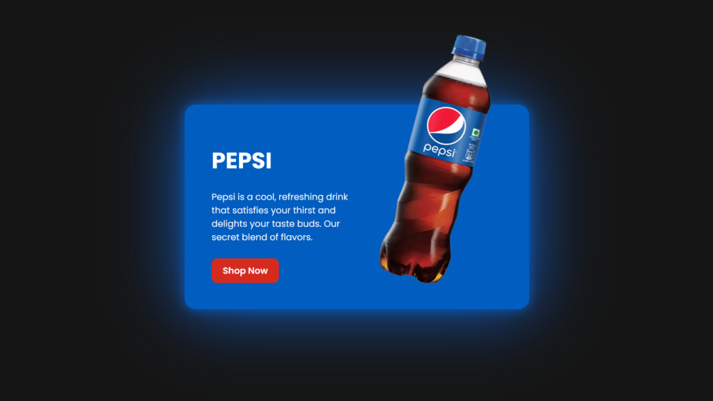
Let’s create a Pepsi Product Card using HTML and CSS. This product card will feature a modern design showcasing a Pepsi bottle or can, complete with product details, pricing, and a visually appealing layout.
We’ll use HTML to structure the product card and CSS to style it, giving it a professional and clean look, perfect for displaying product information.
Let’s get started on building the Pepsi Product Card. Whether you’re a beginner or an experienced developer, this project is a great way to practice web design skills while creating an engaging and visually appealing product display.
HTML :
This HTML code creates a webpage with a Pepsi-themed card. The card includes a logo image in a circular frame, an image of a Pepsi can, and a description with a “Shop Now” link. It uses an external stylesheet (style.css) for styling. The meta tags ensure proper character encoding and responsive design for various devices.
<!DOCTYPE html>
<html lang="en">
<head>
  <meta charset="UTF-8">
  <meta name="viewport" content="width=device-width, initial-scale=1.0">
  <meta http-equiv="X-UA-Compatible" content="ie=edge">
  <title>Pepsi Product Card | @coding.stella</title>
  <link rel="stylesheet" href="style.css">
</head>
<body>

  <div class="card">
    <div class="circle">
      <img src="image.png" alt="Pepsi Logo" class="logo">
    </div>
    <img src="image1.png" alt="Pepsi Can" class="product_img">
    <div class="content">
		<h2>Pepsi</h2>
		<p>Pepsi is a cool, refreshing drink that satisfies your thirst and delights your taste buds. Our secret blend of flavors.</p>
      <a href="#">Shop Now</a>
    </div>
  </div>

</body>
</html>
CSS :
This CSS code styles a Pepsi-themed card with a dynamic hover effect. The card starts with a size of 300x350px and expands to 600px width when hovered. It includes a circular frame around the Pepsi logo, which transitions to a full-sized background color on hover. The card’s product image and content also animate, with the image enlarging and shifting position, while the content fades in and slides into view. The card has a dark background with contrasting colors and a sleek design using transitions and transformations for an engaging user experience.
@import url("https://fonts.googleapis.com/css?family=Poppins:200,300,400,500,600,700,800,900&display=swap");

* {
  margin: 10;
  padding-right: 0;
  box-sizing: border-box;
  font-family: "Poppins", sans-serif;
}

body {
  display: flex;
  justify-content: center;
  align-items: center;
  min-height: 100vh;
  background: #151515;
  --clr: #005cbf;
}

.card {
  position: relative;
  width: 300px;
  height: 350px;
  display: flex;
  justify-content: center;
  align-items: center;
  transition: 0.5s;
  transition-delay: 0.5s;
}

.card:hover {
  width: 600px;
  transition-delay: 0.5s;
}

.card .circle {
  position: absolute;
  top: 0;
  left: 0;
  width: 100%;
  height: 100%;
  border-radius: 20px;
  display: flex;
  justify-content: center;
  align-items: center;
}

.card .circle::before {
  content: "";
  position: absolute;
  top: 30;
  left: 2;
  right: 2;
  width: 350px;
  height: 350px;
  border-radius: 50%;
  background: #191919;
  border: 8px solid var(--clr);
  transition: 0.5s, background 0.5s;
  transition-delay: 0.75s, 1s;
  filter: drop-shadow(0 0 10px var(--clr)) drop-shadow(0 0 60px var(--clr));
}

.card:hover .circle::before {
  transition-delay: 0.5s;
  width: 100%;
  height: 100%;
  border-radius: 20px;
  background: var(--clr);
}

.card .circle .logo {
  position: relative;
  width: 250px;
  transition: 0.5s;
  transition-delay: 0.5s;
}

.card:hover .circle .logo {
  transform: scale(0);
  transition-delay: 0s;
}

.card .product_img {
  position: absolute;
  top: 50%;
  left: 50%;
  transform: translate(-50%, -50%) scale(0) rotate(315deg);
  height: 300px;
  transition: 0.5s ease-in-out;
}

.card:hover .product_img {
  transition-delay: 0.75s;
  top: 25%;
  left: 75%;
  height: 530px;
  transform: translate(-50%, -50%) scale(1) rotate(15deg);
}

.card .content {
  position: absolute;
  width: 50%;
  left: 20%;
  padding: 20px 20px 20px 20px;
  opacity: 0;
  transition: 0.5s;
  visibility: hidden;
}

.card:hover .content {
  transition-delay: 0.75s;
  opacity: 1;
  visibility: visible;
  left: 20px;
}

.card .content h2 {
  color: #fff;
  text-transform: uppercase;
  font-size: 2.5em;
  line-height: 1em;
}

.card .content p {
  color: #fff;
}

.card .content a {
  position: relative;
  color: #fff;
  background: #d52b1e;
  padding: 10px 20px;
  border-radius: 10px;
  display: inline-block;
  text-decoration: none;
  font-weight: 600;
  margin-top: 10px;
}
In conclusion, creating a Pepsi Product Card using HTML and CSS has been a practical and enjoyable project. By combining HTML for structure and CSS for styling, we’ve created a sleek, modern product card that’s perfect for showcasing products in an attractive way.
If your project has problems, don’t worry. Just click to download the source code and face your coding challenges with excitement. Have fun coding!
