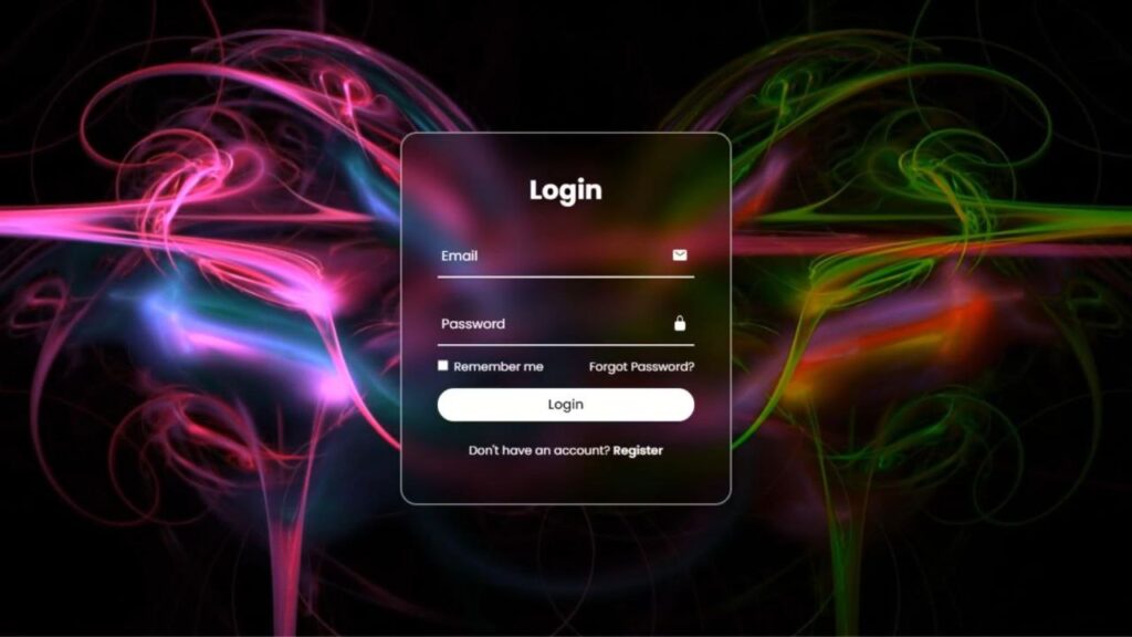
Let’s create an Animated Login Form with a Changing Background using HTML and CSS. This project will feature a stylish login form with a smooth animated background that continuously changes to make the page look modern and engaging.
We’ll use:
- HTML to structure the login form, including input fields for username and password along with the login button.
- CSS to design the form layout, add smooth transitions, and create the animated background effect that changes colors or gradients over time.
This project is perfect for beginners who want to learn how to build beautiful UI components and CSS animations that make login pages look more interactive and visually appealing. Let’s get started and create a modern animated login form! ✨
HTML :
This HTML code sets up the basics for an animated login form. It includes fields for email, password, a remember-me checkbox, and links for password recovery and registration. The code references Ionicons for icons and an external stylesheet named “style.css” for design. It structures the form within a ‘wrapper’ div and applies styling using specific classes.
However, it awaits additional styling and scripting for dynamic background changes and interactive features.
<!DOCTYPE html>
<html lang="en">

<head>
  <meta charset="UTF-8">
  <title>Animated Login Form with Changing Background | @coding.stella</title>
  <link rel="stylesheet" href="./style.css">
</head>

<body>

  <div class="wrapper">

    <div class="login-box">
      <form action="">
        <h2>Login</h2>

        <div class="input-box">
          <span class="icon">
            <ion-icon name="mail"></ion-icon>
          </span>
          <input type="email" required>
          <label>Email</label>
        </div>

        <div class="input-box">
          <span class="icon">
            <ion-icon name="lock-closed"></ion-icon>
          </span>
          <input type="password" required>
          <label>Password</label>
        </div>

        <div class="remember-forgot">
          <label><input type="checkbox"> Remember me</label>
          <a href="#">Forgot Password?</a>
        </div>

        <button type="submit">Login</button>

        <div class="register-link">
          <p>Don't have an account? <a href="#">Register</a></p>
        </div>
      </form>
    </div>
  </div>

  <script src='https://unpkg.com/ionicons@5.5.2/dist/ionicons/ionicons.js'></script>
  <script src='https://unpkg.com/ionicons@5.5.2/dist/ionicons/ionicons.esm.js'></script>
</body>
</html>
CSS :
This CSS code customizes an animated login form. It uses the Montserrat font, resets spacing, and defines the layout. The ‘wrapper’ class creates a background with an animated color shift. ‘login-box’ styles the form, adding a blurred effect and borders. Input fields, labels, and buttons get a clean design with smooth transitions. It adjusts for smaller screens too.
The ‘animateBg’ rule rotates the background colors for a dynamic effect.
@import url('https://fonts.googleapis.com/css2?family=Montserrat&display=swap');

* {
  margin: 0;
  padding: 0;
  box-sizing: border-box;
  font-family: 'Montserrat', sans-serif;
}

.wrapper {
  display: flex;
  justify-content: center;
  align-items: center;
  height: 100vh;
  width: 100%;
  background: url('./image.png') no-repeat;
  background-size: cover;
  background-position: center;
  animation: animateBg 5s linear infinite;
}

@keyframes animateBg {
  100% {
    filter: hue-rotate(360deg);
  }
}

.login-box {
  position: relative;
  width: 400px;
  height: 450px;
  background: transparent;
  border-radius: 15px;
  border: 2px solid rgba(255, 255, 255, .5);
  display: flex;
  justify-content: center;
  align-items: center;
  backdrop-filter: blur(15px);
}

h2 {
  font-size: 2em;
  color: #fff;
  text-align: center;
}

.input-box {
  position: relative;
  width: 310px;
  margin: 30px 0;
  border-bottom: 1px solid #fff;
}

.input-box label {
  position: absolute;
  top: 50%;
  left: 5px;
  transform: translateY(-50%);
  font-size: 1em;
  color: #fff;
  pointer-events: none;
  transition: .5s;
}

.input-box input:focus~label,
.input-box input:valid~label {
  top: -5px;
}

.input-box input {
  width: 100%;
  height: 50px;
  background: transparent;
  border: none;
  outline: none;
  font-size: 1em;
  color: #fff;
  padding: 0 35px 0 5px;
}

.input-box .icon {
  position: absolute;
  right: 8px;
  top: 50%;
  color: #fff;
  transform: translateY(-50%);
}

.remember-forgot {
  margin: -15px 0 15px;
  font-size: .9em;
  color: #fff;
  display: flex;
  justify-content: space-between;
}

.remember-forgot label input {
  margin-right: 3px;
}

.remember-forgot a {
  color: #fff;
  text-decoration: none;
}

.remember-forgot a:hover {
  text-decoration: underline;
}

button {
  width: 100%;
  height: 40px;
  background-color: #fff;
  border: none;
  border-radius: 40px;
  cursor: pointer;
  font-size: 1em;
  color: #000;
  font-weight;
  500;
}

.register-link {
  font-size: .9em;
  color: #fff;
  text-align: center;
  margin: 25px 0 10px;
}

.register-link p a {
  color: #fff;
  text-decoration: none;
  font-weight: 600;
}

.register-link p a:hover {
  text-decoration: underline;
}

@media (max-width:500px) {
  .login-box {
    width: 100%;
    height: 100vh;
    border: none;
    border-radius: 0;
  }

  .input-box {
    width: 290px;
  }
}
To wrap up, we’ve built a cool animated login form using HTML and CSS. We’ve covered the structure and style, making it engaging with dynamic elements. Now, it’s your canvas! Add your touch and try out more animated login designs to level up your skills.
If you face any challenges during the creation of your animated login form, don’t worry. You can easily access the source code files for this project at no cost. Just click the Download button to get started. Happy coding!
