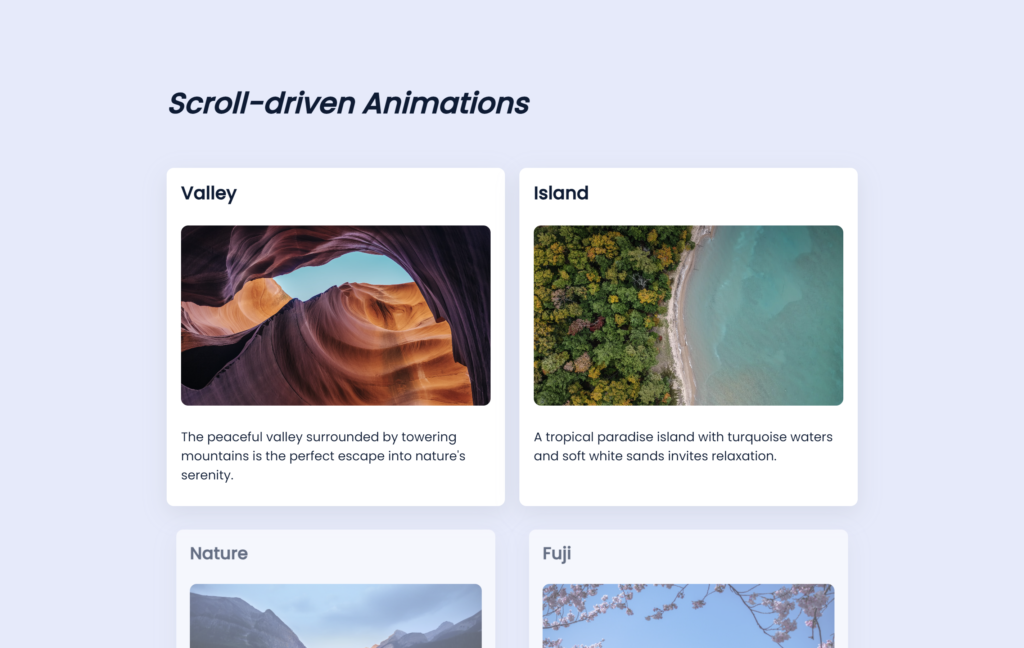
Let’s create Scroll-driven Animations using HTML and CSS. This project will animate elements as the user scrolls down the page, adding a dynamic and engaging experience to your website.
We’ll use HTML to structure the content and CSS to handle the scroll-based animations with keyframes and transforms.
Let’s dive into building Scroll-driven Animations. Whether you’re a beginner or an experienced developer, this project offers a great opportunity to practice creating visually engaging effects based on user interaction. Let’s make scrolling through the page a visually exciting experience!
HTML :
This HTML code sets up a webpage with a section displaying various nature-themed cards. Each card has a title, image, and description. It includes a progress bar at the top and links to an external stylesheet (style.css) for styling. The page is designed to feature scroll-driven animations, making the cards visually appealing as you scroll.
<!DOCTYPE html>
<html lang="en">
<head>
    <meta charset="UTF-8">
    <meta name="viewport" content="width=device-width, initial-scale=1.0">
    <link rel="stylesheet" href="./style.css">
    <title>Scroll driven animation</title>
</head>
<body>

  <div class="progress-bar"></div>
  <section>
    <h1>Scroll-driven Animations</h1>
    <div class="card-container">
      <div class="card">
        <h2>Valley</h2>
        <img src="/img/img1.png" alt="Valley" />
        <p>The peaceful valley surrounded by towering mountains is the perfect escape into nature's serenity.</p>
      </div>
      <div class="card">
        <h2>Island</h2>
        <img src="/img/img2.png" alt="Island" />
        <p>A tropical paradise island with turquoise waters and soft white sands invites relaxation.</p>
      </div>
      <div class="card">
        <h2>Nature</h2>
        <img src="/img/img3.png" alt="Nature" />
        <p>Lush greenery and colorful blooms make nature a vibrant tapestry of life and beauty.</p>
      </div>
      <div class="card">
        <h2>Fuji</h2>
        <img src="/img/img4.png" alt="Mount Fuji" />
        <p>The majestic Mount Fuji stands tall, an iconic symbol of Japan’s natural beauty.</p>
      </div>
      <div class="card">
        <h2>Sunrise</h2>
        <img src="/img/img5.png" alt="Sunrise" />
        <p>Witness the golden hues of the sunrise as the world awakens to a new day.</p>
      </div>
      <div class="card">
        <h2>Lake</h2>
        <img src="/img/img6.png" alt="Lake" />
        <p>A tranquil lake reflects the beauty of the surrounding mountains and sky.</p>
      </div>
      <div class="card">
        <h2>Flowers</h2>
        <img src="/img/img7.png" alt="Flowers" />
        <p>Delicate blossoms sway in the breeze, painting the landscape in vibrant colors.</p>
      </div>
      <div class="card">
        <h2>Snow</h2>
        <img src="/img/img8.png" alt="Snow" />
        <p>Fresh snow blankets the ground, turning the landscape into a winter wonderland.</p>
      </div>
      <div class="card">
        <h2>Sunset</h2>
        <img src="/img/img9.png" alt="Sunset" />
        <p>The sky ignites with fiery oranges and pinks as the sun sets on the horizon.</p>
      </div>
      <div class="card">
        <h2>Autumn</h2>
        <img src="/img/img10.png" alt="Autumn" />
        <p>Autumn leaves, dressed in shades of red and gold, blanket the forest floor.</p>
      </div>
      <div class="card">
        <h2>Stars</h2>
        <img src="/img/img11.png" alt="Stars" />
        <p>Under a starry night, the vastness of the universe becomes clear in the midnight sky.</p>
      </div>
      <div class="card">
        <h2>Van</h2>
        <img src="/img/img12.png" alt="Van" />
        <p>A classic van parked by the beach, ready for an adventure-filled road trip.</p>
      </div>
      <div class="card">
        <h2>Cat</h2>
        <img src="/img/img13.png" alt="Cat" />
        <p>A curious cat explores its surroundings, moving with grace and elegance.</p>
      </div>
      <div class="card">
        <h2>Lavender</h2>
        <img src="/img/img14.png" alt="Lavender" />
        <p>Fields of lavender sway gently in the breeze, filling the air with their calming scent.</p>
      </div>
    </div>
  </section>
</body>
</html>
CSS :
This CSS stylesheet styles a webpage with the Poppins font, sets global box-sizing, and applies a light background color and dark text. It styles headings, paragraphs, and sections for readability and spacing. Cards are designed with a clean look, shadow, and animation. The layout adjusts for smaller screens, and a progress bar at the top has a gradient and scroll-based animation.
@import url("https://fonts.googleapis.com/css2?family=Poppins:wght@400;500&display=swap");

* {
  box-sizing: border-box;
  -webkit-font-smoothing: antialiased;
  -moz-osx-font-smoothing: grayscale;
}

html, body {
  width: 100%;
  margin: 0;
  padding: 0;
}

body {
  color: #001c35;
  background-color: #e3eafc;
  font-family: "Poppins", sans-serif;
}

h1 {
  font-size: 32px;
  font-style: italic;
  margin-bottom: 3rem;
}

h2 {
  font-size: 20px;
  margin: 0 0 1rem 0;
  line-height: 1.2;
  white-space: normal;
  overflow-wrap: break-word;
  text-overflow: ellipsis;
}

p {
  font-size: 14px;
  margin: 0.5rem 0;
  overflow-wrap: break-word;
}

section {
  width: 100%;
  max-width: 800px;
  padding: 4rem 1rem;
  margin: 0 auto;
}

section img {
  width: 100%;
  max-width: 520px;
  height: 100%;
  max-height: 200px;
  object-fit: cover;
  margin: 1rem 0;
  display: block;
  border-radius: 8px;
  transform-origin: center;
}

.card {
  width: 100%;
  max-width: 520px;
  padding: 16px;
  background-color: #fff;
  border-radius: 8px;
  box-shadow: rgba(149, 157, 165, 0.2) 0px 8px 24px;
  animation: fade-in linear both;
  animation-timeline: view();
  animation-range: entry 10% entry 80%;
  display: flex;
  flex-direction: column;
  box-sizing: border-box;
}

.card h2, .card p {
  margin-bottom: 0.5rem;
}

.card-container {
  display: grid;
  grid-template-columns: 1fr 1fr;
  gap: 16px;
}

@media screen and (max-width: 580px) {
  .card-container {
    grid-template-columns: 1fr;
  }
}

@keyframes scaleProgress {
  from {
    transform: scaleX(0);
  }
  to {
    transform: scaleX(100%);
  }
}

.progress-bar {
  position: fixed;
  top: 0;
  left: 0;
  width: 100%;
  height: 1rem;
  z-index: 1;
  background: #feac5e;
  background: -webkit-linear-gradient(to right, #4bc0c8, #c779d0, #feac5e);
  background: linear-gradient(to right, #4bc0c8, #c779d0, #feac5e);
  transform-origin: 0 50%;
  animation: scaleProgress auto linear;
  animation-timeline: scroll(root);
}

@keyframes fade-in {
  from {
    opacity: 0.3;
    transform: scale(0.9);
  }
  to {
    opacity: 1;
    transform: scale(1);
  }
}
In conclusion, creating Scroll-driven Animations using HTML and CSS has been an exciting and educational journey. By combining HTML for structure and CSS for animations, we’ve learned how to create engaging visual effects that activate as the user scrolls down the page.
If your project has problems, don’t worry. Just click to download the source code and face your coding challenges with excitement. Have fun coding!
