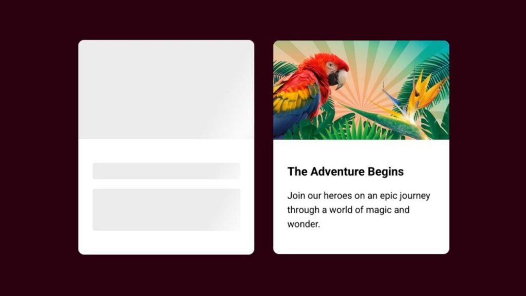
Hey there, coding buddies! Today, let’s jazz up your website with a cool Skeleton Loading Animation using only HTML and CSS. No need for fancy setups – just straightforward coding to make your page look lively during loading.
Why a skeleton loading animation, you ask? Well, it’s not just about looks; it’s about making those loading moments more engaging for your users. So, let’s dive into HTML for structure, CSS for style, and create a fun Skeleton Loading Animation together.
Join me for a quick and easy coding adventure to bring your web pages to life. Ready to add a bit of flair? Let’s get started – the simple HTML and CSS way!
HTML :
The given HTML code represents a simple web page layout with two cards. The first card is a skeleton loading state, indicated by the presence of the “skeleton” class on the image, title, and intro elements. This is commonly used to show a placeholder while content is being loaded. The second card displays an actual image, title, and intro text.
<!DOCTYPE html>
<html lang="en" >
<head>
  <meta charset="UTF-8">
  <title>CodePen - Skeleton Loading </title>
  <link rel="stylesheet" href="./style.css">

</head>
<body>
<!-- partial:index.partial.html -->
<div class="container">
  <div class="card">
    <div class="card-img skeleton"></div>
    <div class="card-body">
      <h2 class="card-title skeleton"></h2>
      <p class="card-intro skeleton"></p>
    </div>
  </div>
  <div class="card">
    <div class="card-img">
      <img src="https://codingstella.com/wp-content/uploads/2024/01/download-9.png ">
    </div>
    <div class="card-body">
      <h2 class="card-title">
        The Adventure Begins
      </h2>
      <p class="card-intro">
        Join our heroes on an epic journey through a world of magic and wonder.
      </p>
    </div>
  </div>
</div>
<!-- partial -->

</body>
</html>
CSS :
The given CSS code provides styling for a web page layout. It sets the box-sizing property to border-box for all elements, applies a background color to the body, and positions the container element in the center of the page. The card class defines the styling for individual cards, including background color, box shadow, and border radius. The card-img class sets the aspect ratio for the card image, while the card-body class provides padding for the card content.
The skeleton class is used to create a gradient background animation for the skeleton loading state, and the @keyframes rule defines the animation behavior.
*,
*:after,
*:before {
  box-sizing: border-box;
}

body {
  font-family: "Inter", sans-serif;
  background-color: #2b010f;
}

.container {
  position: absolute;
  top: 0;
  left: 0;
  right: 0;
  bottom: 0;
  width: 100%;
  display: flex;
  align-items: center;
  justify-content: center;
  flex-wrap: wrap;
}

.card {
  display: flex;
  flex-direction: column;
  flex-basis: 300px;
  flex-shrink: 0;
  flex-grow: 0;
  max-width: 100%;
  background-color: #fff;
  box-shadow: 0 5px 10px 0 rgba(#000, 0.15);
  border-radius: 10px;
  overflow: hidden;
  margin: 1rem;
}

.card-img {
  padding-bottom: 56.25%;
  position: relative;
}

.card-img img {
  position: absolute;
  width: 100%;
}

.card-body {
  padding: 1.5rem;
}

.card-title {
  font-size: 1.25rem;
  line-height: 1.33;
  font-weight: 700;
}

.card-title.skeleton {
  min-height: 28px;
  border-radius: 4px;
}

.card-intro {
  margin-top: 0.75rem;
  line-height: 1.5;
}

.card-intro.skeleton {
  min-height: 72px;
  border-radius: 4px;
}

.skeleton {
  background-image: linear-gradient(
    120deg,
    #ececec 50%,
    #fafafa 60%,
    #fafafa 61%,
    #ececec 70%
  );
  background-size: 200%;
  background-position: 100% 0;
  animation: waves 2s linear infinite;
}

@keyframes waves {
  100% {
    background-position: -100% 0;
  }
}
Awesome job! You’ve just created a cool Skeleton Loading Animation for your website using only HTML and CSS. Now, when users wait for content to load, they’ll have a more engaging and visually appealing experience. Great work, and keep coding with confidence!
If you encounter any challenges, no need to stress! Simply snag the source code for this project by clicking the Download button. Ready to kick off your coding adventure? Happy coding!
