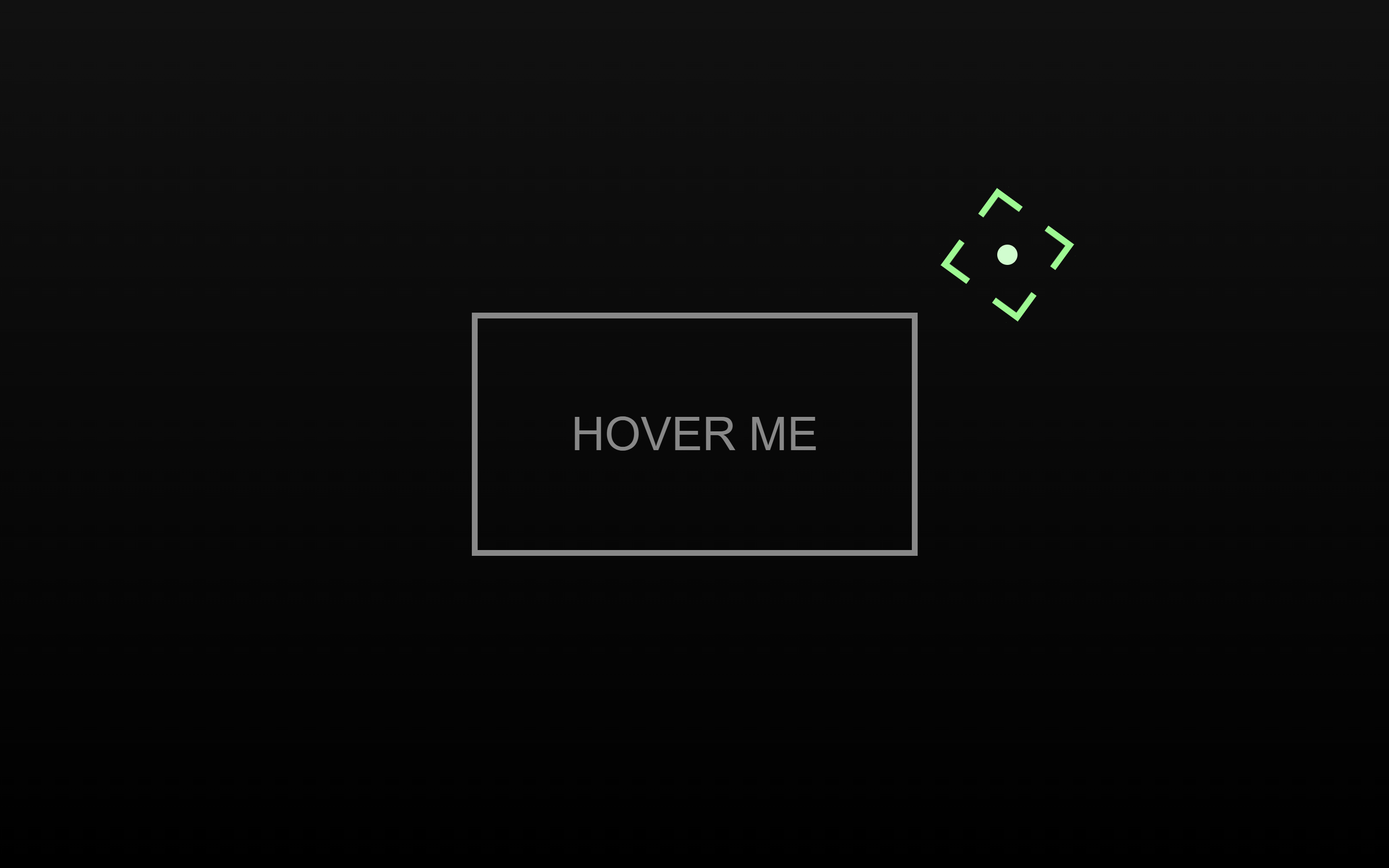
Let’s create a Magnetic Button Hover Effect using HTML, CSS, and JavaScript. This project will feature a button that reacts to the movement of your mouse – giving the illusion that it’s being “pulled” or “attracted” by the cursor like a magnet.
We’ll use:
- HTML to structure the button.
- CSS to style it with smooth transitions and modern visuals.
- JavaScript to detect mouse movement and create the magnetic attraction effect.
This fun and interactive effect adds depth and engagement to any website button. Whether you’re a beginner or an experienced developer, this project is a great way to practice DOM interactions and animations. Let’s make your buttons come alive with magnet-like motion! ⚡🧲
HTML :
This HTML sets up a simple webpage for a magnetic button hover effect demo. It links to external CSS (style.css) and JavaScript (script.js) files and loads the GSAP animation library. The body contains two cursor elements (#cursor and #cursorPt) that replace the default mouse pointer and a centered button-like div (#target) with the text “Hover me.” When combined with the CSS and JS, this setup creates a custom animated cursor that reacts when hovering over the button.
<!DOCTYPE html>
<html lang="en">

<head>
  <meta charset="UTF-8">
  <title>Magnetic Button Hover Effect | @coding.stella</title>
  <link rel="stylesheet" href="./style.css">
</head>

<body>
  <div id="cursor"></div>
  <div id="cursorPt"></div>
  <div id="target">Hover me</div>

  <script src="https://unpkg.com/gsap@3/dist/gsap.min.js"></script>
  <script src="./script.js"></script>
</body>

</html>
CSS :
This CSS creates a fullscreen dark gradient background with a custom glowing cursor and a centered interactive box. The default cursor is hidden (cursor: none), and two custom elements (#cursorPt and #cursor) act as the cursor — a small glowing dot and a decorative square outline that follows the mouse. The #target box is centered using flexbox, styled with borders and text, and smoothly changes color when hovered, giving a futuristic glowing hover effect.
body {
  margin: 0;
  height: 100vh;
  overflow: hidden;
  background: linear-gradient(#111, #000);
  display: flex;
  cursor: none;
}

#cursorPt {
  position: fixed;
  width: 7px;
  height: 7px;
  pointer-events: none;
  z-index: 9999;
  background: #beffcb;
  border-radius: 50%;
  visibility: hidden;
}

#cursor {
  --color: #68fd85;
  position: fixed;
  width: 30px;
  height: 30px;
  pointer-events: none;
  z-index: 9999;
  visibility: hidden;

  background-image: linear-gradient(to right, var(--color) 10px, transparent 0),
    linear-gradient(to bottom, var(--color) 10px, transparent 0),
    linear-gradient(to left, var(--color) 10px, transparent 0),
    linear-gradient(to bottom, var(--color) 10px, transparent 0),
    linear-gradient(to right, var(--color) 10px, transparent 0),
    linear-gradient(to top, var(--color) 10px, transparent 0),
    linear-gradient(to left, var(--color) 10px, transparent 0),
    linear-gradient(to top, var(--color) 10px, transparent 0);

  background-repeat: no-repeat;
  background-position: top left, top left, top right, top right, bottom left,
    bottom left, bottom right, bottom right;
  background-size: 20px 2px, 2px 20px, 20px 2px, 2px 20px, 20px 2px, 2px 20px,
    20px 2px, 2px 20px;
}

#target {
  position: relative;
  width: 150px;
  height: 80px;
  margin: auto;
  border: 2px solid #888;
  transition: 300ms;
  display: flex;
  justify-content: center;
  align-items: center;
  color: #888;
  text-transform: uppercase;
  font-family: sans-serif;
  user-select: none;
}

#target:hover {
  border-color: #ccc;
  color: #ddd;
}
JS :
This JavaScript code creates an animated custom cursor using GSAP. It replaces the default cursor with two elements – a glowing dot (cursorPt) and a rotating square (cursor). The cursor follows the mouse smoothly, and when you hover over the #target box, the rotation stops, and the square expands to match the box size while changing color and position slightly based on mouse movement. When the mouse leaves the target, the cursor shrinks back and starts rotating again, creating a dynamic, interactive hover animation.
const cursor = document.getElementById("cursor");
const cursorPt = document.getElementById("cursorPt");
const target = document.getElementById("target");

const CURSOR_WIDTH = cursor.getBoundingClientRect().width;
const CURSOR_PT_WIDTH = cursorPt.getBoundingClientRect().width;

let isOverTarget = false;
let rotationTween;
let exitTween = null;
let enterTween = null;

function startRotation() {
  gsap.set(cursor, { rotation: 0 });
  rotationTween = gsap.to(cursor, {
    rotation: 180,
    duration: 1.2,
    repeat: -1,
    ease: "linear",
    transformOrigin: "center center"
  });
}

function stopRotation() {
  if (rotationTween) rotationTween.kill();
}

document.addEventListener("mousemove", (e) => {
  gsap.to(cursor, {autoAlpha: 1});
    gsap.to(cursorPt, {autoAlpha: 1});
  if (!isOverTarget) {
    gsap.to(cursor, {
      x: e.clientX - CURSOR_WIDTH / 2,
      y: e.clientY - CURSOR_WIDTH / 2,
      duration: 0.1,
      ease: "expo.out"
    });
  }
  gsap.to(cursorPt, {
    x: e.clientX - CURSOR_PT_WIDTH/2,
    y: e.clientY- CURSOR_PT_WIDTH/2,
    duration: 0.1,
    ease: "expo.out"
  });
});

target.addEventListener("mouseenter", () => {
  isOverTarget = true;
  stopRotation();

  const rect = target.getBoundingClientRect();

  if (exitTween) exitTween.kill();
  enterTween = gsap.to(cursor, {
    width: rect.width,
    height: rect.height,
    borderColor: "red",
    rotation: 360,
    duration: 0.2,
    ease: "easeOut"
  });
});

target.addEventListener("mousemove", (e) => {
  const rect = target.getBoundingClientRect();

  const targetWidth = rect.width;
  const targetHeight = rect.height;

  const cx = rect.left + targetWidth / 2;
  const cy = rect.top + targetHeight / 2;

  const dx = e.clientX - cx;
  const dy = e.clientY - cy;

  gsap.to(cursor, {
    x: rect.left + dx * 0.09,
    y: rect.top + dy * 0.09,
    scale: 1.1,
    duration: 0.1,
    ease: "power2.out"
  });
});

target.addEventListener("mouseleave", () => {
  isOverTarget = false;

  exitTween = gsap.to(cursor, {
    width: 30,
    height: 30,
    duration: 0.5,
    ease: "elastic.out(1, .9)"
  });

  startRotation();
});

startRotation();
In conclusion, building a Magnetic Button Hover Effect using HTML, CSS, and JavaScript is a creative way to enhance user interaction and make your UI feel more dynamic. By combining simple styling with mouse movement logic, we’ve created a smooth, responsive, and eye-catching effect 💫
If your project has problems, don’t worry. Just click to download the source code and face your coding challenges with excitement. Have fun coding!
