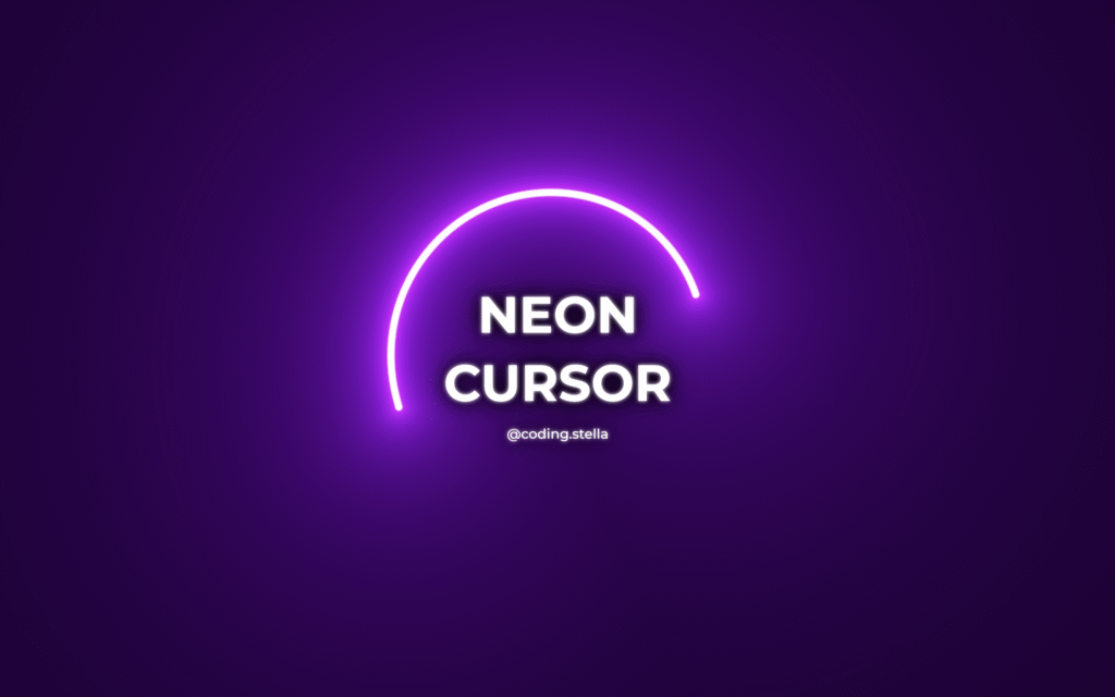
Let’s create a Glowing Neon Cursor using HTML, CSS, and JavaScript! 💡🖱️ This cool effect adds a custom glowing cursor that follows your mouse, giving your website a futuristic and eye-catching vibe.
We’ll use:
- HTML to set up a basic structure.
- CSS to design the neon glow and smooth animations.
- JavaScript to track mouse movement and update the cursor position.
This project is perfect if you want to level up your web design with interactive UI effects. Whether you’re a beginner or just experimenting, it’s simple and fun!
HTML :
This HTML code creates a basic web page with a glowing neon cursor effect. It loads a custom Google Font, links to a CSS file for styling, and a JavaScript file for the cursor animation. The page displays a bold “NEON CURSOR” title and “@coding.stella” text inside a container.
<!DOCTYPE html>
<html lang="en" >
<head>
<meta charset="UTF-8">
<title>Glowing Neon Cursor | @coding.stella</title>
<link rel='stylesheet' href='https://fonts.googleapis.com/css2?family=Montserrat:wght@500;700&display=swap'><link rel="stylesheet" href="./style.css">
</head>
<body>
<div id="app">
<div id="hero">
<h1>NEON<br/>CURSOR</h1>
<p>@coding.stella</p>
</div>
</div>
<script type="module" src="./script.js"></script>
</body>
</html>
CSS :
This CSS styles a full-screen web page with centered, glowing white text. It sets up a responsive layout using #app with a dark neon glow using text-shadow. The heading (h1) is large, uppercase, and vertically centered using custom properties. The canvas (used for glowing cursor effects) is positioned behind everything using z-index: -1, and the entire page has no margin and fills the screen.
body, html, #app {
  margin: 0;
  width: 100%;
  height: 100%;
}

#app {
  overflow: hidden;
  touch-action: pan-up;
  color: #ffffff;
  font-family: 'Montserrat', sans-serif;
  text-align: center;
  text-shadow: 0 0 5px #ffffff, 0 0 20px #000, 0 0 30px #000;
}

#app h1 {
  --fontSize: 60px;
  --lineHeight: 80px;
  width: auto;
  height: calc(2 * var(--lineHeight));
  line-height: var(--lineHeight);
  margin: calc(50vh - var(--lineHeight)) auto 0;
  font-size: var(--fontSize);
  text-transform: uppercase;
}

#app p {
  margin-top: 10px;
  display: inline-block;
  text-decoration: none;
  color: #fff;
}

#app canvas {
  display: block;
  position: fixed;
  z-index: -1;
  top: 0;
}
JavaScript:
This JavaScript code imports the neonCursor effect from the threejs-toys library and applies it to the #app element. It creates a glowing, animated cursor trail using customizable settings like the number of points, curve smoothness, radius size, and motion sensitivity to give a cool neon effect when the user moves their mouse.
import { neonCursor } from 'https://unpkg.com/threejs-toys@0.0.8/build/threejs-toys.module.cdn.min.js'

neonCursor({
  el: document.getElementById('app'),
  shaderPoints: 16,
  curvePoints: 80,
  curveLerp: 0.5,
  radius1: 5,
  radius2: 30,
  velocityTreshold: 10,
  sleepRadiusX: 100,
  sleepRadiusY: 100,
  sleepTimeCoefX: 0.0025,
  sleepTimeCoefY: 0.0025
})
In short, building a Glowing Neon Cursor is a fun way to add style and interactivity to your website. Try it out and impress visitors with a glowing, modern touch! ⚡💻
If your project has problems, don’t worry. Just click to download the source code and face your coding challenges with excitement. Have fun coding!
