Close Menu

    Subscribe to Updates

    Get the latest creative news from FooBar about art, design and business.

    What's Hot

    How to create Social media popup hover menu using HTML and CSS

    25 June 2025

    How to create Valentine’s Love Button Animation using HTML CSS and JS

    23 June 2025

    How to create Magic Indicator Menu using HTML CSS and JS

    20 June 2025
    Facebook X (Twitter) Instagram YouTube Telegram Threads
    Coding StellaCoding Stella
    • Home
    • Blog
    • HTML & CSS
      • Login Form
    • JavaScript
    • Hire us!
    Coding StellaCoding Stella
    Home - JavaScript - How to make Sphere Packing Animation using HTML CSS & JavaScript
    JavaScript

    How to make Sphere Packing Animation using HTML CSS & JavaScript

    Coding StellaBy Coding Stella7 December 2024Updated:7 December 2024No Comments3 Mins Read
    Share Facebook Twitter Pinterest LinkedIn Tumblr Reddit Email WhatsApp Copy Link

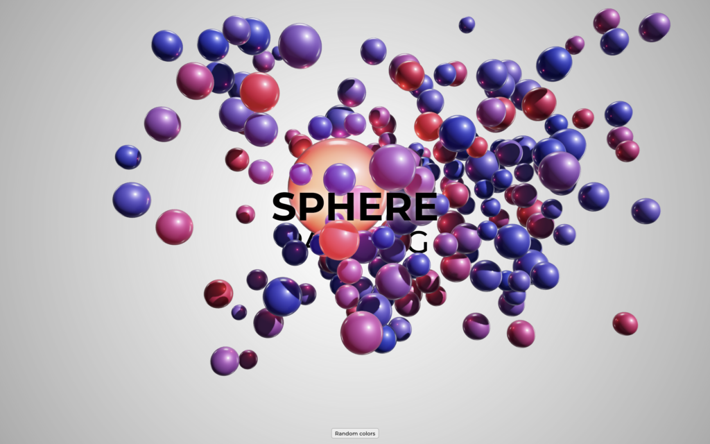
    Let’s create a Sphere Packing Animation using HTML, CSS, and JavaScript. This project will feature dynamically packed spheres that animate beautifully across the screen, providing a mesmerizing visual effect.

    We’ll use HTML to structure the canvas, CSS for styling, and JavaScript to handle the sphere-packing logic and animations.

    Let’s dive into building the Sphere Packing Animation. Whether you’re a beginner or an experienced developer, this project is a fun way to enhance your skills while creating an engaging and visually stunning effect. Let’s bring these spheres to life!

    HTML :

    This HTML sets up a sphere animation page with a centered title, a button to randomize sphere colors, and a WebGL canvas for the animation.

    <!DOCTYPE html>
    <html lang="en" >
    <head>
      <meta charset="UTF-8">
      <title>Sphere Packing Animation | @coding.stella</title>
      <link rel='stylesheet' href='https://fonts.googleapis.com/css2?family=Montserrat:wght@500;700&amp;display=swap'>
      <link rel="stylesheet" href="./style.css">
    
    </head>
    <body>
    
      <div id="app">
        <div class="hero">
          <h1>Sphere</h1>
          <h2>Packing</h2>
        </div>
        <div class="buttons">
          <button type="button" id="colors-btn">
            Random colors
          </button>
        </div>
        <canvas id="webgl-canvas"></canvas>
      </div>
    
      <script type="module" src="./script.js"></script>
    
    </body>
    </html>

    CSS :

    This CSS creates a fullscreen layout with a radial gradient background, a centered “hero” section for bold titles, and fixed buttons at the bottom. It ensures a clean and responsive design.

    body, html, #app {
      margin: 0;
      width: 100%;
      height: 100%;
      background: radial-gradient(circle, rgba(255,255,255,1) 0%, rgba(0,0,0,0.5) 200%);
    }
    
    #app {
      position: relative;
      height: 100%;
      font-family: "Montserrat", serif;
    }
    
    .hero {
      height: 100%;
      display: flex;
      flex-direction: column;
      align-items: center;
      justify-content: center;
    }
    
    h1, h2 {
      margin: 0;
      padding: 0;
      color: black;
      text-transform: uppercase;
      text-shadow: 0 0 20px rgba(255, 255, 255, 1);
      line-height: 100%;
      user-select: none;
    }
    
    h1 {
      position: relative;
      z-index: 2;
      font-size: 100px;
      font-weight: 700;
    }
    
    h2 {
      font-size: 80px;
      font-weight: 500;
    }
    
    #webgl-canvas {
      position: fixed;
      top: 0;
      right: 0;
      bottom: 0;
      left: 0;
      overflow: hidden;
      z-index: 1;
    }
    
    .buttons {
      position: fixed;
      width: 100%;
      bottom: 15px;
      z-index: 2;
    
      display: flex;
      justify-content: center;
      align-items: center;
      gap: 15px;
    }
    
    button {
      font-family: "Montserrat", serif;
      background: rgba(255, 255, 255, 0.5);
      border-radius: 5px;
      border: 1px solid grey;
      padding: 4px 8px;
    }

    JavaScript:

    This code creates a dynamic 3D background with floating spheres using Three.js. It initializes the background with 200 spheres of random colors and sizes. Clicking anywhere on the webpage toggles the animation pause, while clicking the “colors-btn” button changes the spheres’ colors and light randomly.

    import Spheres2Background from 'https://cdn.jsdelivr.net/npm/threejs-components@0.0.8/build/backgrounds/spheres2.cdn.min.js'
    
    const bg = Spheres2Background(document.getElementById('webgl-canvas'), {
      count: 200,
      colors: [0xff0000, 0x0, 0xffffff],
      minSize: 0.5,
      maxSize: 1
    })
    
    const button1 = document.getElementById('colors-btn')
    
    document.body.addEventListener('click', (ev) => {
      if (ev.target !== button1) bg.togglePause()
    })
    
    button1.addEventListener('click', () => {
      bg.spheres.setColors([0xffffff * Math.random(), 0xffffff * Math.random(), 0xffffff * Math.random()])
      bg.spheres.light1.color.set(0xffffff * Math.random())
    })

    In conclusion, creating a Sphere Packing Animation using HTML, CSS, and JavaScript has been a visually exciting and educational project. By combining these technologies, we’ve crafted a dynamic and captivating animation that showcases the beauty of geometric packing and smooth motion.

    If your project has problems, don’t worry. Just click to download the source code and face your coding challenges with excitement. Have fun coding!
    3d animations Animation
    Share. Copy Link Twitter Facebook LinkedIn Email WhatsApp
    Previous ArticleHow to make Animated Download Button using HTML CSS & JavaScript
    Next Article How to create Merry Christmas Tree Animation using HTML CSS & JavaScript
    Coding Stella
    • Website

    Related Posts

    HTML & CSS

    How to create Social media popup hover menu using HTML and CSS

    25 June 2025
    JavaScript

    How to create Valentine’s Love Button Animation using HTML CSS and JS

    23 June 2025
    JavaScript

    How to create Magic Indicator Menu using HTML CSS and JS

    20 June 2025
    Add A Comment
    Leave A Reply Cancel Reply

    Trending Post

    Master Frontend in 100 Days Ebook

    2 March 202419K Views

    How to make Modern Login Form using HTML & CSS | Glassmorphism

    11 January 202417K Views

    How to make I love you Animation in HTML CSS & JavaScript

    14 February 202416K Views

    How to make Valentine’s Day Card using HTML & CSS

    13 February 202412K Views
    Follow Us
    • Instagram
    • Facebook
    • YouTube
    • Twitter
    ads
    Featured Post

    How to make Star Rating using HTML & CSS

    21 January 2024

    How to make a Sticky Navigation Bar using HTML, CSS, And JavaScript

    12 January 2024

    How to make Magic Social Share Menu using HTML CSS and JS

    14 April 2025

    How to make Custom File Upload Button in HTML CSS & JavaScript

    25 February 2024
    Latest Post

    How to create Social media popup hover menu using HTML and CSS

    25 June 2025

    How to create Valentine’s Love Button Animation using HTML CSS and JS

    23 June 2025

    How to create Magic Indicator Menu using HTML CSS and JS

    20 June 2025

    How to create Awesome Cool Loading Animation using HTML CSS and JS

    16 June 2025
    Facebook X (Twitter) Instagram YouTube
    • About Us
    • Privacy Policy
    • Return and Refund Policy
    • Terms and Conditions
    • Contact Us
    • Buy me a coffee
    © 2025 Coding Stella. Made with 💙 by @coding.stella

    Type above and press Enter to search. Press Esc to cancel.

    Ad Blocker Enabled!
    Ad Blocker Enabled!
    Looks like you're using an ad blocker. We rely on advertising to help fund our site.
    Okay! I understood