


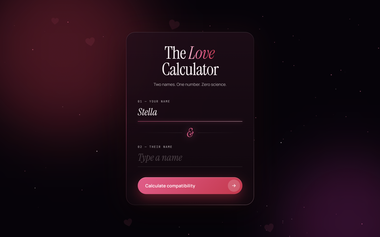
Let’s create a Love Calculator Animation using HTML, CSS, and JavaScript – a dark, romantic card where you type two names, the glass heart beats, fills up with pink liquid, bursts into flying hearts and shows your love score with a fun verdict.
- HTML: Create the two screens of the love calculator: a form with two name inputs and a glowing ampersand, and a result screen with an SVG heart, a percentage, a verdict and three stat bars.
- CSS: Style the frosted glass card with a moving gradient border, elegant serif text, floating labels, the wavy liquid and bubbles inside the heart, heartbeat and ripple effects, and a layout that works on phones.
- JavaScript: Control the score logic that turns two names into a number, the liquid fill and counting animation, the floating background particles and the heart burst on a canvas.
This project teaches how to build an animated love calculator using HTML, CSS, and JavaScript by combining an SVG clipPath liquid fill, CSS keyframe animations, a simple string hash and canvas particle effects.
HTML :
HTML: Creates the structure of the love calculator, including the name form, the SVG heart with its clip path, liquid waves and bubbles, the score, the verdict, the Chemistry, Trust and Passion bars, and the two canvas layers.
const $ = (id) => document.getElementById(id);

const formScreen = $("formScreen");
const resultScreen = $("resultScreen");
const form = $("loveForm");
const name1 = $("name1");
const name2 = $("name2");
const couple = $("couple");
const heartWrap = $("heartWrap");
const liquid = $("liquid");
const percentEl = $("percent");
const verdictEl = $("verdict");
const messageEl = $("message");
const againBtn = $("againBtn");

const HEART = new Path2D(
  "M50 88 C20 65 2 48 2 27 C2 12 14 2 28 2 C38 2 46 8 50 16 C54 8 62 2 72 2 C86 2 98 12 98 27 C98 48 80 65 50 88 Z"
);

function setupCanvas(canvas) {
  const ctx = canvas.getContext("2d");
  const resize = () => {
    const dpr = Math.min(window.devicePixelRatio || 1, 2);
    canvas.width = innerWidth * dpr;
    canvas.height = innerHeight * dpr;
    ctx.setTransform(dpr, 0, 0, dpr, 0, 0);
  };
  resize();
  addEventListener("resize", resize);
  return ctx;
}

function drawHeart(ctx, x, y, size, rotation) {
  ctx.save();
  ctx.translate(x, y);
  ctx.rotate(rotation);
  ctx.scale(size / 100, size / 100);
  ctx.translate(-50, -45);
  ctx.fill(HEART);
  ctx.restore();
}

const rand = (min, max) => Math.random() * (max - min) + min;

// Background: glowing dust + faint drifting hearts
const bg = setupCanvas($("bg"));

const dust = Array.from({ length: 90 }, () => ({
  x: rand(0, innerWidth),
  y: rand(0, innerHeight),
  r: rand(0.3, 1.8),
  vy: rand(0.05, 0.35),
  vx: rand(-0.08, 0.08),
  tw: rand(0, Math.PI * 2),
  ts: rand(0.005, 0.025),
  color: Math.random() < 0.7 ? "255,110,160" : "255,235,240",
}));

const ghosts = Array.from({ length: 9 }, () => ({
  x: rand(0, innerWidth),
  y: rand(0, innerHeight),
  size: rand(18, 46),
  vy: rand(0.15, 0.4),
  rot: rand(-0.4, 0.4),
  sway: rand(0, Math.PI * 2),
  alpha: rand(0.05, 0.12),
}));

function drawBackground() {
  bg.clearRect(0, 0, innerWidth, innerHeight);

  for (const s of dust) {
    s.x += s.vx;
    s.y -= s.vy;
    s.tw += s.ts;
    if (s.y < -5) {
      s.y = innerHeight + 5;
      s.x = rand(0, innerWidth);
    }
    const alpha = 0.15 + 0.6 * (Math.sin(s.tw) * 0.5 + 0.5);
    bg.fillStyle = `rgba(${s.color},${alpha})`;
    bg.beginPath();
    bg.arc(s.x, s.y, s.r, 0, Math.PI * 2);
    bg.fill();
  }

  for (const g of ghosts) {
    g.y -= g.vy;
    g.sway += 0.01;
    if (g.y < -60) {
      g.y = innerHeight + 60;
      g.x = rand(0, innerWidth);
    }
    bg.fillStyle = `rgba(255,79,139,${g.alpha})`;
    drawHeart(bg, g.x + Math.sin(g.sway) * 20, g.y, g.size, g.rot);
  }

  requestAnimationFrame(drawBackground);
}
drawBackground();

// Heart burst particles
const fx = setupCanvas($("fx"));
const COLORS = ["#ff4f8b", "#e11d48", "#ffc2d4", "#ff8fb3", "#ffffff"];
let particles = [];
let fxRunning = false;

function burst(x, y, count) {
  for (let i = 0; i < count; i++) {
    const angle = rand(0, Math.PI * 2);
    const speed = rand(3, 12);
    particles.push({
      x,
      y,
      vx: Math.cos(angle) * speed,
      vy: Math.sin(angle) * speed - 4,
      size: rand(8, 22),
      rot: rand(-0.6, 0.6),
      vr: rand(-0.08, 0.08),
      life: 1,
      decay: rand(0.008, 0.016),
      color: COLORS[Math.floor(Math.random() * COLORS.length)],
    });
  }
  if (!fxRunning) {
    fxRunning = true;
    requestAnimationFrame(tickFx);
  }
}

function tickFx() {
  fx.clearRect(0, 0, innerWidth, innerHeight);

  for (const p of particles) {
    p.vx *= 0.97;
    p.vy = p.vy * 0.97 + 0.2; // drag + gravity
    p.x += p.vx;
    p.y += p.vy;
    p.rot += p.vr;
    p.life -= p.decay;

    fx.globalAlpha = Math.max(p.life, 0);
    fx.fillStyle = p.color;
    drawHeart(fx, p.x, p.y, p.size, p.rot);
  }
  fx.globalAlpha = 1;

  particles = particles.filter((p) => p.life > 0);
  if (particles.length) requestAnimationFrame(tickFx);
  else fxRunning = false;
}

// Same two names always give the same score, in any order
function analyze(a, b) {
  const key = [a, b]
    .map((n) => n.trim().toLowerCase().replace(/\s+/g, ""))
    .sort()
    .join("+");

  let hash = 0;
  for (const char of key) {
    hash = (Math.imul(hash, 31) + char.codePointAt(0)) >>> 0;
  }

  const score = 50 + (hash % 51); // always 50 to 100

  // Stats stay close to the main score
  const stat = (shift) =>
    Math.min(100, Math.max(35, score + ((hash >>> shift) % 25) - 12));

  return {
    score,
    chemistry: stat(3),
    trust: stat(9),
    passion: stat(15),
  };
}

function getVerdict(score) {
  if (score >= 90) return ["Soulmates.", "Written in the stars. Start planning the wedding."];
  if (score >= 75) return ["A perfect match.", "You two just click. Don't overthink it."];
  if (score >= 60) return ["There's a spark.", "Something real is here. Keep it glowing."];
  return ["It's complicated.", "But love has always enjoyed a challenge."];
}

const capitalize = (s) =>
  s.trim().replace(/\s+/g, " ").replace(/\b\w/g, (c) => c.toUpperCase());

// Liquid level inside the heart: 94 = empty, -4 = full
const EMPTY_Y = 94;
const FULL_Y = -4;

function setFill(percent) {
  const y = EMPTY_Y - (percent / 100) * (EMPTY_Y - FULL_Y);
  liquid.setAttribute("transform", `translate(0 ${y})`);
  percentEl.textContent = Math.round(percent);
}

function animateFill(target, duration, onDone) {
  const start = performance.now();
  const ease = (t) => 1 - Math.pow(1 - t, 4);

  function frame(now) {
    const t = Math.min((now - start) / duration, 1);
    setFill(target * ease(t));
    if (t < 1) requestAnimationFrame(frame);
    else onDone();
  }
  requestAnimationFrame(frame);
}

function setStat(id, value) {
  $(id + "Bar").style.width = value + "%";
  $(id + "Val").textContent = value;
}

function showScreen(screen) {
  [formScreen, resultScreen].forEach((s) => s.classList.remove("active"));
  screen.classList.add("active");
}

function shake(input) {
  const field = input.closest(".field");
  field.classList.remove("shake");
  void field.offsetWidth; // restart the shake animation
  field.classList.add("shake");
  input.focus();
}

function setLoading(text) {
  verdictEl.className = "verdict loading";
  verdictEl.textContent = text;
}

form.addEventListener("submit", (e) => {
  e.preventDefault();

  const a = name1.value.trim();
  const b = name2.value.trim();
  if (!a) return shake(name1);
  if (!b) return shake(name2);

  const amp = document.createElement("em");
  amp.textContent = "&";
  couple.replaceChildren(capitalize(a), amp, capitalize(b));

  const result = analyze(a, b);
  resultScreen.classList.remove("done");
  ["chemistry", "trust", "passion"].forEach((id) => setStat(id, 0));
  setFill(0);
  setLoading("Reading the stars");
  heartWrap.className = "heart-wrap calculating";

  showScreen(resultScreen);

  // Short suspense, then fill the heart
  setTimeout(() => {
    heartWrap.className = "heart-wrap";
    setLoading("Measuring chemistry");

    animateFill(result.score, 2600, () => {
      const [verdict, message] = getVerdict(result.score);

      heartWrap.className = "heart-wrap beat";
      verdictEl.className = "verdict";
      verdictEl.textContent = verdict;
      messageEl.textContent = message;
      resultScreen.classList.add("done");

      setTimeout(() => {
        setStat("chemistry", result.chemistry);
        setStat("trust", result.trust);
        setStat("passion", result.passion);
      }, 250);

      const rect = heartWrap.getBoundingClientRect();
      burst(
        rect.left + rect.width / 2,
        rect.top + rect.height * 0.45,
        result.score >= 80 ? 70 : 30
      );
    });
  }, 1800);
});

againBtn.addEventListener("click", () => {
  name1.value = "";
  name2.value = "";
  showScreen(formScreen);
  name1.focus();
});
CSS :
CSS: Styles the dark plum theme, the glass card and its animated border, the inputs and buttons, the wave and bubble motion inside the heart, the heartbeat, ripples, stat bars and the smooth reveal of the result.
* {
  margin: 0;
  padding: 0;
  box-sizing: border-box;
}

:root {
  --bg: #07030a;
  --pink: #ff4f8b;
  --crimson: #e11d48;
  --blush: #ffc2d4;
  --text: #f7eef0;
  --muted: rgba(247, 238, 240, 0.64);
  --faint: rgba(247, 238, 240, 0.15);
  --serif: "Instrument Serif", Georgia, serif;
  --sans: "Manrope", system-ui, sans-serif;
  --mono: "JetBrains Mono", ui-monospace, monospace;
}

@property --angle {
  syntax: "<angle>";
  inherits: false;
  initial-value: 0deg;
}

body {
  min-height: 100vh;
  display: grid;
  place-items: center;
  padding: 32px 16px;
  font-family: var(--sans);
  color: var(--text);
  background: var(--bg);
  overflow-x: hidden;
}

#bg,
#fx {
  position: fixed;
  inset: 0;
  width: 100%;
  height: 100%;
  pointer-events: none;
}

#fx {
  z-index: 20;
}

.glow {
  position: fixed;
  border-radius: 50%;
  filter: blur(90px);
  pointer-events: none;
}

.glow-1 {
  width: 520px;
  height: 520px;
  top: -160px;
  left: -140px;
  background: rgba(225, 29, 72, 0.35);
  animation: drift 14s ease-in-out infinite alternate;
}

.glow-2 {
  width: 460px;
  height: 460px;
  bottom: -180px;
  right: -120px;
  background: rgba(190, 24, 140, 0.28);
  animation: drift 18s ease-in-out infinite alternate-reverse;
}

@keyframes drift {
  to { transform: translate(120px, 80px) scale(1.15); }
}

.grain {
  position: fixed;
  inset: 0;
  pointer-events: none;
  opacity: 0.07;
  mix-blend-mode: overlay;
  background-image: url("data:image/svg+xml,%3Csvg xmlns='http://www.w3.org/2000/svg' width='160' height='160'%3E%3Cfilter id='n'%3E%3CfeTurbulence type='fractalNoise' baseFrequency='.9' numOctaves='3' stitchTiles='stitch'/%3E%3C/filter%3E%3Crect width='100%25' height='100%25' filter='url(%23n)'/%3E%3C/svg%3E");
}

.card {
  position: relative;
  z-index: 1;
  width: min(440px, 100%);
  padding: 44px 40px 38px;
  border-radius: 30px;
  background: linear-gradient(180deg, rgba(40, 13, 27, 0.75), rgba(20, 7, 14, 0.82));
  backdrop-filter: blur(24px);
  -webkit-backdrop-filter: blur(24px);
  box-shadow:
    0 40px 100px rgba(0, 0, 0, 0.6),
    0 0 80px rgba(225, 29, 72, 0.12),
    inset 0 1px 0 rgba(255, 255, 255, 0.1);
  text-align: center;
}

/* Animated gradient border */
.card::before {
  content: "";
  position: absolute;
  inset: 0;
  padding: 1px;
  border-radius: inherit;
  background: conic-gradient(
    from var(--angle),
    rgba(255, 255, 255, 0.1) 0deg,
    rgba(255, 79, 139, 0.9) 60deg,
    rgba(255, 255, 255, 0.1) 120deg,
    rgba(255, 255, 255, 0.1) 240deg,
    rgba(255, 194, 212, 0.5) 300deg,
    rgba(255, 255, 255, 0.1) 360deg
  );
  -webkit-mask: linear-gradient(#000 0 0) content-box, linear-gradient(#000 0 0);
  -webkit-mask-composite: xor;
  mask: linear-gradient(#000 0 0) content-box exclude, linear-gradient(#000 0 0);
  animation: spin 7s linear infinite;
  pointer-events: none;
}

@keyframes spin {
  to { --angle: 360deg; }
}

.screen {
  display: none;
}

.screen.active {
  display: block;
  animation: enter 0.7s cubic-bezier(0.2, 0.8, 0.2, 1) both;
}

@keyframes enter {
  from { opacity: 0; transform: translateY(16px); filter: blur(6px); }
  to   { opacity: 1; transform: none; filter: blur(0); }
}

.title {
  font-family: var(--serif);
  font-weight: 400;
  font-size: 3.7rem;
  line-height: 0.95;
  letter-spacing: -0.02em;
}

.title em {
  background: linear-gradient(100deg, var(--blush), var(--pink) 50%, var(--crimson));
  -webkit-background-clip: text;
  background-clip: text;
  color: transparent;
  padding-right: 4px;
}

.subtitle {
  margin: 14px 0 36px;
  font-size: 0.88rem;
  color: var(--muted);
}

.field {
  display: block;
  text-align: left;
}

.field-label {
  font-family: var(--mono);
  font-size: 0.64rem;
  letter-spacing: 0.18em;
  text-transform: uppercase;
  color: var(--muted);
}

.input-wrap {
  position: relative;
  display: block;
}

.field input {
  width: 100%;
  padding: 6px 0 10px;
  font-family: var(--serif);
  font-style: italic;
  font-size: 2.1rem;
  color: var(--text);
  background: none;
  border: none;
  border-bottom: 1px solid var(--faint);
  outline: none;
}

.field input::placeholder {
  color: rgba(247, 238, 240, 0.24);
}

/* Pink underline grows on focus */
.line {
  position: absolute;
  left: 0;
  bottom: 0;
  width: 100%;
  height: 1px;
  background: linear-gradient(90deg, var(--pink), var(--blush));
  box-shadow: 0 0 12px var(--pink);
  transform: scaleX(0);
  transform-origin: left;
  transition: transform 0.5s cubic-bezier(0.2, 0.8, 0.2, 1);
}

.field input:focus + .line {
  transform: scaleX(1);
}

.field.shake {
  animation: shake 0.45s ease;
}

.field.shake input {
  border-bottom-color: var(--crimson);
}

@keyframes shake {
  0%, 100% { transform: translateX(0); }
  20%, 60% { transform: translateX(-8px); }
  40%, 80% { transform: translateX(8px); }
}

.amp {
  display: flex;
  align-items: center;
  gap: 16px;
  margin: 18px 0 14px;
}

.amp::before,
.amp::after {
  content: "";
  flex: 1;
  height: 1px;
  background: linear-gradient(90deg, transparent, var(--faint));
}

.amp::after {
  background: linear-gradient(90deg, var(--faint), transparent);
}

.amp span {
  font-family: var(--serif);
  font-style: italic;
  font-size: 2.6rem;
  line-height: 1;
  color: var(--pink);
  text-shadow: 0 0 24px rgba(255, 79, 139, 0.7);
  animation: beat 1.4s ease-in-out infinite;
}

.btn {
  position: relative;
  display: flex;
  align-items: center;
  justify-content: space-between;
  width: 100%;
  margin-top: 36px;
  padding: 8px 8px 8px 26px;
  font-family: var(--sans);
  font-size: 0.95rem;
  font-weight: 600;
  letter-spacing: 0.01em;
  color: #fff;
  background: linear-gradient(135deg, var(--pink), var(--crimson));
  border: none;
  border-radius: 99px;
  cursor: pointer;
  overflow: hidden;
  box-shadow:
    0 14px 40px rgba(225, 29, 72, 0.45),
    inset 0 1px 0 rgba(255, 255, 255, 0.35);
  transition: transform 0.3s, box-shadow 0.3s;
}

.btn::after {
  content: "";
  position: absolute;
  inset: 0;
  background: linear-gradient(110deg, transparent 35%, rgba(255, 255, 255, 0.3) 50%, transparent 65%);
  transform: translateX(-100%);
  animation: sheen 4s ease-in-out infinite;
}

@keyframes sheen {
  0%, 65% { transform: translateX(-100%); }
  100%    { transform: translateX(100%); }
}

.btn-icon {
  display: grid;
  place-items: center;
  width: 42px;
  height: 42px;
  border-radius: 50%;
  background: rgba(255, 255, 255, 0.18);
  transition: transform 0.35s cubic-bezier(0.2, 0.8, 0.2, 1), background 0.3s;
}

.btn-icon svg {
  width: 18px;
  height: 18px;
  fill: none;
  stroke: #fff;
  stroke-width: 2;
  stroke-linecap: round;
  stroke-linejoin: round;
}

.btn:hover {
  transform: translateY(-2px);
  box-shadow:
    0 20px 50px rgba(225, 29, 72, 0.6),
    inset 0 1px 0 rgba(255, 255, 255, 0.35);
}

.btn:hover .btn-icon {
  transform: translateX(-4px) rotate(-45deg);
  background: rgba(255, 255, 255, 0.28);
}

.btn:active {
  transform: translateY(0) scale(0.99);
}

.btn-ghost {
  justify-content: center;
  margin-top: 28px;
  padding: 16px;
  background: rgba(255, 255, 255, 0.04);
  border: 1px solid var(--faint);
  box-shadow: none;
}

.btn-ghost::after {
  display: none;
}

.btn-ghost:hover {
  background: rgba(255, 79, 139, 0.1);
  border-color: rgba(255, 79, 139, 0.5);
  box-shadow: none;
}

.couple {
  font-family: var(--serif);
  font-weight: 400;
  font-size: 2.1rem;
  line-height: 1.1;
  word-break: break-word;
}

.couple em {
  margin: 0 8px;
  color: var(--pink);
  text-shadow: 0 0 18px rgba(255, 79, 139, 0.6);
}

.heart-wrap {
  position: relative;
  width: 168px;
  margin: 26px auto 8px;
}

.heart-wrap svg {
  position: relative;
  display: block;
  width: 100%;
  overflow: visible;
  filter:
    drop-shadow(0 0 28px rgba(225, 29, 72, 0.55))
    drop-shadow(0 18px 24px rgba(0, 0, 0, 0.5));
}

.heart-outline {
  fill: none;
  stroke: url(#strokeGrad);
  stroke-width: 0.8;
}

/* Liquid waves slide sideways inside the heart */
.wave-front {
  fill: url(#liquidGrad);
  animation: wave 2.4s linear infinite;
}

.wave-back {
  fill: #ff8fb3;
  opacity: 0.4;
  animation: wave 3.6s linear infinite reverse;
}

@keyframes wave {
  from { transform: translateX(0); }
  to   { transform: translateX(100px); }
}

.bubbles circle {
  fill: rgba(255, 255, 255, 0.6);
  opacity: 0;
  animation: bubble var(--t) ease-in var(--d) infinite;
}

@keyframes bubble {
  0%   { transform: translateY(0); opacity: 0; }
  20%  { opacity: 0.8; }
  100% { transform: translateY(-60px); opacity: 0; }
}

.ring {
  position: absolute;
  top: 46%;
  left: 50%;
  width: 150%;
  aspect-ratio: 1;
  border-radius: 50%;
  border: 1px solid rgba(255, 79, 139, 0.45);
  transform: translate(-50%, -50%) scale(0.5);
  opacity: 0;
  pointer-events: none;
}

/* Fast beat while calculating, slow beat + ripples on the result */
.heart-wrap.calculating svg {
  animation: beat 0.55s ease-in-out infinite;
}

.heart-wrap.beat svg {
  animation: beat 1.3s ease-in-out infinite;
}

.heart-wrap.beat .ring {
  animation: ripple 2.6s ease-out infinite;
}

.heart-wrap.beat .ring:nth-child(2) {
  animation-delay: 1.3s;
}

@keyframes beat {
  0%, 100% { transform: scale(1); }
  14%      { transform: scale(1.09); }
  28%      { transform: scale(1); }
  42%      { transform: scale(1.05); }
}

@keyframes ripple {
  0%   { transform: translate(-50%, -50%) scale(0.5); opacity: 0.8; }
  100% { transform: translate(-50%, -50%) scale(1.15); opacity: 0; }
}

.score {
  font-family: var(--serif);
  font-size: 5.2rem;
  line-height: 1;
  letter-spacing: -0.03em;
  font-variant-numeric: tabular-nums;
}

.score sup {
  margin-left: 4px;
  font-size: 1.8rem;
  vertical-align: top;
  position: relative;
  top: 0.7rem;
  color: var(--pink);
}

.verdict {
  min-height: 2.2rem;
  margin-top: 4px;
  font-family: var(--serif);
  font-style: italic;
  font-size: 1.85rem;
  color: var(--blush);
}

.verdict.loading {
  font-family: var(--mono);
  font-style: normal;
  font-size: 0.72rem;
  letter-spacing: 0.2em;
  text-transform: uppercase;
  color: var(--muted);
  line-height: 2.2rem;
}

.verdict.loading::after {
  content: "";
  animation: dots 1.2s steps(4) infinite;
}

@keyframes dots {
  0%  { content: ""; }
  25% { content: "."; }
  50% { content: ".."; }
  75% { content: "..."; }
}

.message {
  margin-top: 6px;
  font-size: 0.9rem;
  color: var(--muted);
}

.stats {
  display: grid;
  gap: 12px;
  margin-top: 26px;
  padding-top: 22px;
  border-top: 1px solid var(--faint);
}

.stat {
  display: grid;
  grid-template-columns: 84px 1fr 32px;
  align-items: center;
  gap: 14px;
  font-family: var(--mono);
  font-size: 0.64rem;
  letter-spacing: 0.16em;
  text-transform: uppercase;
}

.stat-label {
  text-align: left;
  color: var(--muted);
}

.stat-value {
  text-align: right;
  color: var(--text);
}

.track {
  height: 4px;
  border-radius: 99px;
  background: rgba(255, 255, 255, 0.1);
  overflow: hidden;
}

.fill {
  display: block;
  height: 100%;
  width: 0;
  border-radius: inherit;
  background: linear-gradient(90deg, var(--crimson), var(--pink), var(--blush));
  box-shadow: 0 0 12px var(--pink);
  transition: width 1.4s cubic-bezier(0.2, 0.8, 0.2, 1);
}

/* Result items fade in one by one (delay set with --d) */
.reveal {
  opacity: 0;
  transform: translateY(10px);
  transition: opacity 0.7s ease, transform 0.7s ease;
}

.done .reveal {
  opacity: 1;
  transform: none;
  transition-delay: var(--d, 0s);
}

.reveal.btn-ghost {
  visibility: hidden;
}

.done .reveal.btn-ghost {
  visibility: visible;
}

@media (max-width: 440px) {
  .card {
    padding: 36px 24px 30px;
    border-radius: 26px;
  }

  .title {
    font-size: 3.1rem;
  }

  .field input {
    font-size: 1.8rem;
  }

  .score {
    font-size: 4.5rem;
  }
}
JavaScript:
JavaScript: Handles the background dust and floating hearts, turns the two names into a score between 50 and 100, fills the heart while counting up the percentage, shows the verdict and stats, and fires the heart burst.
const $ = (id) => document.getElementById(id);

const formScreen = $("formScreen");
const resultScreen = $("resultScreen");
const form = $("loveForm");
const name1 = $("name1");
const name2 = $("name2");
const couple = $("couple");
const heartWrap = $("heartWrap");
const liquid = $("liquid");
const percentEl = $("percent");
const verdictEl = $("verdict");
const messageEl = $("message");
const againBtn = $("againBtn");

const HEART = new Path2D(
  "M50 88 C20 65 2 48 2 27 C2 12 14 2 28 2 C38 2 46 8 50 16 C54 8 62 2 72 2 C86 2 98 12 98 27 C98 48 80 65 50 88 Z"
);

function setupCanvas(canvas) {
  const ctx = canvas.getContext("2d");
  const resize = () => {
    const dpr = Math.min(window.devicePixelRatio || 1, 2);
    canvas.width = innerWidth * dpr;
    canvas.height = innerHeight * dpr;
    ctx.setTransform(dpr, 0, 0, dpr, 0, 0);
  };
  resize();
  addEventListener("resize", resize);
  return ctx;
}

function drawHeart(ctx, x, y, size, rotation) {
  ctx.save();
  ctx.translate(x, y);
  ctx.rotate(rotation);
  ctx.scale(size / 100, size / 100);
  ctx.translate(-50, -45);
  ctx.fill(HEART);
  ctx.restore();
}

const rand = (min, max) => Math.random() * (max - min) + min;

// Background: glowing dust + faint drifting hearts
const bg = setupCanvas($("bg"));

const dust = Array.from({ length: 90 }, () => ({
  x: rand(0, innerWidth),
  y: rand(0, innerHeight),
  r: rand(0.3, 1.8),
  vy: rand(0.05, 0.35),
  vx: rand(-0.08, 0.08),
  tw: rand(0, Math.PI * 2),
  ts: rand(0.005, 0.025),
  color: Math.random() < 0.7 ? "255,110,160" : "255,235,240",
}));

const ghosts = Array.from({ length: 9 }, () => ({
  x: rand(0, innerWidth),
  y: rand(0, innerHeight),
  size: rand(18, 46),
  vy: rand(0.15, 0.4),
  rot: rand(-0.4, 0.4),
  sway: rand(0, Math.PI * 2),
  alpha: rand(0.05, 0.12),
}));

function drawBackground() {
  bg.clearRect(0, 0, innerWidth, innerHeight);

  for (const s of dust) {
    s.x += s.vx;
    s.y -= s.vy;
    s.tw += s.ts;
    if (s.y < -5) {
      s.y = innerHeight + 5;
      s.x = rand(0, innerWidth);
    }
    const alpha = 0.15 + 0.6 * (Math.sin(s.tw) * 0.5 + 0.5);
    bg.fillStyle = `rgba(${s.color},${alpha})`;
    bg.beginPath();
    bg.arc(s.x, s.y, s.r, 0, Math.PI * 2);
    bg.fill();
  }

  for (const g of ghosts) {
    g.y -= g.vy;
    g.sway += 0.01;
    if (g.y < -60) {
      g.y = innerHeight + 60;
      g.x = rand(0, innerWidth);
    }
    bg.fillStyle = `rgba(255,79,139,${g.alpha})`;
    drawHeart(bg, g.x + Math.sin(g.sway) * 20, g.y, g.size, g.rot);
  }

  requestAnimationFrame(drawBackground);
}
drawBackground();

// Heart burst particles
const fx = setupCanvas($("fx"));
const COLORS = ["#ff4f8b", "#e11d48", "#ffc2d4", "#ff8fb3", "#ffffff"];
let particles = [];
let fxRunning = false;

function burst(x, y, count) {
  for (let i = 0; i < count; i++) {
    const angle = rand(0, Math.PI * 2);
    const speed = rand(3, 12);
    particles.push({
      x,
      y,
      vx: Math.cos(angle) * speed,
      vy: Math.sin(angle) * speed - 4,
      size: rand(8, 22),
      rot: rand(-0.6, 0.6),
      vr: rand(-0.08, 0.08),
      life: 1,
      decay: rand(0.008, 0.016),
      color: COLORS[Math.floor(Math.random() * COLORS.length)],
    });
  }
  if (!fxRunning) {
    fxRunning = true;
    requestAnimationFrame(tickFx);
  }
}

function tickFx() {
  fx.clearRect(0, 0, innerWidth, innerHeight);

  for (const p of particles) {
    p.vx *= 0.97;
    p.vy = p.vy * 0.97 + 0.2; // drag + gravity
    p.x += p.vx;
    p.y += p.vy;
    p.rot += p.vr;
    p.life -= p.decay;

    fx.globalAlpha = Math.max(p.life, 0);
    fx.fillStyle = p.color;
    drawHeart(fx, p.x, p.y, p.size, p.rot);
  }
  fx.globalAlpha = 1;

  particles = particles.filter((p) => p.life > 0);
  if (particles.length) requestAnimationFrame(tickFx);
  else fxRunning = false;
}

// Same two names always give the same score, in any order
function analyze(a, b) {
  const key = [a, b]
    .map((n) => n.trim().toLowerCase().replace(/\s+/g, ""))
    .sort()
    .join("+");

  let hash = 0;
  for (const char of key) {
    hash = (Math.imul(hash, 31) + char.codePointAt(0)) >>> 0;
  }

  const score = 50 + (hash % 51); // always 50 to 100

  // Stats stay close to the main score
  const stat = (shift) =>
    Math.min(100, Math.max(35, score + ((hash >>> shift) % 25) - 12));

  return {
    score,
    chemistry: stat(3),
    trust: stat(9),
    passion: stat(15),
  };
}

function getVerdict(score) {
  if (score >= 90) return ["Soulmates.", "Written in the stars. Start planning the wedding."];
  if (score >= 75) return ["A perfect match.", "You two just click. Don't overthink it."];
  if (score >= 60) return ["There's a spark.", "Something real is here. Keep it glowing."];
  return ["It's complicated.", "But love has always enjoyed a challenge."];
}

const capitalize = (s) =>
  s.trim().replace(/\s+/g, " ").replace(/\b\w/g, (c) => c.toUpperCase());

// Liquid level inside the heart: 94 = empty, -4 = full
const EMPTY_Y = 94;
const FULL_Y = -4;

function setFill(percent) {
  const y = EMPTY_Y - (percent / 100) * (EMPTY_Y - FULL_Y);
  liquid.setAttribute("transform", `translate(0 ${y})`);
  percentEl.textContent = Math.round(percent);
}

function animateFill(target, duration, onDone) {
  const start = performance.now();
  const ease = (t) => 1 - Math.pow(1 - t, 4);

  function frame(now) {
    const t = Math.min((now - start) / duration, 1);
    setFill(target * ease(t));
    if (t < 1) requestAnimationFrame(frame);
    else onDone();
  }
  requestAnimationFrame(frame);
}

function setStat(id, value) {
  $(id + "Bar").style.width = value + "%";
  $(id + "Val").textContent = value;
}

function showScreen(screen) {
  [formScreen, resultScreen].forEach((s) => s.classList.remove("active"));
  screen.classList.add("active");
}

function shake(input) {
  const field = input.closest(".field");
  field.classList.remove("shake");
  void field.offsetWidth; // restart the shake animation
  field.classList.add("shake");
  input.focus();
}

function setLoading(text) {
  verdictEl.className = "verdict loading";
  verdictEl.textContent = text;
}

form.addEventListener("submit", (e) => {
  e.preventDefault();

  const a = name1.value.trim();
  const b = name2.value.trim();
  if (!a) return shake(name1);
  if (!b) return shake(name2);

  const amp = document.createElement("em");
  amp.textContent = "&";
  couple.replaceChildren(capitalize(a), amp, capitalize(b));

  const result = analyze(a, b);
  resultScreen.classList.remove("done");
  ["chemistry", "trust", "passion"].forEach((id) => setStat(id, 0));
  setFill(0);
  setLoading("Reading the stars");
  heartWrap.className = "heart-wrap calculating";

  showScreen(resultScreen);

  // Short suspense, then fill the heart
  setTimeout(() => {
    heartWrap.className = "heart-wrap";
    setLoading("Measuring chemistry");

    animateFill(result.score, 2600, () => {
      const [verdict, message] = getVerdict(result.score);

      heartWrap.className = "heart-wrap beat";
      verdictEl.className = "verdict";
      verdictEl.textContent = verdict;
      messageEl.textContent = message;
      resultScreen.classList.add("done");

      setTimeout(() => {
        setStat("chemistry", result.chemistry);
        setStat("trust", result.trust);
        setStat("passion", result.passion);
      }, 250);

      const rect = heartWrap.getBoundingClientRect();
      burst(
        rect.left + rect.width / 2,
        rect.top + rect.height * 0.45,
        result.score >= 80 ? 70 : 30
      );
    });
  }, 1800);
});

againBtn.addEventListener("click", () => {
  name1.value = "";
  name2.value = "";
  showScreen(formScreen);
  name1.focus();
});
This project demonstrates how HTML, CSS, and JavaScript can work together to turn a simple name form into a playful love calculator, where SVG, CSS animations and canvas particles make every result feel like a small celebration. It is a fun Valentine’s project to share with friends and a great way to practice animation skills.
If your project has problems, don’t worry. Just click to download the source code and face your coding challenges with excitement. Have fun coding!
