


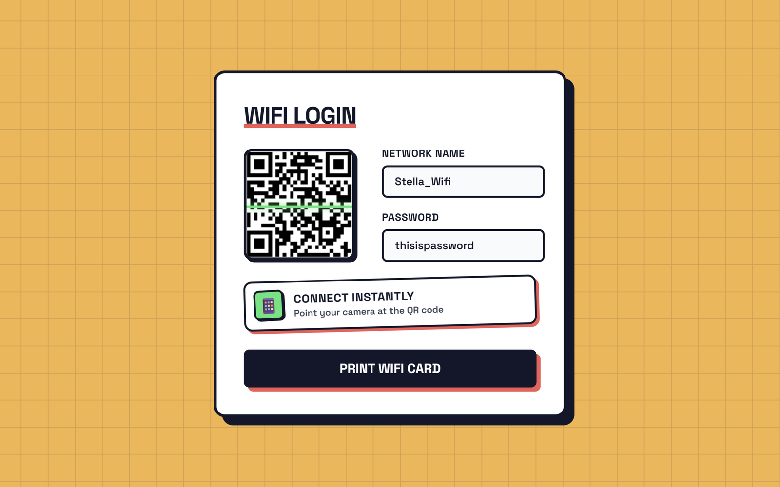
Let’s create a beautiful “WiFi QR Card Generator” using HTML, CSS, and JavaScript. It will feature a stylish WiFi login card with an animated QR scanner, modern colors, smooth animations, and a print option.
We’ll use:
- HTML to create the WiFi card structure, including the Network Name, Password fields, QR code, connection message, and print button.
- CSS to design the card with a modern orange background, bold borders, shadows, responsive layout, and animations like the moving QR scanner and floating icon.
- JavaScript to generate the WiFi QR code automatically using the entered network name and password, update the QR code whenever the user types, add a small bounce animation, and open the print option when the button is clicked.
The QR code automatically changes whenever the user enters or updates the WiFi name or password. The animated scanner gives the QR code a more interactive look, while the print feature allows the user to easily print the WiFi card.
This project is a simple and practical way to learn how HTML, CSS, and JavaScript work together to create a useful, responsive, animated, and interactive WiFi QR code generator.
HTML :
HTML is used to create the structure of the WiFi card. It creates the heading “WiFi Login”, the QR code area, input boxes for the Network Name (SSID) and Password, the “Connect Instantly” message, and the Print WiFi Card button. It also connects the CSS file using <link> and the JavaScript file using <script>. In simple words, HTML decides what elements are present on the webpage.
<!DOCTYPE html>
<html lang="en" >
<head>
  <meta charset="UTF-8">
  <title>Animated WiFi Card Generator | @coding.stella</title>
  <link rel="stylesheet" href="./style.css">
</head>
<body>
<form>
  <h2>WiFi Login</h2>
  <div class="internal">
    <div class="qr-container">
      <img width="164" height="164" src="https://api.qrserver.com/v1/create-qr-code/?size=164x164&data=WIFI:T:WPA;S:;P:;;">
      <div class="scanner"></div>
    </div>

    <div class="inputs">
      <label>
        Network name
        <input class="ssid" placeholder="e.g. Home_Network" autocomplete="off">
      </label>
      <label>
        Password
        <input class="password" placeholder="••••••••" autocomplete="off">
      </label>
    </div>
  </div>

  <div class="scan-notice">
    <div class="scan-icon">📱</div>
    <div class="scan-text">
      <strong>Connect Instantly</strong>
      <span>Point your camera at the QR code</span>
    </div>
  </div>

  <button type="button">Print WiFi Card</button>
</form>
  <script src="./script.js"></script>
</body>
</html>
CSS :
CSS is used to design and style the WiFi card. It gives the page the orange animated grid background, white card, borders, shadows, colors, fonts, rounded corners, and spacing. It also creates animations such as the QR code scanner moving up and down, the card appearing from the bottom, and the phone icon floating. The @media sections make the design responsive on mobile and change the appearance when printing. In simple words, CSS decides how the webpage looks and how it is animated.
@import url('https://fonts.googleapis.com/css2?family=Space+Grotesk:wght@400;600;700&display=swap');

:root {
  --card-bg: #FFFFFF;
  --text-main: #0F172A;
  --border-color: #0F172A;
  --shadow-color: #0F172A;
}

* {
  box-sizing: border-box;
  margin: 0;
  padding: 0;
}

body {
  height: 100vh;
  display: flex;
  justify-content: center;
  align-items: center;
  background-color: #FFB347;
    background-image: url("data:image/svg+xml,%3Csvg width='40' height='40' xmlns='http://www.w3.org/2000/svg'%3E%3Cpath d='M 40 0 L 0 0 0 40' fill='none' stroke='%230F172A' stroke-width='2' stroke-opacity='0.15'/%3E%3C/svg%3E");
  animation: slideGrid 2.5s linear infinite;
  font-family: 'Space Grotesk', sans-serif;
  overflow: hidden;
}

/* Infinite sliding grid animation */
@keyframes slideGrid {
  0% {
    background-position: 0 0;
  }

  100% {
    background-position: 40px 40px;
  }
}

form {
  background-color: var(--card-bg);
  border: 4px solid var(--border-color);
  padding: 2.5rem;
  border-radius: 16px;
  box-shadow: 12px 12px 0px var(--shadow-color);
  width: 90%;
  max-width: 520px;
  animation: cardEntrance 0.8s cubic-bezier(0.175, 0.885, 0.32, 1.275) forwards;
  opacity: 0;
  transform: translateY(50px);
}

@keyframes cardEntrance {
  to {
    opacity: 1;
    transform: translateY(0);
  }
}

h2 {
  font-size: 2.2rem;
  font-weight: 700;
  margin-bottom: 1.5rem;
  color: var(--text-main);
  text-transform: uppercase;
  letter-spacing: -1px;
  position: relative;
  display: inline-block;
}

h2::after {
  content: '';
  position: absolute;
  width: 100%;
  height: 6px;
  background-color: #FF5757;
  /* Solid red accent */
  bottom: 4px;
  left: 0;
  z-index: -1;
}

.internal {
  display: flex;
  gap: 2.5rem;
  align-items: center;
  margin-bottom: 1.5rem;
}

/* QR Code Container with Scanner Animation */
.qr-container {
  position: relative;
  width: 164px;
  height: 164px;
  border: 4px solid var(--border-color);
  border-radius: 12px;
  overflow: hidden;
  box-shadow: 4px 4px 0px var(--shadow-color);
  flex-shrink: 0;
  background-color: white;
  transition: transform 0.15s ease;
}

.qr-container img {
  width: 100%;
  height: 100%;
  display: block;
}

.scanner {
  position: absolute;
  top: 0;
  left: 0;
  width: 100%;
  height: 4px;
  background-color: #00E676;
  /* Solid bright green */
  box-shadow: 0 0 10px #00E676;
  animation: scan 2s linear infinite;
}

@keyframes scan {

  0%,
  100% {
    top: 0%;
    opacity: 0;
  }

  10%,
  90% {
    opacity: 1;
  }

  50% {
    top: calc(100% - 4px);
  }
}

.inputs {
  width: 100%;
  display: flex;
  flex-direction: column;
  gap: 1.2rem;
}

label {
  display: flex;
  flex-direction: column;
  font-weight: 700;
  font-size: 0.95rem;
  color: var(--text-main);
  text-transform: uppercase;
  letter-spacing: 0.5px;
}

input {
  margin-top: 0.5rem;
  height: 48px;
  padding: 0 16px;
  font-family: 'Space Grotesk', monospace;
  font-size: 1rem;
  font-weight: 600;
  color: var(--text-main);
  background-color: #F8FAFC;
  border: 3px solid var(--border-color);
  border-radius: 8px;
  outline: none;
  transition: all 0.2s ease;
  box-shadow: inset 0 0 0 transparent;
}

input:focus {
  background-color: #FFF;
  border-color: #FF5757;
  box-shadow: 4px 4px 0px #FF5757;
  transform: translate(-2px, -2px);
}

.scan-notice {
  display: flex;
  align-items: center;
  background-color: #FFF;
  border: 3px solid var(--border-color);
  border-radius: 12px;
  padding: 0.75rem;
  margin-bottom: 2rem;
  box-shadow: 4px 4px 0px #FF5757;
  transform: rotate(-1.5deg);
  transition: all 0.2s ease;
  cursor: default;
}

.scan-notice:hover {
  transform: rotate(0deg) translate(-2px, -2px);
  box-shadow: 6px 6px 0px #FF5757;
}

.scan-icon {
  background-color: #00E676;
  /* Solid bright green */
  border: 3px solid var(--border-color);
  border-radius: 8px;
  width: 44px;
  height: 44px;
  display: flex;
  justify-content: center;
  align-items: center;
  font-size: 1.5rem;
  margin-right: 15px;
  flex-shrink: 0;
  box-shadow: 2px 2px 0px var(--border-color);
  animation: floatIcon 2.5s infinite ease-in-out;
}

@keyframes floatIcon {

  0%,
  100% {
    transform: translateY(0) rotate(-5deg);
  }

  50% {
    transform: translateY(-5px) rotate(5deg);
  }
}

.scan-text {
  display: flex;
  flex-direction: column;
}

.scan-text strong {
  font-size: 1.1rem;
  color: var(--text-main);
  text-transform: uppercase;
  letter-spacing: 0.5px;
  font-weight: 700;
  line-height: 1.2;
}

.scan-text span {
  font-size: 0.85rem;
  color: #334155;
  font-weight: 600;
  margin-top: 2px;
}

button {
  width: 100%;
  height: 3.5rem;
  background-color: var(--border-color);
  color: white;
  border: none;
  border-radius: 8px;
  font-size: 1.2rem;
  font-weight: 700;
  font-family: 'Space Grotesk', sans-serif;
  text-transform: uppercase;
  cursor: pointer;
  position: relative;
  transition: all 0.1s ease;
  box-shadow: 6px 6px 0px #FF5757;
}

button:hover {
  transform: translate(-2px, -2px);
  box-shadow: 8px 8px 0px #FF5757;
}

button:active {
  transform: translate(4px, 4px);
  box-shadow: 2px 2px 0px #FF5757;
}

/* Printing styles */
@media print {
  body {
    background: none;
    align-items: flex-start;
  }

  form {
    box-shadow: none;
    border: 2px solid black;
    animation: none;
    transform: none;
    opacity: 1;
    margin-top: 2rem;
  }

  .scanner {
    display: none;
  }

  .scan-notice {
    box-shadow: none !important;
    transform: none !important;
    border-color: black !important;
  }

  .scan-icon {
    box-shadow: none !important;
    animation: none !important;
    border-color: black !important;
  }

  button {
    display: none;
  }

  input {
    box-shadow: none !important;
    transform: none !important;
    border-color: black !important;
  }
}

@media (max-width: 500px) {
  .internal {
    flex-direction: column;
    gap: 1.5rem;
  }

  form {
    padding: 1.5rem;
  }
}
JavaScript:
JavaScript is used to make the WiFi card interactive and functional. It takes the Network Name and Password entered by the user and creates the WiFi information in the format required for a QR code. Whenever the user types something, JavaScript updates the QR code using the QR Server API. It also adds a small bounce effect to the QR code whenever the user types. Finally, when the user clicks Print WiFi Card, JavaScript opens the browser’s print option using window.print(). In simple words, JavaScript makes the webpage work and respond to user actions.
const img = document.querySelector('img');
const ssid = document.querySelector('.ssid');
const password = document.querySelector('.password');
const button = document.querySelector('button');
const qrContainer = document.querySelector('.qr-container');

function update() {
  const wifi = `WIFI:T:WPA;S:${ssid.value};P:${password.value};;`;
  img.src = `https://api.qrserver.com/v1/create-qr-code/?size=164x164&data=${encodeURIComponent(wifi)}`;

  // Interactive bounce animation when typing
  qrContainer.style.transform = 'scale(0.92)';
  setTimeout(() => {
    qrContainer.style.transform = 'scale(1)';
  }, 150);
}

ssid.addEventListener('input', update);
password.addEventListener('input', update);

button.addEventListener('click', () => {
  window.print();
});
This project is a simple and practical way to understand how HTML, CSS, and JavaScript work together to create an interactive and visually engaging web interface.
If you face any issues with your project, don’t worry! You can grab the source code for this project by clicking the Download button. Ready to kick off your coding journey? Happy coding!
