


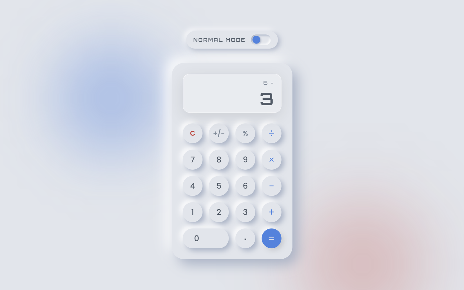
Crafting a calculator can be quite the challenge, but it’s a goal many web developers aim to achieve on their journey. Fortunately, with HTML, CSS, and JavaScript, creating a functional calculator is totally doable.
In today’s blog, you’re in for a treat! We’ll walk you through creating a Responsive Calculator using HTML, CSS, and JavaScript. This calculator won’t just cover the basics – it’ll handle division, multiplication, addition, subtraction, and more, making it a versatile tool for various calculations.
HTML :
This below HTML code creates a neumorphic calculator with light/dark themes. It includes a toggle switch for theme selection and uses buttons with neumorphic design. The calculator layout organizes digits, operations, and a display. The JavaScript file "script.js" is linked for functionality.
<!DOCTYPE html>
<html lang="en">
<head>
  <meta charset="UTF-8">
  <title>Neumorphism Calculator Dark/Light Theme | @coding.stella</title>
  <link rel="stylesheet" href="https://fonts.googleapis.com/css2?family=Orbitron:wght@400;500;700&family=Poppins:wght@300;400;500;600&display=swap">
  <link rel="stylesheet" href="./style.css">
</head>
<body>

  <!-- Glowing Orbs Background -->
  <div class="orb orb-1"></div>
  <div class="orb orb-2"></div>

  <div class="theme-switch-wrapper">
    <span class="theme-label" id="theme-label">NORMAL MODE</span>
    <label class="theme-switch" for="checkbox">
      <input type="checkbox" id="checkbox" />
      <div class="slider round"></div>
    </label>
  </div>

  <div class="calculator">
    <!-- Frosted Glass Display with digital reflection -->
    <div class="display">
      <div class="glass-reflection"></div>
      <div id="history"></div>
      <div id="value">0</div>
    </div>

    <!-- Neumorphic Buttons Grid -->
    <div class="buttons">
      <!-- Row 1 -->
      <button class="operator top-op" data-action="clear" id="clear">AC</button>
      <button class="operator top-op" data-action="+/-">+/-</button>
      <button class="operator top-op" data-action="%">%</button>
      <button class="operator right-op" data-action="/">÷</button>

      <!-- Row 2 -->
      <button class="num">7</button>
      <button class="num">8</button>
      <button class="num">9</button>
      <button class="operator right-op" data-action="*">×</button>

      <!-- Row 3 -->
      <button class="num">4</button>
      <button class="num">5</button>
      <button class="num">6</button>
      <button class="operator right-op" data-action="-">−</button>

      <!-- Row 4 -->
      <button class="num">1</button>
      <button class="num">2</button>
      <button class="num">3</button>
      <button class="operator right-op" data-action="+">+</button>

      <!-- Row 5 -->
      <button class="num zero">0</button>
      <button class="num dot">.</button>
      <button class="operator right-op equal-btn" data-action="=">=</button>
    </div>
  </div>

  <script src="./script.js"></script>
</body>
</html>
CSS :
This Below CSS code styles a neumorphic calculator with a grid layout and supports a dark theme. It uses custom properties for colors and defines neumorphic design elements for the display, buttons, and theme switcher. The grid layout organizes the calculator buttons, and a toggle switch smoothly transitions between light and dark themes. The styling ensures a polished appearance with rounded elements and proper spacing.
/* General Styles & Variables */
:root {
  --bg-color: #e0e5ec;
  --text-color: #4d5b68;
  --history-color: #7a8b9a;

  --shadow-light: #ffffff;
  --shadow-dark: #a3b1c6;

  --op-right-color: #0984e3;
  --op-top-color: #7a8b9a;
  --ac-color: #d63031;

  --glass-bg: rgba(255, 255, 255, 0.25);
  --glass-border: rgba(255, 255, 255, 0.6);

  --orb-1: rgba(9, 132, 227, 0.4);
  --orb-2: rgba(214, 48, 49, 0.3);
}

body.dark {
  /* Dark Mode */
  --bg-color: #24252a;
  --text-color: #e2e8f0;
  --history-color: #a0aec0;

  /* Calibrated dark neumorphism */
  --shadow-light: #2c2d33;
  --shadow-dark: #1c1d21;

  /* Elegant, subdued accents */
  --op-right-color: #4facfe;
  --op-top-color: #a0aec0;
  --ac-color: #ff6b6b;

  --glass-bg: rgba(30, 31, 36, 0.65);
  --glass-border: rgba(255, 255, 255, 0.08);

  /* Deep, luxurious ambient background lighting */
  --orb-1: rgba(79, 172, 254, 0.15);
  --orb-2: rgba(102, 126, 234, 0.15);
}

* {
  margin: 0;
  padding: 0;
  box-sizing: border-box;
  font-family: 'Poppins', sans-serif;
  user-select: none;
}

body {
  display: flex;
  flex-direction: column;
  justify-content: center;
  align-items: center;
  min-height: 100vh;
  background: var(--bg-color);
  transition: background 0.6s ease;
  overflow: hidden;
}

/* Glowing Orbs Animation */
.orb {
  position: absolute;
  border-radius: 50%;
  filter: blur(90px);
  z-index: -1;
  animation: float 12s ease-in-out infinite alternate;
  transition: background 0.6s ease;
}

.orb-1 {
  width: 350px;
  height: 350px;
  background: var(--orb-1);
  top: 5%;
  left: 15%;
}

.orb-2 {
  width: 300px;
  height: 300px;
  background: var(--orb-2);
  bottom: 5%;
  right: 15%;
  animation-delay: -6s;
}

@keyframes float {
  0% {
    transform: translate(0, 0) scale(1);
  }

  50% {
    transform: translate(60px, 120px) scale(1.15);
  }

  100% {
    transform: translate(-60px, 60px) scale(0.9);
  }
}

/* Theme Switch */
.theme-switch-wrapper {
  margin-bottom: 40px;
  display: flex;
  align-items: center;
  gap: 15px;
  z-index: 10;
  background: var(--bg-color);
  padding: 10px 20px;
  border-radius: 30px;
  box-shadow: 5px 5px 15px var(--shadow-dark),
    -5px -5px 15px var(--shadow-light);
  transition: all 0.6s ease;
}

.theme-label {
  font-family: 'Orbitron', sans-serif;
  color: var(--text-color);
  font-weight: 700;
  font-size: 0.9em;
  letter-spacing: 2px;
  transition: color 0.6s ease, text-shadow 0.6s ease;
}

body.dark .theme-label {
  text-shadow: 0 0 10px rgba(79, 172, 254, 0.4);
}

.theme-switch {
  display: inline-block;
  height: 30px;
  position: relative;
  width: 56px;
}

.theme-switch input {
  display: none;
}

.slider {
  background-color: var(--bg-color);
  bottom: 0;
  cursor: pointer;
  left: 0;
  position: absolute;
  right: 0;
  top: 0;
  transition: .6s;
  box-shadow: inset 3px 3px 6px var(--shadow-dark),
    inset -3px -3px 6px var(--shadow-light);
}

.slider:before {
  background-color: var(--op-right-color);
  bottom: 4px;
  content: "";
  height: 22px;
  left: 4px;
  position: absolute;
  transition: .4s cubic-bezier(0.68, -0.55, 0.265, 1.55);
  width: 22px;
  box-shadow: 2px 2px 5px var(--shadow-dark);
}

input:checked+.slider:before {
  transform: translateX(26px);
}

.slider.round {
  border-radius: 34px;
}

.slider.round:before {
  border-radius: 50%;
}

/* Calculator Body (Neumorphism) */
.calculator {
  width: 340px;
  padding: 30px;
  border-radius: 35px;
  background: var(--bg-color);
  box-shadow: 15px 15px 35px var(--shadow-dark),
    -15px -15px 35px var(--shadow-light);
  transition: all 0.6s ease;
  z-index: 10;
  position: relative;
  border: 1px solid rgba(255, 255, 255, 0.03);
}

@keyframes themeSwitchPulse {
  0% { transform: scale(1) translateY(0); }
  50% { transform: scale(0.96) translateY(5px); }
  100% { transform: scale(1) translateY(0); }
}

.calculator.animate-switch {
  animation: themeSwitchPulse 0.5s cubic-bezier(0.25, 1, 0.5, 1);
}

/* Glassmorphism Display */
.display {
  position: relative;
  width: 100%;
  margin-bottom: 30px;
  display: flex;
  flex-direction: column;
  align-items: flex-end;
  justify-content: flex-end;
  height: 110px;
  padding: 15px 20px;
  border-radius: 20px;
  overflow: hidden;

  background: var(--glass-bg);
  backdrop-filter: blur(15px);
  -webkit-backdrop-filter: blur(15px);
  border: 1px solid var(--glass-border);
  box-shadow: 0 10px 40px 0 rgba(0, 0, 0, 0.1),
    inset 0 0 10px rgba(255, 255, 255, 0.1);
  transition: all 0.6s ease;
}

@keyframes displayFlare {
  0% { filter: brightness(1); }
  50% { filter: brightness(1.4); }
  100% { filter: brightness(1); }
}

.display.animate-flare {
  animation: displayFlare 0.5s ease;
}

/* Glass Reflection Sheen */
.glass-reflection {
  position: absolute;
  top: 0;
  left: -100%;
  width: 50%;
  height: 100%;
  background: linear-gradient(to right, rgba(255, 255, 255, 0) 0%, rgba(255, 255, 255, 0.3) 50%, rgba(255, 255, 255, 0) 100%);
  transform: skewX(-25deg);
  animation: shine 6s infinite;
}

@keyframes shine {
  0% {
    left: -100%;
  }

  20% {
    left: 200%;
  }

  100% {
    left: 200%;
  }
}

body.dark .glass-reflection {
  background: linear-gradient(to right, rgba(255, 255, 255, 0) 0%, rgba(255, 255, 255, 0.08) 50%, rgba(255, 255, 255, 0) 100%);
}

.display #history {
  height: 20px;
  color: var(--history-color);
  font-size: 15px;
  margin-bottom: 5px;
  letter-spacing: 2px;
  font-family: 'Orbitron', sans-serif;
  font-weight: 500;
  transition: color 0.6s ease;
}

.display #value {
  width: 100%;
  text-align: right;
  color: var(--text-color);
  font-size: 3em;
  font-weight: 700;
  overflow-x: auto;
  white-space: nowrap;
  font-family: 'Orbitron', sans-serif;
  letter-spacing: 1px;
  transition: color 0.6s ease, text-shadow 0.6s ease;
}

body.dark .display #value {
  text-shadow: 0 0 15px rgba(255, 255, 255, 0.15);
}

.display #value::-webkit-scrollbar {
  display: none;
}

.display #value {
  -ms-overflow-style: none;
  scrollbar-width: none;
}

/* Buttons Grid */
.buttons {
  display: grid;
  grid-template-columns: repeat(4, 1fr);
  gap: 18px;
}

/* Neumorphic Buttons */
.buttons button {
  border: none;
  outline: none;
  background: var(--bg-color);
  color: var(--text-color);
  font-size: 1.4em;
  font-weight: 500;
  border-radius: 50%;
  aspect-ratio: 1/1;
  cursor: pointer;
  display: flex;
  justify-content: center;
  align-items: center;
  box-shadow: 7px 7px 15px var(--shadow-dark),
    -7px -7px 15px var(--shadow-light);
  transition: all 0.3s cubic-bezier(0.68, -0.55, 0.265, 1.55), background 0.6s ease, color 0.6s ease, box-shadow 0.6s ease;
}

.buttons button:hover {
  transform: translateY(-2px);
  box-shadow: 8px 8px 20px var(--shadow-dark),
    -8px -8px 20px var(--shadow-light);
}

.buttons button:active,
.buttons button.active {
  box-shadow: inset 5px 5px 10px var(--shadow-dark),
    inset -5px -5px 10px var(--shadow-light);
  color: var(--op-right-color);
  transform: scale(0.92);
  transition: all 0.1s;
}

/* Zero Button */
.buttons button.zero {
  grid-column: span 2;
  aspect-ratio: auto;
  border-radius: 40px;
  justify-content: flex-start;
  padding-left: 32px;
}

/* Dot button uniqueness */
.buttons button.dot {
  font-family: 'Orbitron', sans-serif;
  font-weight: 700;
  font-size: 2em;
  line-height: 0;
  padding-bottom: 15px;
}

/* Specific Operators */
.buttons button.top-op {
  color: var(--op-top-color);
  font-weight: 600;
  font-size: 1.2em;
}

.buttons button#clear {
  color: var(--ac-color);
  font-weight: 600;
}

.buttons button.right-op {
  color: var(--op-right-color);
  font-size: 1.8em;
  font-weight: 400;
}

.buttons button.equal-btn {
  background: var(--op-right-color);
  color: var(--bg-color);
  box-shadow: 5px 5px 15px rgba(0, 0, 0, 0.15),
    -5px -5px 15px var(--shadow-light);
}

body.dark .buttons button.equal-btn {
  color: #ffffff;
}

.buttons button.equal-btn:active,
.buttons button.equal-btn.active {
  box-shadow: inset 4px 4px 10px rgba(0, 0, 0, 0.3);
  color: var(--bg-color);
}
JavaScript :
This JavaScript code handles the functionality of a calculator and a theme switcher. It captures button clicks, updates the display accordingly, and evaluates expressions when the “=” button is clicked. The calculator supports basic arithmetic operations, decimal points, and clearing. Additionally, it includes a theme switcher using a checkbox, toggling between “dark” and “light” themes by updating the data-theme attribute on the html element.
const buttons = document.querySelectorAll(".buttons button");
const valueDisplay = document.getElementById("value");
const historyDisplay = document.getElementById("history");
const toggleTheme = document.getElementById("checkbox");
const body = document.querySelector("body");
const clearBtn = document.getElementById("clear");
const themeLabel = document.getElementById("theme-label");

let currentInput = "";
let previousInput = "";
let operation = null;
let shouldResetScreen = false;

// Theme toggle
toggleTheme.addEventListener("change", (e) => {
  const calcBody = document.querySelector(".calculator");
  const displayArea = document.querySelector(".display");

  // Remove animation classes to reset them
  calcBody.classList.remove("animate-switch");
  displayArea.classList.remove("animate-flare");

  // Trigger a browser reflow so the animation restarts
  void calcBody.offsetWidth;

  // Re-add animation classes
  calcBody.classList.add("animate-switch");
  displayArea.classList.add("animate-flare");

  if (e.target.checked) {
    body.classList.add("dark");
    themeLabel.innerText = "PRO MODE";
  } else {
    body.classList.remove("dark");
    themeLabel.innerText = "NORMAL MODE";
  }
});

function updateDisplay() {
  valueDisplay.innerText = currentInput === "" ? "0" : formatNumber(currentInput);

  if (operation != null) {
    let opSymbol = operation;
    if(opSymbol === '*') opSymbol = '×';
    if(opSymbol === '/') opSymbol = '÷';
    if(opSymbol === '-') opSymbol = '−';
    historyDisplay.innerText = `${formatNumber(previousInput)} ${opSymbol}`;
  } else {
    historyDisplay.innerText = "";
  }

  // Toggle AC to C
  if (currentInput !== "" || previousInput !== "") {
    clearBtn.innerText = "C";
  } else {
    clearBtn.innerText = "AC";
  }

  valueDisplay.scrollLeft = valueDisplay.scrollWidth;
}

// Add commas for large numbers
function formatNumber(num) {
  if (num === "") return "";
  if (num === "-") return "-";
  if (num === "Error") return "Error";

  let parts = num.toString().split(".");
  parts[0] = parts[0].replace(/\B(?=(\d{3})+(?!\d))/g, ",");
  return parts.join(".");
}

function handleInput(action) {
  if (action === "clear" || action === "AC" || action === "C") {
    currentInput = "";
    previousInput = "";
    operation = null;
  } else if (action === "⌫" || action === "Backspace") {
    currentInput = currentInput.toString().slice(0, -1);
  } else if (action === "+/-") {
    if (currentInput !== "") {
      currentInput = (parseFloat(currentInput) * -1).toString();
    }
  } else if (action === "%") {
    if (currentInput !== "") {
      currentInput = (parseFloat(currentInput) / 100).toString();
    }
  } else if (["+", "-", "*", "/"].includes(action)) {
    if (currentInput === "" && previousInput !== "") {
      operation = action;
    } else if (currentInput !== "") {
      if (previousInput !== "") {
        currentInput = evaluate(previousInput, currentInput, operation).toString();
      }
      operation = action;
      previousInput = currentInput;
      shouldResetScreen = true;
    }
  } else if (action === "=") {
    if (currentInput !== "" && previousInput !== "") {
      currentInput = evaluate(previousInput, currentInput, operation).toString();
      operation = null;
      previousInput = "";
      shouldResetScreen = true;
    }
  } else {
    // Numbers and dot
    if (shouldResetScreen) {
      currentInput = "";
      shouldResetScreen = false;
    }
    if (action === "." && currentInput.includes(".")) return;
    if (currentInput.replace(".", "").length >= 10) return; // limit digit count

    // Prevent multiple leading zeros
    if (currentInput === "0" && action !== ".") {
      currentInput = action;
    } else {
      currentInput += action;
    }
  }

  updateDisplay();
}

function evaluate(a, b, op) {
  let num1 = parseFloat(a);
  let num2 = parseFloat(b);
  if (isNaN(num1) || isNaN(num2)) return "";

  let res = 0;
  switch (op) {
    case "+": res = num1 + num2; break;
    case "-": res = num1 - num2; break;
    case "*": res = num1 * num2; break;
    case "/": res = num2 !== 0 ? num1 / num2 : "Error"; break;
  }

  if (res !== "Error") {
    res = parseFloat(res.toFixed(10)); // prevent floating point weirdness
  }
  return res;
}

// Click events
buttons.forEach(btn => {
  btn.addEventListener("click", function () {
    let action = this.getAttribute("data-action") || this.innerText;
    handleInput(action);
  });
});

// Keyboard Mapping
const keyMap = {
  '0': '0', '1': '1', '2': '2', '3': '3', '4': '4',
  '5': '5', '6': '6', '7': '7', '8': '8', '9': '9',
  '.': '.', '+': '+', '-': '-', '*': '*', '/': '/',
  'Enter': '=', '=': '=',
  'Backspace': 'Backspace', 'Escape': 'clear',
  '%': '%'
};

document.addEventListener("keydown", (e) => {
  let key = e.key;
  if (keyMap[key]) {
    e.preventDefault();
    let action = keyMap[key];

    buttons.forEach(btn => {
      let btnAction = btn.getAttribute("data-action") || btn.innerText;
      if (btnAction === '×') btnAction = '*';
      if (btnAction === '÷') btnAction = '/';
      if (btnAction === '−') btnAction = '-';
      if (btnAction === 'AC' || btnAction === 'C') btnAction = 'clear';

      if (btnAction === action || (action === '=' && btnAction === '=')) {
        btn.classList.add('active');
        setTimeout(() => btn.classList.remove('active'), 150);
      }
    });

    handleInput(action);
  }
});
Awesome work, everyone! We’ve just wrapped up creating a Neumorphic Calculator featuring both Light and Dark themes using HTML, CSS, and a touch of JavaScript. Whether you’re a coding pro or just starting out, you now have a sleek and versatile calculator at your fingertips. Kudos on completing the project! Keep coding, stay curious, and enjoy the satisfaction of building something cool. Great job!
Facing challenges in your project? No problem! The source code is available for you. Simply hit Download and begin your coding journey. May your coding be filled with joy!
