


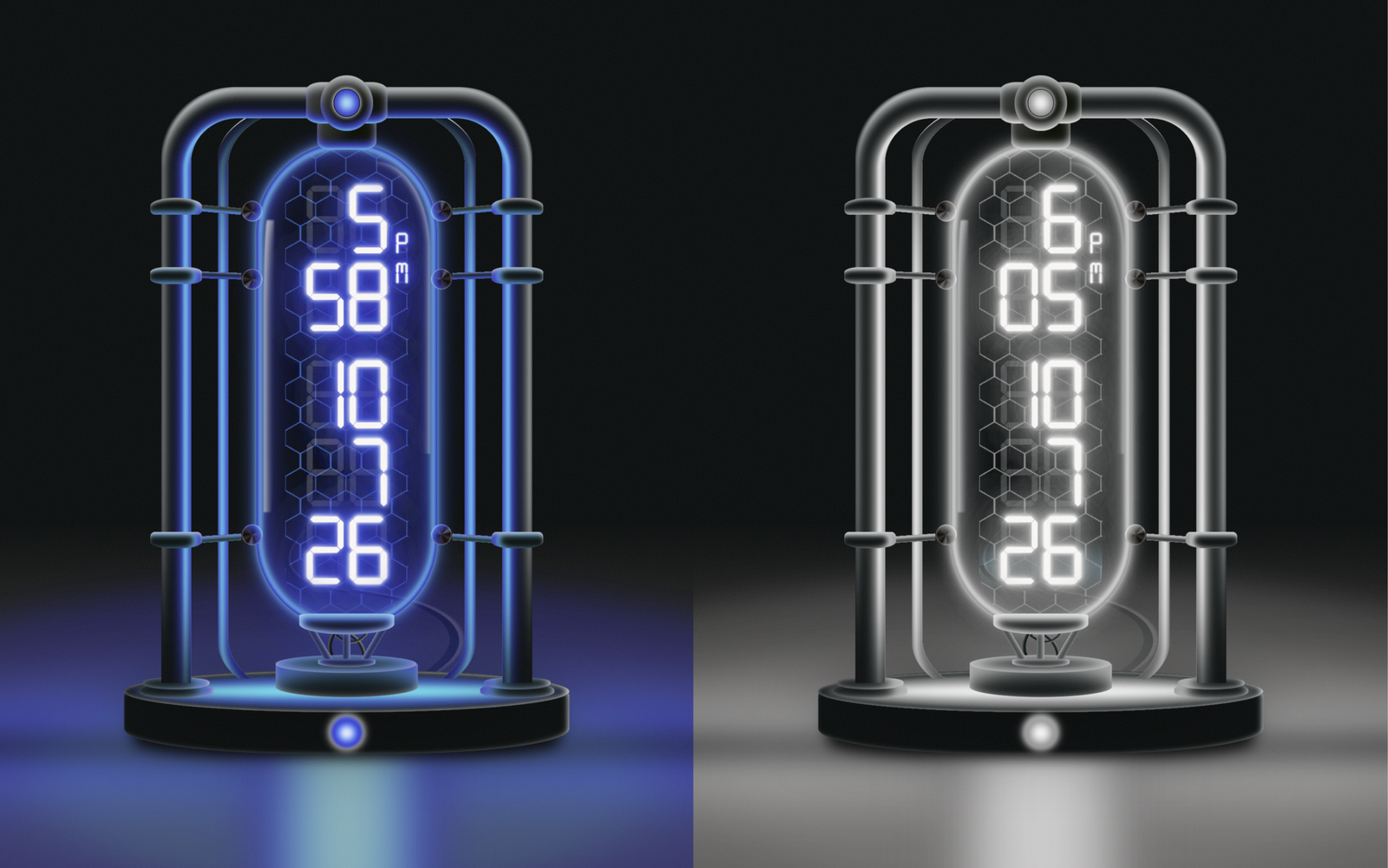
Let’s create a beautiful “Quantum Clock” using HTML, CSS, and JavaScript. It will feature a futuristic digital clock with glowing elements, animated digits, a dynamic date display, and smooth visual effects.
We’ll use:
- HTML to create the Quantum Clock structure, including the time display, hour/minute/second digits, AM/PM indicator, date, and decorative clock elements.
- CSS to design the clock with a futuristic dark theme, glowing digits, bold typography, borders, shadows, animations, and a responsive layout.
- JavaScript to make the clock functional by getting the current time, updating the hours, minutes, and seconds every second, displaying the current date, handling the AM/PM format, and controlling the clock animations and dynamic effects.
The clock automatically updates every second, so the displayed time always stays accurate. The animated digits and glowing interface give it a futuristic quantum-inspired appearance, while the responsive design makes it work smoothly on both desktop and mobile screens.
This project is a simple and practical way to learn how HTML, CSS, and JavaScript work together to create a beautiful, real-time, animated, and interactive digital clock.
HTML :
HTML creates the structure of the Quantum Clock. It defines the main clock container, time digits, date, labels, buttons, and other elements that appear on the webpage.
<!DOCTYPE html>
<html lang="en">

<head>
  <meta charset="UTF-8">
  <title>The Quantum Clock</title>
  <link rel="stylesheet" href="./style.css">

</head>

<body>
  <svg id="noise-svg">

    <filter id='noiseFilter'>
      <feTurbulence type='fractalNoise' baseFrequency='1.5' numOctaves='3' stitchTiles='stitch' />
    </filter>
    <rect id="noise-rect" filter='url(#noiseFilter)' />
  </svg>

  <div class="clock off">
    <div class="shadow"></div>

    <div class="base-container">
      <div class="base">
        <div></div>
      </div>
    </div>
    <div class="small-outer-pipe">
      <div class="small-inner-pipe"></div>
    </div>
    <div class="outer-pipe">
      <div class="inner-pipe"></div>
    </div>
    <div class="pipe-accents">
      <div class="top-tube"></div>
      <div class="tube-holders">
        <div></div>
        <div></div>
        <div></div>
        <div></div>
        <div></div>
        <div></div>
      </div>
      <div class="top"></div>
      <div class="topinset"></div>
      <div class="left">
        <div></div>
        <div></div>
        <div></div>
      </div>
      <div class="right">
        <div></div>
        <div></div>
        <div></div>
      </div>
      <div class="bottom-left"></div>
      <div class="bottom-right"></div>
    </div>

    <div class="display">
      <div class="row">
        <div class="col">
          <div>8</div>
          <div id="char01">0</div>
          <div id="char02">0</div>
        </div>
        <div class="col">
          <div>8</div>
          <div id="char11">0</div>
          <div id="char12">0</div>
        </div>
      </div>
      <div class="row">
        <div class="col">
          <div>8</div>
          <div id="char21">0</div>
          <div id="char22">0</div>
        </div>
        <div class="col">
          <div>8</div>
          <div id="char31">0</div>
          <div id="char32">0</div>
        </div>
      </div>
      <div style="height: 0.2em;"></div>
      <div class="small-row">
        <div class="row">
          <div class="col">
            <div>8</div>
            <div id="char41">0</div>
            <div id="char42">0</div>
          </div>
          <div class="col">
            <div>8</div>
            <div id="char51">0</div>
            <div id="char52">0</div>
          </div>
        </div>
      </div>
      <div class="row">
        <div class="col">
          <div>8</div>
          <div id="char61">0</div>
          <div id="char62">0</div>
        </div>
        <div class="col">
          <div>8</div>
          <div id="char71">0</div>
          <div id="char72">0</div>
        </div>
      </div>
      <div class="row">
        <div class="col">
          <div>8</div>
          <div id="char81">0</div>
          <div id="char82">0</div>
        </div>
        <div class="col">
          <div>8</div>
          <div id="char91">0</div>
          <div id="char92">0</div>
        </div>
      </div>
      <div class="row">
        <div class="col">
          <div>8</div>
          <div id="char101">0</div>
          <div id="char102">0</div>
        </div>
        <div class="col">
          <div>8</div>
          <div id="char111">0</div>
          <div id="char112">0</div>
        </div>
      </div>
    </div>

    <div class="glass-tube"></div>
    <div class="hex">
      <div class="overlay"></div>
    </div>

    <div class="tube-base-container">
      <div class="wires">
        <div></div>
        <div></div>
      </div>
      <div class="tube-base"></div>
      <div class="rods">
        <div class="left-rod"></div>
        <div class="center-rod"></div>
        <div class="right-rod"></div>
      </div>
      <div class="tube-btm"></div>
    </div>

    <div class="power-cord">
      <div></div>
      <div></div>
    </div>

    <div class="button" onclick="body.querySelector('.clock').classList.toggle('off')">
      <div></div>
    </div>
  </div>
  <script src="./script.js"></script>

</body>

</html>
CSS :
CSS controls the complete appearance of the clock. It handles the layout, spacing, fonts, colors, glowing effects, borders, animations, and responsive design to make the clock look futuristic.
@import url('https://fonts.cdnfonts.com/css/lcd');
* {
box-sizing: border-box;
}
html,
body {
height: 100%;
overflow: hidden;
}
body {
display: flex;
flex-direction: row;
flex-wrap: wrap;
justify-content: center;
align-items: center;
margin: 0;
background: linear-gradient(#040909 60vh, #312c2a 80vh);
font-family: 'LCD', sans-serif;
font-family: 'LCD2', sans-serif;
font-family: 'LCDMono2', sans-serif;
font-family: 'LCDMono', sans-serif;
font-family: 'Digitalism', sans-serif;
--_refl: #f3eeef;
--_bloom: #fcfbf9;
--_y1: #a5f3fa;
--_y2: #08d6fb;
--_o1: #0c8fff;
--_o2: #0247e7;
--_o3: #0128b3;
--mw1: #d0d5d7;
--m1: #09eafd;
--m2: #0367e4;
--m3: #042aac;
}
#noise-svg {
height: 100%;
width: 100%;
opacity: 0.12;
position: absolute;
z-index: 100;
pointer-events: none;
}
#noise-rect {
width: 100vw;
height: 100vh;
}
.clock {
position: relative;
width: 100%;
height: 100%;
display: flex;
justify-content: center;
align-items: center;
font-size: calc(var(--_size) * 0.01);
--_factor: min(600px, 80vh);
--_size: min(var(--_factor), 80vw);
}
.shadow {
transition: box-shadow 1.5s ease-in-out, opacity 1.5s ease-in-out;
position: absolute;
bottom: 0;
top: 0;
margin: auto;
width: 100%;
height: 0em;
translate: 0 45em;
box-shadow:
0 0 3em 2em #040909,
0 0 8em 3em var(--_o3),
0 0 10em 4em var(--_o2),
0 0 10em 5em var(--_o1);
opacity: 0.6;
}
.shadow::before {
content: '';
display: block;
position: absolute;
left: 0;
right: 0;
margin: auto;
height: 20em;
width: 0;
box-shadow:
0 0 8em 4em var(--_y1),
0 0 8em 6em var(--_y2),
0 0 8em 8em var(--_o1),
0 0 8em 10em var(--_o2),
0 0 8em 12em var(--_o3);
}
.shadow::after {
content: '';
display: block;
position: absolute;
z-index: -1;
opacity: 0.5;
left: 0;
right: 0;
margin: auto;
border-radius: 50%;
height: 10em;
width: 10em;
border: 2px solid blue;
transform: rotateX(70deg);
box-shadow:
0 0em 12em 40em var(--_o1),
0 0em 12em 60em var(--_o2),
0 0em 12em 80em var(--_o3);
}
.clock.off .shadow {
transition: box-shadow 1.5s ease-in-out, opacity 1.5s ease-in-out;
box-shadow:
0 0 4em 3em #040909,
0 0 8em 3em var(--_o3),
0 0 10em 4em var(--_o2),
0 0 10em 5em var(--_o1);
opacity: 0;
}
.outer-pipe {
position: absolute;
z-index: 2;
width: calc(var(--_size) * (8/15));
height: var(--_size);
border-radius: 20% / 10%;
overflow: hidden;
opacity: 1;
--_clip-btm: 85.8%;
clip-path: polygon(0 0, 100% 0, 100% var(--_clip-btm), 0 var(--_clip-btm));
}
.inner-pipe {
width: 100%;
height: 100%;
scale: 0.84 0.91;
border-radius: 15% / 7%;
box-shadow:
0em 104em 16em 20em #040909,
0em 1.2em 1em 0.2em var(--m3),
0em 1.2em 1em 0.5em var(--m2),
0em 1.2em 0.5em 1.2em var(--m1),
0em 1.2em 1.2em 1.5em var(--m2),
0em 1.2em 2em 2em var(--m3),
0em 90em 16em 20em #040909,
-1em 1em 2em 3.7em #040909,
0.5em 0em 2em 3.7em #040909,
0em 0em 0em 4.6em var(--mw1),
0em 0em 0.5em 5em var(--mw1),
0em 0em 0em 20em #040909;
}
.pipe-accents {
width: calc(var(--_size) * (8/15));
height: var(--_size);
position: absolute;
}
.pipe-accents .top-tube,
.pipe-accents .top,
.pipe-accents .topinset,
.pipe-accents .left,
.pipe-accents .right {
z-index: 3;
}
.pipe-accents .top-tube {
position: absolute;
top: 3%;
left: 0;
right: 0;
margin: auto;
width: 16%;
height: 6%;
background: #040909;
background: linear-gradient(120deg, rgba(60, 62, 62, 1) 0%, rgba(4, 9, 0, 1) 60%);
box-shadow:
inset -0.2em 1.1em 1.4em -0.4em var(--mw1),
inset 0em -1.2em 0.5em -1.1em var(--m1),
inset 0em -1.2em 1em -0.8em var(--m2),
inset 0em -1.2em 1em -0.2em var(--m3);
border-radius: 20%;
}
.pipe-accents .tube-holders {
position: absolute;
width: 26em;
height: 70em;
translate: 0 -7em;
margin: auto;
left: 0;
right: 0;
top: 0;
bottom: 0;
z-index: 2;
}
.pipe-accents .tube-holders div {
position: absolute;
width: 3em;
height: 3em;
border-radius: 50%;
--_metal-1: #30241d;
--_metal-2: #000000;
--_metal-3: #5f5f5f;
--_vl: -8%;
background: conic-gradient(from 0deg at 50% 50%,
var(--_metal-1) 0%,
var(--_metal-2) 7%,
var(--_metal-1) 21%,
var(--_metal-2) 35%,
var(--_metal-2) 42%,
var(--_metal-3) 56%,
var(--_metal-1) 63%,
var(--_metal-1) 70%,
var(--_metal-2) 77%,
var(--_metal-3) 84%,
var(--_metal-2) 91%,
var(--_metal-1) 100%);
box-shadow:
inset 0 0 0.1em 0.1em #ffffff5d,
inset 0em -1.2em 0.5em -1.1em var(--m1),
inset 0em -1.2em 1em -0.8em var(--m2),
inset 0em -1.2em 1em -0.2em var(--m3);
}
.pipe-accents .tube-holders div:nth-child(1) {
top: 12%;
left: var(--_vl);
rotate: -65deg;
}
.pipe-accents .tube-holders div:nth-child(2) {
top: 12%;
right: var(--_vl);
rotate: 65deg;
}
.pipe-accents .tube-holders div:nth-child(3) {
top: 26%;
left: var(--_vl);
rotate: -85deg;
}
.pipe-accents .tube-holders div:nth-child(4) {
top: 26%;
right: var(--_vl);
rotate: 85deg;
}
.pipe-accents .tube-holders div:nth-child(5) {
top: 78.5%;
left: var(--_vl);
rotate: -115deg;
}
.pipe-accents .tube-holders div:nth-child(6) {
top: 78.5%;
right: var(--_vl);
rotate: 115deg;
}
.pipe-accents .top {
position: absolute;
top: -0.7%;
left: 0;
right: 0;
margin: auto;
width: 22%;
height: 6%;
background: #040909;
background: linear-gradient(120deg, rgba(60, 62, 62, 1) 0%, rgba(4, 9, 0, 1) 60%);
box-shadow:
inset -0.2em 1.1em 1.4em -0.4em var(--mw1),
inset 0em -1.2em 0.5em -1.1em var(--m1),
inset 0em -1.2em 1em -0.8em var(--m2),
inset 0em -1.2em 1em -0.2em var(--m3);
border-radius: 20%;
}
.pipe-accents .topinset {
position: absolute;
top: -1.7%;
left: 0;
right: 0;
margin: auto;
width: 14%;
height: 8%;
background: #040909;
background: linear-gradient(120deg, rgba(60, 62, 62, 1) 0%, rgba(4, 9, 0, 1) 60%);
box-shadow:
inset -0.2em 1.1em 1.4em -0.4em var(--mw1),
inset 0em -1.2em 0.5em -1.1em var(--m1),
inset 0em -1.2em 1em -0.8em var(--m2),
inset 0em -1.2em 1em -0.2em var(--m3);
border-radius: 50%;
}
.pipe-accents .topinset::before {
content: '';
display: block;
width: 50%;
height: 50%;
border-radius: 50%;
position: absolute;
left: 0;
right: 0;
top: 0;
bottom: 0;
margin: auto;
box-shadow:
inset 0 0 0em 0.1em #040909,
0 0 0.5em 0.1em var(--_bloom),
inset 0 0 1.3em 0.2em var(--_o3),
inset 0 0 1.3em 0.4em var(--_o2),
inset 0 0 1.3em 0.6em var(--_o1),
inset 0 0 1.3em 2em var(--_y1);
animation: 5s flicker linear infinite;
}
@keyframes flicker {
0% {
opacity: 1;
}
10% {
opacity: 1;
}
11% {
opacity: 0.8;
}
12% {
opacity: 1;
}
65% {
opacity: 1;
}
66% {
opacity: 0.7;
}
67% {
opacity: 0.9;
}
68% {
opacity: 1;
}
69% {
opacity: 0.4;
}
70% {
opacity: 1;
}
100% {
top: 1;
}
}
.pipe-accents .left,
.pipe-accents .right {
width: 100%;
height: 100%;
position: absolute;
}
.pipe-accents .left div,
.pipe-accents .right div {
--_pipe-pos-x: -3%;
position: absolute;
margin: auto;
width: 14%;
height: 2.4%;
border-radius: 0.7em;
background: #040909;
}
.pipe-accents .left div:nth-child(1) {
top: 16%;
left: var(--_pipe-pos-x);
border-top-right-radius: 50%;
border-top-left-radius: 50%;
box-shadow:
inset -0.1em 0.4em 0.6em -0.2em var(--mw1),
inset -1em -0.5em 0.8em -0.8em var(--m3),
inset -1em -0.5em 0.9em -0.5em var(--m2),
inset -1em -0.5em 1em -0.3em var(--m1);
}
.pipe-accents .left div:nth-child(1)::before {
content: '';
display: block;
width: 98%;
height: 1em;
background: #040909;
position: absolute;
left: 78%;
top: 40%;
rotate: 5deg;
bottom: 0;
margin: auto;
z-index: -1;
box-shadow:
inset 0em 0.3em 0.6em -0.4em var(--mw1),
inset 1em -0.5em 0.3em -0.5em var(--m3),
inset 1em -0.5em 0.4em -0.3em var(--m2),
inset 1em -0.5em 0.6em -0.2em var(--m1);
}
.pipe-accents .left div:nth-child(2) {
top: 26%;
left: var(--_pipe-pos-x);
border-top-right-radius: 30%;
border-top-left-radius: 30%;
border-bottom-right-radius: 30%;
border-bottom-left-radius: 30%;
box-shadow:
inset -0.1em 0.4em 0.6em -0.2em var(--mw1),
inset -1em 0em 0.8em -0.6em var(--m3),
inset -1em 0em 0.9em 0em var(--m2),
inset -1em 0em 1em 0.1em var(--m1);
}
.pipe-accents .left div:nth-child(2)::before {
content: '';
display: block;
width: 98%;
height: 1em;
background: #040909;
position: absolute;
left: 78%;
top: 0%;
rotate: 2deg;
bottom: 0;
margin: auto;
z-index: -1;
box-shadow:
inset 0em 0.3em 0.6em -0.4em var(--mw1),
inset 1em -0.1em 0.3em 0em var(--m3),
inset 1em -0.1em 0.4em 0.2em var(--m2),
inset 1em -0.1em 0.6em -0.3em var(--m1);
}
.pipe-accents .left div:nth-child(3) {
top: 64%;
left: var(--_pipe-pos-x);
border-bottom-right-radius: 40%;
border-bottom-left-radius: 40%;
box-shadow:
inset -0.1em 0.4em 0.6em -0.2em var(--mw1),
inset -1em 0.3em 0.8em -0.5em var(--m3),
inset -1em 0.3em 0.9em -0.3em var(--m2),
inset -1em 0.3em 1em 0em var(--m1);
}
.pipe-accents .left div:nth-child(3)::before {
content: '';
display: block;
width: 98%;
height: 1em;
background: #040909;
position: absolute;
left: 78%;
top: 20%;
rotate: -4deg;
margin: auto;
z-index: -1;
box-shadow:
inset 0em 0.3em 0.6em -0.4em var(--mw1),
inset 1em 0.2em 0.3em -0.1em var(--m3),
inset 1em 0.2em 0.4em 0em var(--m2),
inset 1em 0.2em 0.6em 0.1em var(--m1);
}
.pipe-accents .right div:nth-child(1) {
top: 16%;
right: var(--_pipe-pos-x);
border-top-right-radius: 50%;
border-top-left-radius: 50%;
box-shadow:
inset -0.1em 0.4em 0.6em -0.2em var(--mw1),
inset 1em -0.5em 0.8em -0.8em var(--m3),
inset 1em -0.5em 0.9em -0.5em var(--m2),
inset 1em -0.5em 1em -0.3em var(--m1);
}
.pipe-accents .right div:nth-child(1)::before {
content: '';
display: block;
width: 98%;
height: 1em;
background: #040909;
position: absolute;
right: 78%;
top: 40%;
rotate: -5deg;
bottom: 0;
margin: auto;
z-index: -1;
box-shadow:
inset 0em 0.3em 0.6em -0.4em var(--mw1),
inset -1em -0.5em 0.3em -0.5em var(--m3),
inset -1em -0.5em 0.4em -0.3em var(--m2),
inset -1em -0.5em 0.6em -0.2em var(--m1);
}
.pipe-accents .right div:nth-child(2) {
top: 26%;
right: var(--_pipe-pos-x);
border-top-right-radius: 30%;
border-top-left-radius: 30%;
border-bottom-right-radius: 30%;
border-bottom-left-radius: 30%;
box-shadow:
inset -0.1em 0.4em 0.6em -0.2em var(--mw1),
inset 1em 0em 0.8em -0.6em var(--m3),
inset 1em 0em 0.9em 0em var(--m2),
inset 1em 0em 1em 0.1em var(--m1);
}
.pipe-accents .right div:nth-child(2)::before {
content: '';
display: block;
width: 98%;
height: 1em;
background: #040909;
position: absolute;
right: 78%;
top: 0%;
rotate: -2deg;
bottom: 0;
margin: auto;
z-index: -1;
box-shadow:
inset 0em 0.3em 0.6em -0.4em var(--mw1),
inset -1em -0.1em 0.3em 0em var(--m3),
inset -1em -0.1em 0.4em 0.2em var(--m2),
inset -1em -0.1em 0.6em -0.3em var(--m1);
}
.pipe-accents .right div:nth-child(3) {
top: 64%;
right: var(--_pipe-pos-x);
border-bottom-right-radius: 40%;
border-bottom-left-radius: 40%;
box-shadow:
inset -0.1em 0.4em 0.6em -0.2em var(--mw1),
inset 1em 0.3em 0.8em -0.5em var(--m3),
inset 1em 0.3em 0.9em -0.3em var(--m2),
inset 1em 0.3em 1em 0em var(--m1);
}
.pipe-accents .right div:nth-child(3)::before {
content: '';
display: block;
width: 98%;
height: 1em;
background: #040909;
position: absolute;
right: 78%;
top: 20%;
rotate: 4deg;
margin: auto;
z-index: -1;
box-shadow:
inset 0em 0.3em 0.6em -0.4em var(--mw1),
inset -1em 0.2em 0.3em -0.1em var(--m3),
inset -1em 0.2em 0.4em 0em var(--m2),
inset -1em 0.2em 0.6em 0.1em var(--m1);
}
.pipe-accents .bottom-left {
position: absolute;
bottom: 12%;
left: -6%;
width: 20%;
height: 2.4%;
background: #040909;
border-radius: 40%;
border-top-left-radius: 50%;
border-top-right-radius: 50%;
box-shadow:
inset -0.4em -0.1em 1em -0.4em var(--mw1),
inset -2em 0em 1.8em -1.5em var(--m3),
inset -2em 0em 1.9em -1.3em var(--m2),
inset -2em 0em 2em -1em var(--m1);
}
.pipe-accents .bottom-left::before {
display: block;
content: '';
position: absolute;
top: -24%;
left: 0;
right: 0;
margin: auto;
background: #040909;
width: 90%;
height: 70%;
border-radius: 50%;
border-top-left-radius: 40%;
border-top-right-radius: 40%;
box-shadow:
inset -0.4em 0em 1em -0.3em var(--mw1),
inset -2em 0em 1.8em -1.5em var(--m3),
inset -2em 0em 1.9em -1.3em var(--m2),
inset -2em 0em 2em -1em var(--m1);
}
.pipe-accents .bottom-right {
position: absolute;
bottom: 12%;
right: -6%;
width: 20%;
height: 2.4%;
background: #040909;
border-radius: 40%;
border-top-left-radius: 50%;
border-top-right-radius: 50%;
box-shadow:
inset -0.4em -0.1em 1em -0.4em var(--mw1),
inset 2em 0em 1.8em -1.5em var(--m3),
inset 2em 0em 1.9em -1.3em var(--m2),
inset 2em 0em 2em -1em var(--m1);
}
.pipe-accents .bottom-right::before {
display: block;
content: '';
position: absolute;
top: -24%;
left: 0;
right: 0;
margin: auto;
background: #040909;
width: 90%;
height: 70%;
border-radius: 50%;
border-top-left-radius: 40%;
border-top-right-radius: 40%;
box-shadow:
inset -0.4em 0em 1em -0.3em var(--mw1),
inset 2em 0em 1.8em -1.5em var(--m3),
inset 2em 0em 1.9em -1.3em var(--m2),
inset 2em 0em 2em -1em var(--m1);
}
.small-outer-pipe {
position: absolute;
translate: 0 -5.6%;
width: calc(var(--_size) * (1/2.7));
height: calc(var(--_size) * 0.87);
border-radius: 40% / 10%;
overflow: hidden;
opacity: 1;
--_clip-btm: 96%;
clip-path: polygon(0 0, 100% 0, 100% var(--_clip-btm), 0 var(--_clip-btm));
border-top: 0.3em solid var(--mw1);
}
.small-inner-pipe {
width: 100%;
height: 100%;
scale: 0.92 0.98;
border-radius: 35% / 10%;
box-shadow:
0em -94em 20em 20em #040909,
0em 104em 20em 20em #040909,
0em 1em 1em 0.2em var(--m3),
0em 1em 1em 0.5em var(--m2),
0em 1em 0.5em 1.2em var(--m1),
0em 1em 1.2em 1.5em var(--m2),
0em 1em 2em 2em var(--m3),
-0.2em 0.5em 0.8em -0.2em var(--mw1),
0em 90em 16em 20em #040909,
-1em 1em 2em 2em #040909,
0.5em 0em 2em 2em #040909,
0em 0em 0em 4.6em var(--mw1),
0em 0em 1.5em 5em var(--mw1),
0em 0em 0em 20em #040909;
}
.base-container {
position: absolute;
width: calc(var(--_size) * (8/15));
height: var(--_size);
}
.base-container .base {
width: 100%;
height: 100%;
position: absolute;
}
.base-container .base div {
background: #040909;
position: absolute;
bottom: 4%;
left: -10%;
width: 120%;
height: 12%;
border-radius: 40% 40% / 30% 30%;
box-shadow:
0 2em 2em -1.4em #000,
inset -0.4em 0.1em 0.8em -0.2em var(--mw1);
}
.base-container .base div::before {
content: "";
display: block;
width: 100%;
height: 50%;
border-radius: 100%;
box-shadow:
0 2em 10em 0 #000,
inset -0.4em 0em 0.8em 0em var(--mw1),
inset 0em 0em 0.5em 0.3em #040909,
inset 0em 0em 0.5em 0.3em #040909,
inset 0em 0em 1em 0em #040909,
inset 0em 0em 2em 0em #040909,
inset 0em 0em 3em 0em #040909,
inset 0em 0em 1em 0em var(--m3),
inset 0em 0em 1em 2em var(--m2),
inset 1em 0.3em 10em 10em var(--m1);
}
.display {
color: var(--_bloom);
font-size: 14em;
line-height: 0.8em;
translate: 0 -0.4em;
}
.display .row {
display: flex;
}
.display .small-row {
font-size: 0.3em;
position: absolute;
right: -22%;
top: 10%;
}
.display .small-row .row {
flex-direction: column;
line-height: 1.02em;
}
.display .row .col {
display: flex;
position: relative;
}
.display .row .col>div:nth-child(1) {
opacity: 0.2;
}
.display .row .col>div:nth-child(2) {
position: absolute;
right: 0;
z-index: 2;
}
.display .row .col>div:nth-child(3) {
position: absolute;
right: 0;
color: var(--_bloom);
--_o1-size: 0.1em;
--_o2-size: 0.4em;
--_o3-size: 0.6em;
text-shadow:
0em 0em 0.04em var(--_bloom),
0em 0em 0.04em var(--_bloom),
0em 0em var(--_o3-size) var(--_o3),
0em 0em var(--_o3-size) var(--_o3),
0em 0em var(--_o3-size) var(--_o3),
0em 0em var(--_o3-size) var(--_o3),
0em 0em var(--_o2-size) var(--_o2),
0em 0em var(--_o2-size) var(--_o2),
0em 0em var(--_o2-size) var(--_o2),
0em 0em var(--_o2-size) var(--_o2),
0em 0em var(--_o1-size) var(--_o1),
0em 0em var(--_o1-size) var(--_o1),
0em 0em var(--_o1-size) var(--_o1),
0em 0em var(--_o1-size) var(--_o1);
}
.glass-tube {
position: absolute;
width: 26em;
height: 70em;
translate: 0 -7em;
border-radius: 1000px;
box-shadow:
0em 0em 1em -0.2em var(--m1),
0em 0em 2em -0.4em var(--m2),
0em 0em 3em -0.4em var(--m2),
inset 0em 0em 0.4em 0.2em var(--m3),
inset 0em 0em 0.6em 0.4em var(--m2),
inset 0em 0em 1em 0.7em var(--m1),
inset 0em 0em 3em 0em var(--m2),
inset 0em 0em 5em 1em var(--m3),
inset -0.1em 0.1em 0.1em 0em var(--mw1),
inset 0 0 1em 0.1em var(--mw1);
}
.glass-tube::before {
content: "";
display: block;
width: 6%;
opacity: 0.9;
height: 60%;
box-shadow:
inset 1.5em 0em 1em -1em var(--mw1);
position: absolute;
left: 4%;
top: 16%;
filter: blur(0.6px);
opacity: 0.8;
border-radius: 50% 1% / 50% 100%;
}
.glass-tube::after {
content: "";
display: block;
width: 30%;
opacity: 0.9;
height: 60%;
box-shadow:
inset -1em 0.5em 1em -1em var(--mw1);
position: absolute;
right: 4%;
top: 4%;
filter: blur(0.6px);
opacity: 1;
border-radius: 0% 100% / 10% 30%;
}
.hex {
position: absolute;
width: 17.7em;
height: 70em;
translate: 0 -7em;
border-radius: 1000px;
overflow: hidden;
z-index: -1;
opacity: 0.7;
--_hex-cl1: #040909;
--_hex-cl2: var(--_o1);
--_hex-size: 2.18em;
background:
radial-gradient(circle farthest-side at 0% 50%, var(--_hex-cl1) 23.5%, rgba(12, 143, 255, 0) 0) calc(1.06*var(--_hex-size)) calc(1.5*var(--_hex-size)),
radial-gradient(circle farthest-side at 0% 50%, var(--_hex-cl2) 24%, rgba(12, 143, 255, 0) 0) calc(0.94*var(--_hex-size)) calc(1.5*var(--_hex-size)),
linear-gradient(var(--_hex-cl1) 14%, rgba(12, 143, 255, 0) 0, rgba(12, 143, 255, 0) 85%, var(--_hex-cl1) 0)0 0,
linear-gradient(150deg, var(--_hex-cl1) 24%, var(--_hex-cl2) 0, var(--_hex-cl2) 26%, rgba(12, 143, 255, 0) 0, rgba(12, 143, 255, 0) 74%, var(--_hex-cl2) 0, var(--_hex-cl2) 76%, var(--_hex-cl1) 0)0 0,
linear-gradient(30deg, var(--_hex-cl1) 24%, var(--_hex-cl2) 0, var(--_hex-cl2) 26%, rgba(12, 143, 255, 0) 0, rgba(12, 143, 255, 0) 74%, var(--_hex-cl2) 0, var(--_hex-cl2) 76%, var(--_hex-cl1) 0)0 0,
linear-gradient(90deg, var(--_hex-cl2) 2%, var(--_hex-cl1) 0, var(--_hex-cl1) 98%, var(--_hex-cl2) 0%)0 0 var(--_hex-cl1);
background-size: calc(2*var(--_hex-size)) calc(3*var(--_hex-size));
}
.hex .overlay {
position: absolute;
background: #fff;
mix-blend-mode: overlay;
width: 200%;
left: -40%;
height: 12%;
rotate: 40deg;
animation: 5s electric ease-in infinite;
}
@keyframes electric {
0% {
top: 700%;
}
100% {
top: -20%;
}
}
.tube-base-container {
position: absolute;
width: 34em;
height: 30em;
translate: 0 24em;
}
.tube-base {
position: absolute;
bottom: 4%;
width: 60%;
height: 20%;
background: #040909;
left: 0;
right: 0;
margin: auto;
border-radius: 80% / 40%;
box-shadow:
inset 0em -0.1em 1.2em -0.4em var(--mw1),
inset 0em 3em 2.8em -2.5em var(--m3),
inset 0em 3em 3.9em -2.3em var(--m2),
inset 0em 3em 4em -2em var(--m1);
}
.tube-base::before {
display: block;
content: '';
width: 99%;
height: 42%;
background: #040909;
border-radius: 50%;
box-shadow:
inset 0em -0.1em 1.2em -0.4em var(--mw1),
inset 0em 0em 1.8em -0.5em var(--m3),
inset 0em 0em 1.9em -0.3em var(--m2),
inset 0em 0em 2em -0em var(--m1);
}
.tube-btm {
width: 40%;
height: 10%;
position: absolute;
left: 0;
right: 0;
margin: auto;
bottom: 34%;
background-color: #040909;
border-radius: 20% 20% 100% 100%;
box-shadow:
inset 0em 0em 1.2em -0.2em var(--mw1),
inset 0em 0.3em 1.2em 0em var(--m1),
inset 0em 0.3em 1.2em 0.3em var(--m2),
inset 0em 0.3em 1.2em 0.6em var(--m3);
}
.tube-btm::before {
content: '';
display: block;
width: 60%;
height: 40%;
position: absolute;
left: 0;
right: 0;
margin: auto;
bottom: -158%;
border-radius: 30% 30% 100% 100%;
background-color: #040909;
box-shadow:
inset 0em -0.1em 0.7em -0.2em var(--mw1),
inset 0em 0.1em 1em -0.7em var(--m1),
inset 0em 0.1em 1em -0.3em var(--m2),
inset 0em 0.1em 1em -0em var(--m3);
}
.rods {
width: 50%;
height: 28%;
position: absolute;
left: 0;
right: 0;
margin: auto;
bottom: 14%;
--_clip-btm: 80%;
clip-path: polygon(0 0, 100% 0, 100% var(--_clip-btm), 0 var(--_clip-btm));
}
.rods .left-rod {
width: 60%;
height: 12%;
rotate: 60deg;
position: absolute;
bottom: 40%;
left: 0;
background: #040909;
}
.rods .center-rod {
width: 30%;
height: 12%;
rotate: 90deg;
position: absolute;
bottom: 40%;
right: 0;
left: 0;
margin: auto;
background: #040909;
}
.rods .right-rod {
width: 60%;
height: 12%;
rotate: -60deg;
position: absolute;
bottom: 40%;
right: 0;
background: #040909;
}
.rods .left-rod,
.rods .center-rod,
.rods .right-rod {
box-shadow:
inset 0em 0.1em 0.8em -0.2em var(--mw1),
inset 0em 0.1em 1em -0.7em var(--m1),
inset 0em 0.1em 1em -0.3em var(--m2),
inset 0em 0.1em 1em -0em var(--m3);
}
.wires {
width: 100%;
height: 100%;
z-index: -1;
}
.wires div:nth-child(1),
.wires div:nth-child(2) {
width: 18%;
height: 18%;
rotate: 25deg;
translate: 14em -5em;
position: absolute;
bottom: 0;
box-shadow:
inset 0em 0.1em 0.4em 0em var(--mw1),
inset 0 0 0 0.5em #040909;
border-radius: 0% 100% / 50% 100%;
}
.wires div:nth-child(2) {
translate: 15em -8em;
rotate: 122deg;
scale: 0.7;
}
.button {
position: absolute;
width: 4em;
height: 4em;
border-radius: 50%;
translate: 0 0em;
left: 0;
right: 0;
margin: auto;
top: 0;
bottom: 0;
translate: 0 43em;
z-index: 100;
cursor: pointer;
background: var(--_bloom);
box-shadow:
0em -0.1em 0.2em 0em var(--_o1),
0em -0.1em 0.2em 0.1em var(--_o2),
0em -0.1em 0.2em 0.2em var(--_o3),
0em -0.1em 1em 0.5em var(--_bloom),
inset 0em 0em 1em 0em var(--_o3),
inset 0em 0em 1em 0.5em var(--_o2),
inset 0em 0em 1em 1em var(--_o1);
filter: blur(1px);
}
.power-cord {
z-index: -1;
scale: 1.4 0.9;
position: absolute;
width: 100%;
height: 50em;
top: 0;
bottom: 0;
margin: auto;
translate: -36em 44em;
transform: rotateX(55deg) rotateZ(-64deg);
}
.power-cord div:nth-child(1) {
width: 20em;
height: 18em;
box-shadow: 0.3em 0.3em 0.2em 0.1em rgba(255, 255, 255, 0.2);
border-bottom: 6px solid #040909;
border-right: 4px solid #040909;
position: absolute;
left: 0;
right: 0;
translate: 39.3em 0em;
margin: auto;
bottom: 4%;
border-radius: 100% 30% / 100% 0;
}
.power-cord div:nth-child(2) {
width: 20em;
height: 12em;
box-shadow: inset 0.3em 0.1em 0.2em -0.1em rgba(255, 255, 255, 0.2);
border-top: 3px solid #04090977;
border-left: 4px solid #040909;
position: absolute;
translate: 58em 0.2em;
left: 0;
right: 0;
margin: auto;
bottom: 40%;
border-radius: 100% 30% / 100% 0;
}
*,
*:before,
*:after {
transition: box-shadow 0.2s ease-in-out, opacity 0.2s ease-in-out;
user-select: none;
}
.clock.off .hex {
opacity: 0.3;
filter: grayscale(1);
}
.clock.off .hex .overlay {
display: none;
}
.clock.off .pipe-accents .top-tube,
.clock.off .pipe-accents .top,
.clock.off .pipe-accents .topinset {
box-shadow:
inset -0.2em 1.1em 1.4em -0.4em var(--mw1),
inset 0em -1.2em 0.5em -1.1em rgba(0, 0, 0, 0),
inset 0em -1.2em 1em -0.8em rgba(0, 0, 0, 0),
inset 0em -1.2em 1em -0.2em rgba(0, 0, 0, 0);
}
.clock.off .pipe-accents .topinset::before {
box-shadow:
inset 0 0 0em 0.1em #040909,
-0.1em 0.2em 0.7em 0.1em rgba(255, 255, 255, 0.4),
inset 0 0 1.3em 0.2em rgba(0, 0, 0, 0),
inset 0 0 1.3em 0.4em rgba(0, 0, 0, 0),
inset 0 0 1.3em 0.6em rgba(0, 0, 0, 0),
inset 0 0 1.3em 2em rgba(0, 0, 0, 0);
animation-play-state: paused;
}
.clock.off .pipe-accents .tube-holders div {
box-shadow:
inset 0 0 0.1em 0.1em #ffffff5d,
inset 0em -1.2em 0.5em -1.1em rgba(0, 0, 0, 0),
inset 0em -1.2em 1em -0.8em rgba(0, 0, 0, 0),
inset 0em -1.2em 1em -0.2em rgba(0, 0, 0, 0);
}
.clock.off .inner-pipe {
box-shadow:
0em 104em 16em 20em #040909,
0em 1.2em 1em 0.2em rgba(0, 0, 0, 0),
0em 1.2em 1em 0.5em rgba(0, 0, 0, 0),
0em 1.2em 0.5em 1.2em rgba(0, 0, 0, 0),
0em 1.2em 1.2em 1.5em rgba(0, 0, 0, 0),
0em 1.2em 2em 2em rgba(0, 0, 0, 0),
0em 90em 16em 20em #040909,
-1em 1em 2em 3.7em #040909,
0.5em 0em 2em 3.7em #040909,
0em 0em 0em 4.6em var(--mw1),
0em 0em 0.5em 5em var(--mw1),
0em 0em 0em 20em #040909;
}
.clock.off .small-inner-pipe {
width: 100%;
height: 100%;
scale: 0.92 0.98;
border-radius: 35% / 10%;
box-shadow:
0em -94em 20em 20em #040909,
0em 104em 20em 20em #040909,
0em 1em 1em 0.2em rgba(0, 0, 0, 0),
0em 1em 1em 0.5em rgba(0, 0, 0, 0),
0em 1em 0.5em 1.2em rgba(0, 0, 0, 0),
0em 1em 1.2em 1.5em rgba(0, 0, 0, 0),
0em 1em 2em 2em rgba(0, 0, 0, 0),
-0.2em 0.5em 0.8em -0.2em var(--mw1),
0em 90em 16em 20em #040909,
-1em 1em 2em 2em #040909,
0.5em 0em 2em 2em #040909,
0em 0em 0em 4.6em var(--mw1),
0em 0em 1.5em 5em var(--mw1),
0em 0em 0em 20em #040909;
}
.clock.off .pipe-accents .bottom-left {
box-shadow:
inset -0.4em -0.1em 1em -0.4em var(--mw1),
inset -3em 0em 1.8em -1.5em rgba(0, 0, 0, 0),
inset -3em 0em 1.9em -1.3em rgba(0, 0, 0, 0),
inset -3em 0em 2em -1em rgba(0, 0, 0, 0);
}
.clock.off .pipe-accents .bottom-left::before {
box-shadow:
inset -0.4em 0em 1em -0.3em var(--mw1),
inset -3em 0em 1.8em -1.5em rgba(0, 0, 0, 0),
inset -3em 0em 1.9em -1.3em rgba(0, 0, 0, 0),
inset -3em 0em 2em -1em rgba(0, 0, 0, 0);
}
.clock.off .pipe-accents .bottom-right {
box-shadow:
inset -0.4em -0.1em 1em -0.4em var(--mw1),
inset 3em 0em 1.8em -1.5em rgba(0, 0, 0, 0),
inset 3em 0em 1.9em -1.3em rgba(0, 0, 0, 0),
inset 3em 0em 2em -1em rgba(0, 0, 0, 0);
}
.clock.off .pipe-accents .bottom-right::before {
box-shadow:
inset -0.4em 0em 1em -0.3em var(--mw1),
inset 3em 0em 1.8em -1.5em rgba(0, 0, 0, 0),
inset 3em 0em 1.9em -1.3em rgba(0, 0, 0, 0),
inset 3em 0em 2em -1em rgba(0, 0, 0, 0);
}
.clock.off .pipe-accents .left div:nth-child(1) {
box-shadow:
inset -0.1em 0.4em 0.6em -0.2em var(--mw1),
inset -1em -0.5em 0.8em -0.8em rgba(0, 0, 0, 0),
inset -1em -0.5em 0.9em -0.5em rgba(0, 0, 0, 0),
inset -1em -0.5em 1em -0.3em rgba(0, 0, 0, 0);
;
}
.clock.off .pipe-accents .left div:nth-child(1)::before,
.clock.off .pipe-accents .left div:nth-child(2)::before,
.clock.off .pipe-accents .left div:nth-child(3)::before,
.clock.off .pipe-accents .right div:nth-child(1)::before,
.clock.off .pipe-accents .right div:nth-child(2)::before,
.clock.off .pipe-accents .right div:nth-child(3)::before {
box-shadow:
inset 0em 0.3em 0.6em -0.3em var(--mw1),
inset 1em -0.5em 0.3em -0.5em rgba(0, 0, 0, 0),
inset 1em -0.5em 0.4em -0.3em rgba(0, 0, 0, 0),
inset 1em -0.5em 0.6em -0.2em rgba(0, 0, 0, 0);
}
.clock.off .pipe-accents .left div:nth-child(2) {
box-shadow:
inset -0.1em 0.4em 0.6em -0.2em var(--mw1),
inset -1em 0em 0.8em -0.6em rgba(0, 0, 0, 0),
inset -1em 0em 0.9em 0em rgba(0, 0, 0, 0),
inset -1em 0em 1em 0.1em rgba(0, 0, 0, 0);
;
}
.clock.off .pipe-accents .left div:nth-child(3) {
box-shadow:
inset -0.1em 0.4em 0.6em -0.2em var(--mw1),
inset -1em 0.3em 0.8em -0.5em rgba(0, 0, 0, 0),
inset -1em 0.3em 0.9em -0.3em rgba(0, 0, 0, 0),
inset -1em 0.3em 1em 0em rgba(0, 0, 0, 0);
;
}
.clock.off .pipe-accents .right div:nth-child(1) {
box-shadow:
inset -0.1em 0.4em 0.6em -0.2em var(--mw1),
inset 1em -0.5em 0.8em -0.8em rgba(0, 0, 0, 0),
inset 1em -0.5em 0.9em -0.5em rgba(0, 0, 0, 0),
inset 1em -0.5em 1em -0.3em rgba(0, 0, 0, 0);
;
}
.clock.off .pipe-accents .right div:nth-child(2) {
box-shadow:
inset -0.1em 0.4em 0.6em -0.2em var(--mw1),
inset 1em 0em 0.8em -0.6em rgba(0, 0, 0, 0),
inset 1em 0em 0.9em 0em rgba(0, 0, 0, 0),
inset 1em 0em 1em 0.1em rgba(0, 0, 0, 0);
;
}
.clock.off .pipe-accents .right div:nth-child(3) {
box-shadow:
inset -0.1em 0.4em 0.6em -0.2em var(--mw1),
inset 1em 0.3em 0.8em -0.5em rgba(0, 0, 0, 0),
inset 1em 0.3em 0.9em -0.3em rgba(0, 0, 0, 0),
inset 1em 0.3em 1em 0em rgba(0, 0, 0, 0);
;
}
.clock.off .base-container .base div::before {
box-shadow:
0 2em 10em 0 #000,
inset -0.4em 0em 0.8em 0em var(--mw1),
inset 0em 0em 0.5em 0.3em #040909,
inset 0em 0em 0.5em 0.3em #040909,
inset 0em 0em 1em 0em #040909,
inset 0em 0em 2em 0em #040909,
inset 0em 0em 3em 0em #040909,
inset 0em 0em 1em 0em rgba(0, 0, 0, 0),
inset 0em 0em 1em 2em rgba(0, 0, 0, 0),
inset 1em 0.3em 10em 10em rgba(0, 0, 0, 0);
}
.clock.off .display .row .col>div:nth-child(2) {
opacity: 0;
}
.clock.off .display .row .col>div:nth-child(3) {
opacity: 0;
}
.clock.off .glass-tube {
box-shadow:
0em 0em 1em -0.2em rgba(0, 0, 0, 0),
0em 0em 2em -0.4em rgba(0, 0, 0, 0),
0em 0em 3em -0.4em rgba(0, 0, 0, 0),
inset 0em 0em 0.4em 0.2em rgba(0, 0, 0, 0),
inset 0em 0em 0.6em 0.4em rgba(0, 0, 0, 0),
inset 0em 0em 1em 0.7em rgba(0, 0, 0, 0),
inset 0em 0em 3em 0em rgba(0, 0, 0, 0),
inset 0em 0em 5em 1em rgba(0, 0, 0, 0),
inset -0.1em 0.1em 0.1em 0em var(--mw1),
inset 0 0 1em 0.1em var(--mw1);
}
.clock.off .tube-base {
box-shadow:
inset 0em -0.1em 1.2em -0.4em var(--mw1),
inset 0em 3em 2.8em -2.5em rgba(0, 0, 0, 0),
inset 0em 3em 3.9em -2.3em rgba(0, 0, 0, 0),
inset 0em 3em 4em -2em rgba(0, 0, 0, 0);
}
.clock.off .tube-base::before {
box-shadow:
inset 0em -0.1em 1.2em -0.4em var(--mw1),
inset 0em 0em 1.8em -0.5em rgba(0, 0, 0, 0),
inset 0em 0em 1.9em -0.3em rgba(0, 0, 0, 0),
inset 0em 0em 2em -0em rgba(0, 0, 0, 0);
}
.clock.off .tube-btm {
box-shadow:
inset 0em 0em 1.2em -0.2em var(--mw1),
inset 0em 0.3em 1.2em 0em rgba(0, 0, 0, 0),
inset 0em 0.3em 1.2em 0.3em rgba(0, 0, 0, 0),
inset 0em 0.3em 1.2em 0.6em rgba(0, 0, 0, 0);
}
.clock.off .tube-btm::before {
box-shadow:
inset 0em -0.1em 0.7em -0.2em var(--mw1),
inset 0em 0.1em 1em -0.7em rgba(0, 0, 0, 0),
inset 0em 0.1em 1em -0.3em rgba(0, 0, 0, 0),
inset 0em 0.1em 1em -0em rgba(0, 0, 0, 0);
}
.clock.off .rods .left-rod,
.clock.off .rods .center-rod,
.clock.off .rods .right-rod {
box-shadow:
inset 0em 0.1em 0.8em -0.2em var(--mw1),
inset 0em 0.1em 1em -0.7em rgba(0, 0, 0, 0),
inset 0em 0.1em 1em -0.3em rgba(0, 0, 0, 0),
inset 0em 0.1em 1em -0em rgba(0, 0, 0, 0);
}
.clock.off .wires div:nth-child(1),
.clock.off .wires div:nth-child(2) {
box-shadow:
inset 0em 0.1em 0.4em -0.1em var(--mw1),
inset 0 0 0 0.5em #040909;
}
.clock.off .button {
background: #8d8d8d;
box-shadow:
0em -0.1em 0.2em 0em #040909,
0em -0.1em 0.2em 0.1em #040909,
0em 0em 1em 0.5em var(--_bloom),
0em -0.1em 1em 0.5em #040909,
inset 0em 0em 1em 0em var(--mw1),
inset 0em 0em 1em 0.5em var(--mw1),
inset 0em 0em 1em 1em var(--mw1);
filter: blur(0.7px);
animation: 5s flicker linear infinite;
}
.hex::after {
content: '';
position: absolute;
top: -50%;
left: 0;
width: 100%;
height: 10%;
background: linear-gradient(to bottom, rgba(8, 214, 251, 0), rgba(8, 214, 251, 0.5), rgba(8, 214, 251, 0));
animation: scanline 4s linear infinite;
pointer-events: none;
z-index: 10;
}
@keyframes scanline {
0% {
top: -10%;
opacity: 0;
}
10% {
opacity: 1;
}
90% {
opacity: 1;
}
100% {
top: 100%;
opacity: 0;
}
}
.clock:not(.off) .shadow {
transition: box-shadow 1.5s ease-in-out, opacity 1.5s ease-in-out;
animation: breathe 10s ease-in-out infinite alternate;
}
@keyframes breathe {
0% {
transform: scale(0.95);
opacity: 0.6;
}
100% {
transform: scale(1.05);
opacity: 0.8;
}
}
JavaScript:
JavaScript makes the clock interactive and functional. It gets the current system time, updates the hours, minutes, seconds, and date automatically, changes the display every second, and controls the clock’s animations and effects.
const colorThemes = [
    { // Nuclear Red
        '--_y1': '#faa5a5', '--_y2': '#fb0808',
        '--_o1': '#ff0c0c', '--_o2': '#e70202', '--_o3': '#b30101',
        '--m1': '#fd0909', '--m2': '#e40303', '--m3': '#ac0404'
    },
    { // Neon Blue
        '--_y1': '#a5f3fa', '--_y2': '#08d6fb',
        '--_o1': '#0c8fff', '--_o2': '#0247e7', '--_o3': '#0128b3',
        '--m1': '#09eafd', '--m2': '#0367e4', '--m3': '#042aac'
    },
    { // Ghostly White
        '--_y1': '#ffffff', '--_y2': '#e0e0e0',
        '--_o1': '#cccccc', '--_o2': '#aaaaaa', '--_o3': '#777777',
        '--m1': '#ffffff', '--m2': '#bbbbbb', '--m3': '#888888'
    },
    { // Cyberpunk Pink/Purple
        '--_y1': '#faa5f3', '--_y2': '#fb08d6',
        '--_o1': '#ff0c8f', '--_o2': '#e70247', '--_o3': '#b30128',
        '--m1': '#fd09ea', '--m2': '#e40367', '--m3': '#ac042a'
    },
    { // Classic Amber/Orange
        '--_y1': '#fae8a5', '--_y2': '#fbd608',
        '--_o1': '#ff8f0c', '--_o2': '#e74702', '--_o3': '#b32801',
        '--m1': '#fdea09', '--m2': '#e46703', '--m3': '#ac2a04'
    }
];

let currentThemeIndex = 4;
for (const [variable, color] of Object.entries(colorThemes[currentThemeIndex])) {
    document.body.style.setProperty(variable, color);
}
let lastDisplayStr = "";
let lastHourStr = "";

function updateTimeAndDate() {
    const now = new Date();
    let hours = now.getHours();
    const minutes = now.getMinutes().toString().padStart(2, '0');
    let amPm = hours >= 12 ? 'PM' : 'AM';

    const currentHourStr = hours + amPm;

    if (hours > 12) {
        hours -= 12;
    } else if (hours === 0) {
        hours = 12;
    }
    let timeStr = hours.toString().padStart(2, '0') + minutes;
    if (timeStr.startsWith('0')) {
        timeStr = ' ' + timeStr.slice(1);
    }
    let month = (now.getMonth() + 1).toString().padStart(2, '0');
    let day = now.getDate().toString().padStart(2, '0');
    const year = now.getFullYear().toString().slice(-2);
    if (month.startsWith('0')) {
        month = ' ' + month.slice(1);
    }
    if (day.startsWith('0')) {
        day = ' ' + day.slice(1);
    }
    const displayStr = timeStr + amPm + month + day + year;

    if (displayStr !== lastDisplayStr) {
        animateDigits(displayStr);
        lastDisplayStr = displayStr;

        // Change color theme every minute
        currentThemeIndex = (currentThemeIndex + 1) % colorThemes.length;
        const theme = colorThemes[currentThemeIndex];
        for (const [variable, color] of Object.entries(theme)) {
            document.body.style.setProperty(variable, color);
        }

        /*
        // --- ALTERNATIVE: Change color theme every hour instead of every minute ---
        // To use this, comment out the "Change color theme every minute" block above,
        // and uncomment the block below.

        if (lastHourStr !== "" && currentHourStr !== lastHourStr) {
            currentThemeIndex = (currentThemeIndex + 1) % colorThemes.length;
            const theme = colorThemes[currentThemeIndex];
            for (const [variable, color] of Object.entries(theme)) {
                document.body.style.setProperty(variable, color);
            }
        }
        lastHourStr = currentHourStr;
        */
    }
}

function animateDigits(targetStr) {
    const chars = "0123456789";
    let iterations = 0;
    const maxIterations = 15;

    const interval = setInterval(() => {
        iterations++;
        for (let i = 0; i < 12; i++) {
            let charToShow = targetStr[i];

            if (iterations < maxIterations - (i * 0.5) && targetStr[i] !== ' ') {

                if (targetStr[i] >= 'A' && targetStr[i] <= 'Z') {
                    const letters = "ABCDEFGHIJKLMNOPQRSTUVWXYZ";
                    charToShow = letters[Math.floor(Math.random() * letters.length)];
                } else {
                    charToShow = chars[Math.floor(Math.random() * chars.length)];
                }
            }

            document.getElementById('char' + i + '1').textContent = charToShow;
            document.getElementById('char' + i + '2').textContent = charToShow;
        }

        if (iterations >= maxIterations) {
            clearInterval(interval);
        }
    }, 50);
}

updateTimeAndDate();
setInterval(updateTimeAndDate, 1000);
This project is a simple and practical way to understand how HTML, CSS, and JavaScript work together to create an interactive and visually engaging web interface.
If you face any issues with your project, don’t worry! You can grab the source code for this project by clicking the Download button. Ready to kick off your coding journey? Happy coding!
