


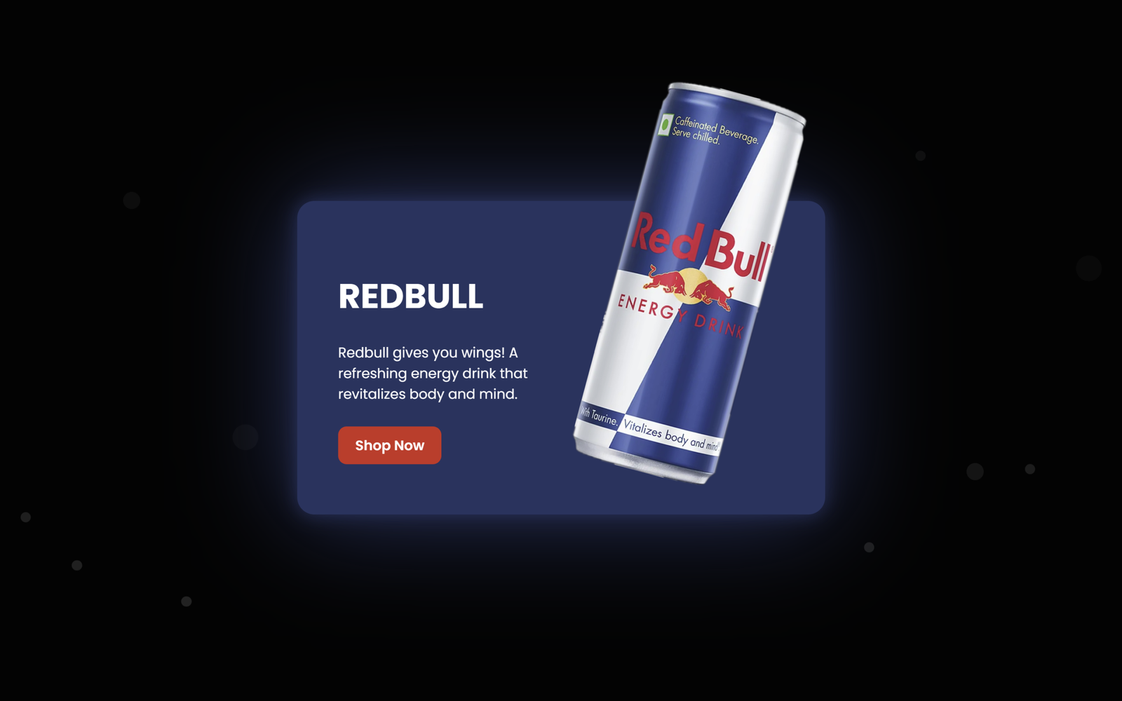
Let’s create a beautiful “Red Bull Product Card” using HTML and CSS. It will feature a stylish Red Bull product card with a glowing circular design, animated bubbles, smooth hover effects, and a modern product showcase.
We’ll use:
- HTML to create the Red Bull product card structure, including the Red Bull logo, product image, product name, description, and Shop Now button.
- CSS to design the card with a modern dark background, glowing blue effects, rounded borders, shadows, responsive layout, and animations like floating bubbles and the glowing circle.
The product card automatically responds to the hover interaction, creating a smooth and interactive product showcase. The glowing circle and floating bubbles add a modern visual effect, while the Shop Now button provides a clear call-to-action.
This project is a simple and practical way to learn how HTML and CSS work together to create a beautiful, responsive, animated, and interactive product card.
HTML :
The HTML creates a Red Bull product card. It contains a background with animated bubbles, a circular Red Bull logo, the product image, product name, description, and a Shop Now button. When the user hovers over the card, the product image appears, the circle expands, and the content becomes visible.
<!DOCTYPE html>
<html lang="en">
<head>
  <meta charset="UTF-8">
  <meta name="viewport" content="width=device-width, initial-scale=1.0">
  <meta http-equiv="X-UA-Compatible" content="ie=edge">
  <title>Redbull Product Card | @coding.stella</title>
  <link rel="stylesheet" href="style.css">
</head>
<body>

  <div class="bubbles">
    <span style="--i:11"></span>
    <span style="--i:12"></span>
    <span style="--i:24"></span>
    <span style="--i:10"></span>
    <span style="--i:14"></span>
    <span style="--i:23"></span>
    <span style="--i:18"></span>
    <span style="--i:16"></span>
    <span style="--i:19"></span>
    <span style="--i:20"></span>
    <span style="--i:22"></span>
    <span style="--i:25"></span>
    <span style="--i:18"></span>
    <span style="--i:21"></span>
    <span style="--i:15"></span>
    <span style="--i:13"></span>
    <span style="--i:26"></span>
    <span style="--i:17"></span>
    <span style="--i:13"></span>
    <span style="--i:28"></span>
  </div>

  <div class="card">
    <div class="circle">
      <img src="logo.png" alt="Redbull Logo" class="logo">
    </div>
    <img src="can.png" alt="Redbull Can" class="product_img">
    <div class="content">
		<h2>Redbull</h2>
		<p>Redbull gives you wings! A refreshing energy drink that revitalizes body and mind.</p>
      <a href="#">Shop Now</a>
    </div>
  </div>

</body>
</html>
CSS :
The CSS is used to design and animate the card. It centers the card on a black background, adds glowing effects, rounded corners, and hover animations. @keyframes creates animations like the card moving upward when loaded, the circle glowing, and bubbles floating from bottom to top. On hover, the card expands, the logo disappears, the Red Bull can appears with rotation, and the text and button become visible.
@import url("https://fonts.googleapis.com/css?family=Poppins:200,300,400,500,600,700,800,900&display=swap");

* {
  margin: 10;
  padding-right: 0;
  box-sizing: border-box;
  font-family: "Poppins", sans-serif;
}

body {
  display: flex;
  justify-content: center;
  align-items: center;
  min-height: 100vh;
  background: #030303;
  --clr: #203360;
  overflow: hidden;
}

@keyframes fadeInUp {
  from {
    opacity: 0;
    transform: translateY(50px);
  }

  to {
    opacity: 1;
    transform: translateY(0);
  }
}

.card {
  position: relative;
  z-index: 1;
  width: 300px;
  height: 350px;
  display: flex;
  justify-content: center;
  align-items: center;
  transition: 0.5s;
  transition-delay: 0.5s;
  animation: fadeInUp 1s ease-out;
}

.card:hover {
  width: 600px;
  transition-delay: 0.5s;
}

.card .circle {
  position: absolute;
  top: 0;
  left: 0;
  width: 100%;
  height: 100%;
  border-radius: 20px;
  display: flex;
  justify-content: center;
  align-items: center;
}

@keyframes pulseGlow {

  0%,
  100% {
    filter: drop-shadow(0 0 10px var(--clr)) drop-shadow(0 0 60px var(--clr));
  }

  50% {
    filter: drop-shadow(0 0 20px var(--clr)) drop-shadow(0 0 90px var(--clr));
  }
}

.card .circle::before {
  content: "";
  position: absolute;
  top: 30;
  left: 2;
  right: 2;
  width: 350px;
  height: 350px;
  border-radius: 50%;
  background: #191919;
  border: 8px solid var(--clr);
  transition: 0.5s, background 0.5s;
  transition-delay: 0.75s, 1s;
  filter: drop-shadow(0 0 10px var(--clr)) drop-shadow(0 0 60px var(--clr));
  animation: pulseGlow 3s infinite;
}

.card:hover .circle::before {
  transition-delay: 0.5s;
  width: 100%;
  height: 100%;
  border-radius: 20px;
  background: var(--clr);
}

.card .circle .logo {
  position: relative;
  width: 250px;
  transition: 0.5s;
  transition-delay: 0.5s;
}

.card:hover .circle .logo {
  transform: scale(0);
  transition-delay: 0s;
}

.card .product_img {
  position: absolute;
  top: 50%;
  left: 50%;
  transform: translate(-50%, -50%) scale(0) rotate(315deg);
  height: 300px;
  transition: 0.5s ease-in-out;
}

.card:hover .product_img {
  transition-delay: 0.75s;
  top: 25%;
  left: 75%;
  height: 530px;
  transform: translate(-50%, -50%) scale(1) rotate(15deg);
}

.card .content {
  position: absolute;
  width: 50%;
  left: 20%;
  padding: 20px 20px 20px 20px;
  opacity: 0;
  transition: 0.5s;
  visibility: hidden;
}

.card:hover .content {
  transition-delay: 0.75s;
  opacity: 1;
  visibility: visible;
  left: 20px;
}

.card .content h2 {
  color: #fff;
  text-transform: uppercase;
  font-size: 2.5em;
  line-height: 1em;
}

.card .content p {
  color: #fff;
}

.card .content a {
  position: relative;
  color: #fff;
  background: #d52b1e;
  padding: 10px 20px;
  border-radius: 10px;
  display: inline-block;
  text-decoration: none;
  font-weight: 600;
  margin-top: 10px;
  transition: all 0.3s ease;
}

.card .content a:hover {
  background: #fff;
  color: #d52b1e;
  box-shadow: 0 5px 15px rgba(213, 43, 30, 0.4);
  transform: translateY(-3px);
}

.bubbles {
  position: absolute;
  top: 0;
  left: 0;
  width: 100%;
  height: 100%;
  overflow: hidden;
  display: flex;
  justify-content: space-around;
  align-items: flex-end;
  z-index: 0;
  pointer-events: none;
}

.bubbles span {
  display: block;
  width: 12px;
  height: 12px;
  background: rgba(255, 255, 255, 0.15);
  border-radius: 50%;
  animation: animateBubbles calc(120s / var(--i)) linear infinite;
}

.bubbles span:nth-child(3n) {
  width: 20px;
  height: 20px;
  background: rgba(255, 255, 255, 0.1);
}

.bubbles span:nth-child(5n) {
  width: 30px;
  height: 30px;
  background: rgba(255, 255, 255, 0.05);
}

.bubbles span:nth-child(even) {
  animation-duration: calc(160s / var(--i));
}

@keyframes animateBubbles {
  0% {
    transform: translateY(100px);
    opacity: 1;
  }

  100% {
    transform: translateY(-120vh);
    opacity: 0;
  }
}
The Red Bull Product Card project demonstrates how HTML and CSS can be used to create a modern and interactive product design. HTML provides the structure, while CSS adds styling, animations, hover effects, glowing elements, and responsive design. This project helps in understanding web layouts, CSS animations, transitions, and interactive UI design.
This project is a simple and practical way to understand how HTML, CSS, and JavaScript work together to create an interactive and visually engaging web interface.
If you face any issues with your project, don’t worry! You can grab the source code for this project by clicking the Download button. Ready to kick off your coding journey? Happy coding!
