


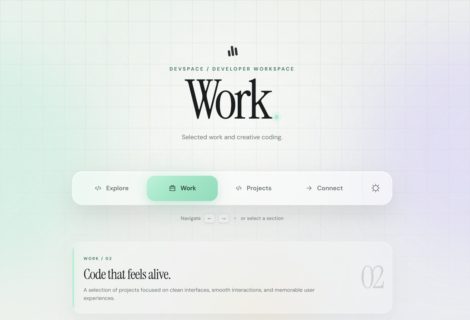
Let’s create a modern Floating Glass Navigation Bar using HTML, CSS, and JavaScript. It will have a glass effect, glowing border, smooth animations, and easy navigation between sections.
We’ll use:
- HTML to create the navbar, links, sections, and navigation dots.
- CSS to create the glass effect, glowing border, animations, colors, and responsive design.
- JavaScript to make the navbar interactive, change the active section, support ← → arrow keys, and handle the theme toggle.
You can click the navigation links, use the arrow keys, or select the dots to move between sections. This project is a simple way to learn how HTML, CSS, and JavaScript work together to create an interactive UI.
HTML :
HTML creates the structure of the website. It defines the header, title, navigation buttons like Overview, Lab, Archive, and Connect, the preview section, theme toggle, and footer. It also connects the CSS file for styling and JavaScript file for functionality.
<!doctype html>
<html lang="en">

<head>
  <meta charset="UTF-8" />
  <meta name="viewport" content="width=device-width, initial-scale=1.0" />
  <meta name="description" content="A developer workspace for projects, experiments, and creative web builds." />
  <title>Floating Glass Navigation Bar | Created by @coding.stella</title>
  <link rel="preconnect" href="https://fonts.googleapis.com">
  <link rel="preconnect" href="https://fonts.gstatic.com" crossorigin>
  <link
    href="https://fonts.googleapis.com/css2?family=DM+Sans:wght@400;500;600;700&family=Instrument+Serif:ital@0;1&display=swap"
    rel="stylesheet">
  <link rel="stylesheet" href="styles.css" />
</head>

<body>
  <div class="grain" aria-hidden="true"></div>
  <div class="orb orb-one" aria-hidden="true"></div>
  <div class="orb orb-two" aria-hidden="true"></div>
  <div class="orb orb-three" aria-hidden="true"></div>

  <main class="shell">
    <header class="hero">
      <div class="brand-mark" aria-hidden="true"><span></span><span></span><span></span></div>
      <p class="eyebrow">DEVSPACE / DEVELOPER WORKSPACE</p>
      <div class="title-wrap">
        <h1 id="pageTitle">Projects</h1>
        <span class="title-dot" aria-hidden="true"></span>
      </div>
      <p class="subline" id="subline">Building interfaces, experiments, and interactive web experiences.</p>
    </header>

    <nav class="dock" aria-label="Primary navigation">
      <div class="dock-glow" aria-hidden="true"></div>
      <div class="nav-track" id="navTrack">
        <div class="active-bead" id="activeBead" aria-hidden="true"></div>
        <button class="nav-item" data-page="Explore" type="button">
          <span class="nav-icon" aria-hidden="true">
            <svg viewBox="0 0 24 24">
              <path d="M4 11.5 12 5l8 6.5v7a1 1 0 0 1-1 1h-4.5v-5h-5v5H5a1 1 0 0 1-1-1z" />
            </svg>
          </span><span>Overview</span>
        </button>
        <button class="nav-item" data-page="Work" type="button">
          <span class="nav-icon" aria-hidden="true">
            <svg viewBox="0 0 24 24">
              <path d="M9 3v5l-5.2 8.6A2.2 2.2 0 0 0 5.7 20h12.6a2.2 2.2 0 0 0 1.9-3.4L15 8V3" />
              <path d="M8 14h8" />
            </svg>
          </span><span>Lab</span>
        </button>
        <button class="nav-item active" data-page="Projects" type="button">
          <span class="nav-icon" aria-hidden="true">
            <svg viewBox="0 0 24 24">
              <path d="M5 5.5A1.5 1.5 0 0 1 6.5 4H19v16H6.5A1.5 1.5 0 0 0 5 21.5z" />
              <path d="M5 5.5v14A1.5 1.5 0 0 0 6.5 21H19" />
              <path d="M9 8h6M9 11.5h6" />
            </svg>
          </span><span>Archive</span>
        </button>
        <button class="nav-item" data-page="Connect" type="button">
          <span class="nav-icon" aria-hidden="true">
            <svg viewBox="0 0 24 24">
              <path
                d="M5 6.5A2.5 2.5 0 0 1 7.5 4h9A2.5 2.5 0 0 1 19 6.5v6A2.5 2.5 0 0 1 16.5 15H12l-4.2 4v-4H7.5A2.5 2.5 0 0 1 5 12.5z" />
            </svg>
          </span><span>Connect</span>
        </button>
      </div>
      <button class="mode-toggle" id="themeToggle" type="button" aria-label="Switch theme">
        <span class="mode-icon sun-icon" aria-hidden="true">☼</span>
        <span class="mode-icon moon-icon" aria-hidden="true">◐</span>
      </button>
    </nav>

    <div class="hint">
      <span>Navigate</span>
      <kbd>←</kbd><kbd>→</kbd>
      <span class="hint-separator"></span>
      <span>or select a section</span>
    </div>

    <section class="preview" id="preview" aria-live="polite">
      <div class="preview-line"></div>
      <div class="preview-copy">
        <span class="preview-label" id="previewLabel">BUILD / 03</span>
        <h2 id="previewTitle">Projects worth exploring.</h2>
        <p id="previewText">A collection of web projects, UI experiments, and creative coding builds.</p>
      </div>
      <div class="preview-number" id="previewNumber">03</div>
    </section>

    <footer class="footer">
      <span>© <span id="year"></span> Devspace</span>
      <span>Built with code & curiosity</span>
    </footer>
  </main>

  <script src="script.js"></script>
</body>

</html>
CSS :
CSS controls the look and design of the website. It creates the liquid-glass effect, background grid, glowing orbs, navigation bar, active button animation, typography, dark mode, responsive mobile layout, shadows, spacing, and transitions. Basically, CSS makes the HTML look polished and interactive.
:root {
  --bg: #eef2ed;
  --ink: #151b1b;
  --muted: #687271;
  --line: rgba(38, 55, 52, .10);
  --glass: rgba(255, 255, 255, .53);
  --glass-strong: rgba(255, 255, 255, .70);
  --glass-edge: rgba(255, 255, 255, .78);
  --accent: #8cf0ca;
  --accent-deep: #267765;
  --accent-soft: rgba(108, 225, 190, .25);
  --shadow: 0 24px 60px rgba(47, 61, 57, .15), inset 0 1px 0 rgba(255,255,255,.82);
  --serif: "Instrument Serif", Georgia, serif;
  --sans: "DM Sans", system-ui, sans-serif;
}

* { box-sizing: border-box; }
html { min-height: 100%; }
body {
  min-height: 100vh;
  margin: 0;
  overflow-x: hidden;
  color: var(--ink);
  font-family: var(--sans);
  background: var(--bg);
  transition: background .55s ease, color .55s ease;
}

body::before {
  content: "";
  position: fixed;
  inset: 0;
  z-index: -5;
  background:
    linear-gradient(to right, var(--line) 1px, transparent 1px),
    linear-gradient(to bottom, var(--line) 1px, transparent 1px);
  background-size: 48px 48px;
  mask-image: linear-gradient(to bottom, black, rgba(0,0,0,.72) 55%, transparent 100%);
}

body::after {
  content: "";
  position: fixed;
  inset: 0;
  z-index: -6;
  background: radial-gradient(circle at 50% 38%, rgba(255,255,255,.60), transparent 45%), linear-gradient(135deg, rgba(211,248,235,.35), transparent 40%, rgba(224,220,255,.30));
  pointer-events: none;
}

.grain {
  position: fixed;
  inset: 0;
  z-index: 10;
  pointer-events: none;
  opacity: .035;
  background-image: url("data:image/svg+xml,%3Csvg viewBox='0 0 180 180' xmlns='http://www.w3.org/2000/svg'%3E%3Cfilter id='n'%3E%3CfeTurbulence type='fractalNoise' baseFrequency='.9' numOctaves='4' stitchTiles='stitch'/%3E%3C/filter%3E%3Crect width='100%25' height='100%25' filter='url(%23n)' opacity='.7'/%3E%3C/svg%3E");
}

.orb { position: fixed; border-radius: 50%; filter: blur(70px); pointer-events: none; z-index: -2; }
.orb-one { width: 520px; height: 520px; left: -250px; top: 100px; background: #b8f1df; opacity: .58; }
.orb-two { width: 480px; height: 480px; right: -220px; top: 80px; background: #d8d1fa; opacity: .52; }
.orb-three { width: 260px; height: 260px; left: 44%; bottom: -150px; background: #f4e4c7; opacity: .42; }

.shell {
  width: min(920px, 100%);
  min-height: 100vh;
  margin: 0 auto;
  padding: 96px 24px 38px;
  display: flex;
  flex-direction: column;
  align-items: center;
}

.hero { text-align: center; }
.brand-mark {
  width: 30px;
  height: 30px;
  margin: 0 auto 22px;
  display: flex;
  align-items: flex-end;
  justify-content: center;
  gap: 3px;
  transform: rotate(-8deg);
}
.brand-mark span { width: 5px; border-radius: 6px; background: var(--ink); opacity: .9; }
.brand-mark span:nth-child(1) { height: 14px; }
.brand-mark span:nth-child(2) { height: 23px; }
.brand-mark span:nth-child(3) { height: 18px; }

.eyebrow {
  margin: 0 0 13px;
  color: var(--accent-deep);
  font-size: 11px;
  font-weight: 700;
  letter-spacing: .25em;
  text-transform: uppercase;
}

.title-wrap { display: inline-flex; align-items: flex-end; gap: 11px; }
h1 {
  margin: 0;
  font-family: var(--serif);
  font-size: clamp(76px, 11vw, 122px);
  line-height: .82;
  font-weight: 400;
  letter-spacing: -.055em;
  transition: opacity .18s ease, transform .34s cubic-bezier(.2,.8,.2,1);
}
.title-dot {
  width: 10px;
  height: 10px;
  margin-bottom: 7px;
  border-radius: 50%;
  background: var(--accent);
  box-shadow: 0 0 0 7px rgba(140,240,202,.16);
}
.subline {
  width: min(460px, 90vw);
  margin: 22px auto 0;
  color: var(--muted);
  font-size: 14px;
  line-height: 1.55;
}

.dock {
  position: relative;
  width: min(720px, 100%);
  margin-top: 66px;
  padding: 8px;
  display: flex;
  align-items: center;
  border: 1px solid var(--glass-edge);
  border-radius: 24px;
  background: var(--glass);
  box-shadow: var(--shadow);
  backdrop-filter: blur(24px) saturate(145%);
  -webkit-backdrop-filter: blur(24px) saturate(145%);
}
.dock::before {
  content: "";
  position: absolute;
  inset: 1px;
  border-radius: 23px;
  border-top: 1px solid rgba(255,255,255,.68);
  pointer-events: none;
}
.dock-glow {
  position: absolute;
  width: 170px;
  height: 90px;
  left: var(--glow-left, 50%);
  top: 50%;
  transform: translate(-50%, -50%);
  border-radius: 50%;
  background: var(--accent-soft);
  filter: blur(25px);
  opacity: .7;
  transition: left .5s cubic-bezier(.2,1,.3,1);
  pointer-events: none;
}
.nav-track {
  position: relative;
  flex: 1;
  height: 58px;
  display: grid;
  grid-template-columns: repeat(4, 1fr);
}
.active-bead {
  position: absolute;
  z-index: 0;
  top: 0;
  left: 0;
  width: 0;
  height: 58px;
  border-radius: 18px;
  background: linear-gradient(140deg, #a6f5d8 0%, #7be9c4 48%, #65dfba 100%);
  box-shadow: 0 9px 22px rgba(74, 193, 157, .23), inset 0 1px 0 rgba(255,255,255,.72);
  transition: left .58s cubic-bezier(.16,1.25,.25,1), width .44s ease;
}
.nav-item, .mode-toggle { border: 0; font: inherit; cursor: pointer; }
.nav-item {
  position: relative;
  z-index: 1;
  display: flex;
  align-items: center;
  justify-content: center;
  gap: 9px;
  min-width: 0;
  padding: 0 10px;
  border-radius: 18px;
  background: transparent;
  color: var(--muted);
  font-size: 14px;
  font-weight: 600;
  transition: color .25s ease, transform .25s ease;
}
.nav-item:hover { color: var(--ink); transform: translateY(-1px); }
.nav-item.active { color: #173b31; }
.nav-icon { width: 18px; height: 18px; display: grid; place-items: center; }
.nav-icon svg { width: 17px; height: 17px; fill: none; stroke: currentColor; stroke-width: 1.7; stroke-linecap: round; stroke-linejoin: round; }
.mode-toggle {
  position: relative;
  width: 58px;
  height: 58px;
  flex: 0 0 58px;
  margin-left: 7px;
  border-left: 1px solid var(--line);
  background: transparent;
  color: var(--ink);
  font-size: 21px;
}
.mode-icon { position: absolute; inset: 0; display: grid; place-items: center; transition: opacity .3s ease, transform .35s ease; }
.moon-icon { opacity: 0; transform: rotate(-25deg) scale(.7); }

.hint { display: flex; align-items: center; gap: 7px; margin-top: 19px; color: var(--muted); font-size: 11px; letter-spacing: .01em; }
.hint-separator { width: 4px; height: 4px; margin: 0 4px; border-radius: 50%; background: currentColor; opacity: .35; }
kbd { min-width: 25px; height: 22px; display: inline-grid; place-items: center; padding: 0 6px; border: 1px solid rgba(60,75,72,.16); border-bottom-color: rgba(60,75,72,.25); border-radius: 6px; background: rgba(255,255,255,.35); box-shadow: 0 2px 4px rgba(0,0,0,.04); font: 11px var(--sans); }

.preview {
  width: min(720px, 100%);
  margin-top: 42px;
  padding: 0 22px 0 25px;
  display: grid;
  grid-template-columns: 1fr auto;
  gap: 24px;
  align-items: center;
  border: 1px solid rgba(255,255,255,.48);
  border-radius: 22px;
  background: rgba(255,255,255,.20);
  box-shadow: 0 14px 40px rgba(52,66,63,.06);
  backdrop-filter: blur(15px);
  -webkit-backdrop-filter: blur(15px);
  overflow: hidden;
  opacity: 0;
  transform: translateY(9px);
  transition: opacity .4s ease, transform .4s ease;
}
.preview.visible { opacity: 1; transform: translateY(0); }
.preview-line { position: absolute; left: 0; top: 0; bottom: 0; width: 3px; background: var(--accent); box-shadow: 0 0 20px rgba(91,214,174,.45); }
.preview-copy { padding: 24px 0; }
.preview-label { color: var(--accent-deep); font-size: 9px; font-weight: 700; letter-spacing: .22em; }
.preview h2 { margin: 7px 0 6px; font-family: var(--serif); font-size: 31px; font-weight: 400; letter-spacing: -.025em; }
.preview p { max-width: 530px; margin: 0; color: var(--muted); font-size: 12px; line-height: 1.55; }
.preview-number { padding-left: 20px; color: rgba(60,76,72,.18); font: 400 70px/.8 var(--serif); letter-spacing: -.08em; }

.footer { width: min(720px, 100%); margin-top: auto; padding-top: 70px; display: flex; justify-content: space-between; color: var(--muted); font-size: 10px; letter-spacing: .04em; }

body.dark {
  --bg: #090d12;
  --ink: #edf4f1;
  --muted: #899491;
  --line: rgba(186, 209, 202, .09);
  --glass: rgba(14, 18, 24, .52);
  --glass-strong: rgba(20, 25, 31, .72);
  --glass-edge: rgba(168, 188, 184, .23);
  --accent: #79e8c3;
  --accent-deep: #79d8bb;
  --accent-soft: rgba(73, 210, 170, .14);
  --shadow: 0 28px 65px rgba(0,0,0,.42), inset 0 1px 0 rgba(255,255,255,.06);
}
body.dark::after { background: radial-gradient(circle at 50% 38%, rgba(34,52,49,.25), transparent 45%), linear-gradient(135deg, rgba(10,64,57,.26), transparent 42%, rgba(46,38,86,.25)); }
body.dark .orb-one { background: #0d5c52; opacity: .46; }
body.dark .orb-two { background: #352b70; opacity: .45; }
body.dark .orb-three { background: #5c4931; opacity: .18; }
body.dark .brand-mark span { background: var(--ink); }
body.dark .active-bead { box-shadow: 0 10px 26px rgba(70,214,173,.15), inset 0 1px 0 rgba(255,255,255,.52); }
body.dark .nav-item.active { color: #13362d; }
body.dark .preview { background: rgba(18,24,29,.30); border-color: rgba(180,200,194,.14); }
body.dark .preview-number { color: rgba(218,237,231,.12); }
body.dark kbd { background: rgba(255,255,255,.035); border-color: rgba(190,210,205,.13); }
body.dark .sun-icon { opacity: 0; transform: rotate(25deg) scale(.7); }
body.dark .moon-icon { opacity: 1; transform: rotate(0) scale(1); }

@media (max-width: 650px) {
  .shell { padding: 70px 14px 25px; }
  .brand-mark { margin-bottom: 17px; }
  .subline { margin-top: 17px; font-size: 12px; }
  .dock { margin-top: 48px; border-radius: 20px; padding: 6px; }
  .nav-track { height: 54px; }
  .active-bead { height: 54px; border-radius: 15px; }
  .nav-item { gap: 5px; padding: 0 4px; font-size: 11px; border-radius: 15px; }
  .nav-icon { width: 15px; height: 15px; }
  .nav-icon svg { width: 15px; height: 15px; }
  .mode-toggle { width: 43px; flex-basis: 43px; height: 54px; margin-left: 3px; }
  .hint { font-size: 10px; }
  .preview { margin-top: 32px; padding-left: 19px; }
  .preview-copy { padding: 20px 0; }
  .preview h2 { font-size: 27px; }
  .preview-number { font-size: 55px; }
  .footer { padding-top: 48px; }
}

@media (max-width: 430px) {
  .nav-item span:last-child { display: none; }
  .nav-item { font-size: 0; }
  .nav-icon svg { width: 18px; height: 18px; }
  .preview-number { display: none; }
  .preview { grid-template-columns: 1fr; }
}

@media (prefers-reduced-motion: reduce) {
  *, *::before, *::after { scroll-behavior: auto !important; transition-duration: .01ms !important; animation-duration: .01ms !important; }
}
JavaScript:
JavaScript controls the behavior and interactions. It changes the content when a navigation button is clicked or when the user presses the left/right arrow keys, moves the glowing active indicator, animates the title and preview, switches between light and dark mode, remembers the selected theme using localStorage, and updates the year automatically.
const navTrack = document.getElementById('navTrack');
const bead = document.getElementById('activeBead');
const dock = document.querySelector('.dock');
const items = [...document.querySelectorAll('.nav-item')];
const title = document.getElementById('pageTitle');
const subline = document.getElementById('subline');
const preview = document.getElementById('preview');
const previewLabel = document.getElementById('previewLabel');
const previewTitle = document.getElementById('previewTitle');
const previewText = document.getElementById('previewText');
const previewNumber = document.getElementById('previewNumber');
const themeToggle = document.getElementById('themeToggle');

document.getElementById('year').textContent = new Date().getFullYear();

const sections = {

  Explore: {
    subline: 'Explore code, tools, and ideas.',
    label: 'EXPLORE / 01',
    title: 'Build. Break. Learn. Repeat.',
    text: 'Explore frontend ideas, new technologies, and small experiments that turn concepts into interfaces.',
    number: '01'
  },

  Work: {
    subline: 'Selected work and creative coding.',
    label: 'WORK / 02',
    title: 'Code that feels alive.',
    text: 'A selection of projects focused on clean interfaces, smooth interactions, and memorable user experiences.',
    number: '02'
  },

  Projects: {
    subline: 'Web projects, prototypes, and experiments.',
    label: 'PROJECT / 03',
    title: 'Ideas turned into interfaces.',
    text: 'From portfolio experiments to interactive websites, each project is a chance to try something new.',
    number: '03'
  },

  Connect: {
    subline: 'Let’s build something together.',
    label: 'CONNECT / 04',
    title: 'Let’s build something.',
    text: 'Open to interesting collaborations, creative projects, and conversations about web development.',
    number: '04'
  }

};

let current = Math.max(0, items.findIndex(item => item.classList.contains('active')));
let resizeFrame;

function positionBead(animate = true) {
  const active = items[current];
  if (!active) return;
  const trackRect = navTrack.getBoundingClientRect();
  const itemRect = active.getBoundingClientRect();
  const left = itemRect.left - trackRect.left;
  bead.style.transitionDuration = animate ? '' : '0ms';
  bead.style.left = `${left}px`;
  bead.style.width = `${itemRect.width}px`;
  dock.style.setProperty('--glow-left', `${left + itemRect.width / 2}px`);
}

function animateTitle(nextTitle) {
  title.style.opacity = '0';
  title.style.transform = 'translateY(7px) skewX(-2deg)';
  window.setTimeout(() => {
    title.textContent = nextTitle;
    title.style.opacity = '1';
    title.style.transform = 'translateY(0) skewX(0)';
  }, 125);
}

function selectSection(index, animate = true) {
  current = (index + items.length) % items.length;
  const item = items[current];
  const page = item.dataset.page;
  const data = sections[page];

  items.forEach((el, i) => {
    const active = i === current;
    el.classList.toggle('active', active);
    el.setAttribute('aria-current', active ? 'page' : 'false');
  });

  positionBead(animate);
  animateTitle(page);

  subline.style.opacity = '0';
  window.setTimeout(() => {
    subline.textContent = data.subline;
    subline.style.opacity = '1';
  }, 100);

  preview.classList.remove('visible');
  window.setTimeout(() => {
    previewLabel.textContent = data.label;
    previewTitle.textContent = data.title;
    previewText.textContent = data.text;
    previewNumber.textContent = data.number;
    preview.classList.add('visible');
  }, 150);
}

items.forEach((item, index) => {
  item.addEventListener('click', () => selectSection(index));
});

document.addEventListener('keydown', event => {
  if (event.key !== 'ArrowLeft' && event.key !== 'ArrowRight') return;
  if (event.target.matches('input, textarea, select')) return;
  event.preventDefault();
  selectSection(current + (event.key === 'ArrowRight' ? 1 : -1));
});

themeToggle.addEventListener('click', () => {
  const dark = document.body.classList.toggle('dark');
  localStorage.setItem('devspace-theme', dark ? 'dark' : 'light');
});

if (localStorage.getItem('devspace-theme') === 'dark') {
  document.body.classList.add('dark');
}

window.addEventListener('resize', () => {
  cancelAnimationFrame(resizeFrame);
  resizeFrame = requestAnimationFrame(() => positionBead(false));
});

window.addEventListener('load', () => {
  positionBead(false);
  selectSection(current, false);
});
This project shows how HTML, CSS, and JavaScript can work together to create a modern and interactive Floating Glass Navigation Bar. We learned how to use glass effects, animations, active states, keyboard controls, and smooth navigation to make the website more engaging and user-friendly.
If you face any issues with your project, don’t worry! You can grab the source code for this project by clicking the Download button. Ready to kick off your coding journey? Happy coding!
