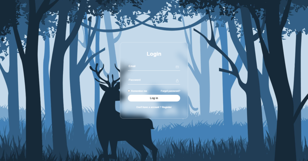
Hey folks! Today, let’s craft a sleek Glassmorphism Login Form using just HTML and CSS. It’s a modern and trendy design that adds a touch of elegance to your web projects.
Whether you’re a coding enthusiast or just starting out, this tutorial is a great opportunity to experiment with Glassmorphism – that cool glass-like aesthetic that’s gaining popularity. We’ll use HTML for the structure and CSS for styling, keeping it simple and stylish.
Join me on this coding journey into the world of Glassmorphism Login Forms. Let’s play with HTML and CSS to create something visually appealing without the need for complex setups.
Ready to bring a touch of modern design to your login forms? Let’s dive into the Glassmorphism Login Form creation – the HTML and CSS way!
HTML :
The provided HTML code is a login form designed with a glassmorphism style. It includes input fields for email and password, a “Remember me” checkbox, a “Forgot password?” link, a “Log in” button, and a “Don’t have an account? Register” link. The form also utilizes Ionicons for the icons used in the input fields.
<!DOCTYPE html>
<html lang="en" >
<head>
  <meta charset="UTF-8">
  <title>Glassmorphism Login form | CodingStella</title>
  <link rel="stylesheet" href="./style.css">

</head>
<body>
<!-- partial:index.partial.html -->
<section>
  <div class="form-box">
    <div class="form-value">
      <form action="">
        <h2>Login</h2>
        <div class="inputbox">
          <ion-icon name="mail-outline"></ion-icon>
          <input type="email" required>
          <label for="">Email</label>
        </div>
        <div class="inputbox">
          <ion-icon name="lock-closed-outline"></ion-icon>
          <input type="password" required>
          <label for="">Password</label>
        </div>
        <div class="forget">
          <label>
            <input type="checkbox"> Remember me
          </label>
          <label>
            <a href="#">Forgot password?</a>
          </label>
        </div>
        <button>Log in</button>
        <div class="register">
          <p>Don't have a account ? <a href="#">Register</a></p>
        </div>
      </form>
    </div>
  </div>
</section>
<!-- partial -->
  <script src='https://unpkg.com/ionicons@5.5.2/dist/ionicons/ionicons.js'></script>
<script src='https://unpkg.com/ionicons@5.5.2/dist/ionicons/ionicons.esm.js'></script>
</body>
</html>
CSS :
The provided CSS code styles a login form with a glassmorphism effect. It sets the font family to “Poppins”, resets the margin and padding for all elements, and centers the form within a section. The form box has a transparent background with a blurred border, and the input fields have a bottom border that moves up when focused or when the input is valid. The form also includes styling for labels, icons, checkboxes, buttons, and registration links, all with a white color scheme.
* {
  margin: 0;
  padding: 0;
  font-family: "Poppins", sans-serif;
}

section {
  display: flex;
  justify-content: center;
  align-items: center;
  min-height: 100vh;
  width: 100%;
  background: url("https://codingstella.com/wp-content/uploads/2024/01/download-8-scaled.jpeg")
    no-repeat;
  background-position: center;
  background-size: cover;
}

.form-box {
  position: relative;
  width: 400px;
  height: 450px;
  background: transparent;
  border: 2px solid rgba(255, 255, 255, 0.5);
  border-radius: 20px;
  backdrop-filter: blur(15px);
  display: flex;
  justify-content: center;
  align-items: center;
}

h2 {
  font-size: 2em;
  color: #fff;
  text-align: center;
}

.inputbox {
  position: relative;
  margin: 30px 0;
  width: 310px;
  border-bottom: 2px solid #fff;
}

.inputbox label {
  position: absolute;
  top: 50%;
  left: 5px;
  transform: translateY(-50%);
  color: #fff;
  font-size: 1em;
  pointer-events: none;
  transition: 0.5s;
}

input:focus ~ label {
  top: -5px;
}
input:valid ~ label {
  top: -5px;
}

.inputbox input {
  width: 100%;
  height: 50px;
  background: transparent;
  border: none;
  outline: none;
  font-size: 1em;
  padding: 0 35px 0 5px;
  color: #fff;
}

.inputbox ion-icon {
  position: absolute;
  right: 8px;
  color: #fff;
  font-size: 1.2em;
  top: 20px;
}

.forget {
  display: flex;
  justify-content: space-between;
  margin: 10px 0 15px;
  font-size: 0.9em;
  color: #fff;
}

.forget label:nth-child(2) {
  order: 1;
}

.forget label {
  display: flex;
  align-items: center;
}

.forget label input[type="checkbox"] {
  margin-right: 6px;
}

.forget label a {
  color: #fff;
  text-decoration: none;
}

.forget label a:hover {
  text-decoration: underline;
}

button {
  width: 100%;
  height: 40px;
  border-radius: 40px;
  background: #fff;
  border: none;
  outline: none;
  cursor: pointer;
  font-size: 1em;
  font-weight: 600;
}

.register {
  font-size: 0.9em;
  color: #fff;
  text-align: center;
  margin: 25px 0 10px;
}

.register p a {
  text-decoration: none;
  color: #fff;
  font-weight: 600;
}

.register p a:hover {
  text-decoration: underline;
}
In summary, we’ve created a modern Glassmorphism Login Form using HTML and CSS. This sleek design adds a touch of elegance to your web projects without the need for complex setups. Whether you’re a beginner or an experienced coder, this tutorial provides a simple yet stylish introduction to the Glassmorphism trend. Customize and experiment to suit your needs.
If you happen to face any problems along the way in your project, keep calm. Hit the Download button, secure the source code, and face your coding problems with a sense of curiosity and excitement. Happy coding!
