


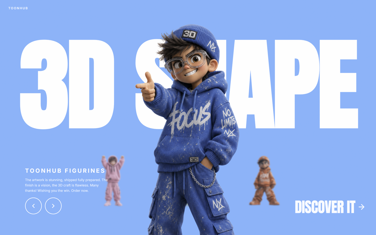
Let’s create a 3D Toons Carousel Slider using HTML, CSS, and JavaScript. This project showcases multiple 3D toon figurines in a smooth, interactive carousel where the active item is highlighted at the center while the surrounding items are scaled, blurred, and repositioned to create a realistic 3D depth effect.
We’ll use:
- HTML to build the basic structure, including the carousel container, navigation buttons, branding, and text content.
- CSS to design the full-screen layout, style the 3D carousel, add smooth transitions, responsive positioning, hover effects, and create a modern UI with animated typography.
- JavaScript to dynamically generate the carousel items, manage their positions (center, left, right, and back), update the active slide, change the background color, and enable navigation using buttons and keyboard controls.
This project is perfect for learning DOM manipulation, CSS transforms, responsive layouts, smooth animations, and interactive UI design, while creating a visually stunning 3D carousel that makes a great addition to your frontend development portfolio. Let’s get started! 🚀✨
HTML :
The HTML creates the structure of the 3D carousel webpage. It includes the main container, a background text, brand name, carousel area, product title and description, navigation buttons (previous and next), and a “Discover It” button. It also links Google Fonts, the external CSS file for styling, and the JavaScript file to add carousel functionality.
<!DOCTYPE html>
<html lang="en">

<head>
  <meta charset="UTF-8" />
  <meta name="viewport" content="width=device-width, initial-scale=1.0" />
  <title>3D Toon Carousel Slider | @coding.stella</title>
  <link rel="preconnect" href="https://fonts.googleapis.com" />
  <link rel="preconnect" href="https://fonts.gstatic.com" crossorigin />
  <link href="https://fonts.googleapis.com/css2?family=Anton&family=Inter:wght@400;500;600;700&display=swap"
    rel="stylesheet" />
  <link rel="stylesheet" href="style.css" />
</head>

<body>

  <div id="app">
    <div id="inner">
      <div id="grain"></div>

      <div id="ghost-text">3D SHAPE</div>

      <div id="brand">TOONHUB</div>

      <div id="carousel" style="position:absolute;inset:0;z-index:3;"></div>

      <div id="bottom-left">
        <p id="product-title">TOONHUB FIGURINES</p>
        <p id="product-desc">The artwork is stunning, shipped fully prepared. The finish is a vision, the 3D craft is
          flawless. Many thanks! Wishing you the win. Order now.</p>
        <div id="nav-buttons">
          <button class="nav-btn" id="btn-prev" aria-label="Previous">
            <svg viewBox="0 0 24 24">
              <polyline points="15 18 9 12 15 6"></polyline>
            </svg>
          </button>
          <button class="nav-btn" id="btn-next" aria-label="Next">
            <svg viewBox="0 0 24 24">
              <polyline points="9 18 15 12 9 6"></polyline>
            </svg>
          </button>
        </div>
      </div>

      <a id="discover" href="#">
        DISCOVER IT
        <svg viewBox="0 0 24 24">
          <line x1="5" y1="12" x2="19" y2="12"></line>
          <polyline points="12 5 19 12 12 19"></polyline>
        </svg>
      </a>

    </div>
  </div>

  <script src="script.js"></script>
</body>

</html>
CSS :
The CSS is responsible for the design and layout of the webpage. It styles the full-screen background, large ghost text, brand logo, carousel items, buttons, and text sections. It also adds smooth animations, hover effects, responsive design for different screen sizes, and positions every element properly to create a clean and modern 3D look.
*,
*::before,
*::after {
    box-sizing: border-box;
    margin: 0;
    padding: 0;
}

body {
    font-family: 'Inter', sans-serif;
    overflow: hidden;
    width: 100vw;
    height: 100vh;
}

#app {
    width: 100%;
    height: 100vh;
    position: relative;
    overflow: hidden;
    transition: background-color 650ms cubic-bezier(0.4, 0, 0.2, 1);
}

#inner {
    position: relative;
    width: 100%;
    height: 100vh;
    overflow: hidden;
}

#grain {
    position: absolute;
    inset: 0;
    pointer-events: none;
    z-index: 50;
    opacity: 0.4;
    background-repeat: repeat;
    background-size: 200px 200px;
}

#ghost-text {
    position: absolute;
    inset: 0;
    display: flex;
    align-items: center;
    justify-content: center;
    transform: translateY(-14%);
    pointer-events: none;
    user-select: none;
    z-index: 2;
    font-family: 'Anton', sans-serif;
    font-size: clamp(90px, 28vw, 380px);
    font-weight: 900;
    color: white;
    opacity: 1;
    line-height: 1;
    text-transform: uppercase;
    letter-spacing: -0.02em;
    white-space: nowrap;
}

#brand {
    position: absolute;
    top: 1.5rem;
    left: 1rem;
    z-index: 60;
    font-size: 0.75rem;
    font-weight: 600;
    text-transform: uppercase;
    color: white;
    opacity: 0.9;
    letter-spacing: 0.18em;
}

.carousel-item {
    position: absolute;
    aspect-ratio: 0.6 / 1;
    transition:
        transform 650ms cubic-bezier(0.4, 0, 0.2, 1),
        filter 650ms cubic-bezier(0.4, 0, 0.2, 1),
        opacity 650ms cubic-bezier(0.4, 0, 0.2, 1),
        left 650ms cubic-bezier(0.4, 0, 0.2, 1),
        height 650ms cubic-bezier(0.4, 0, 0.2, 1),
        bottom 650ms cubic-bezier(0.4, 0, 0.2, 1);
    will-change: transform, filter, opacity;
}

.carousel-item img {
    width: 100%;
    height: 100%;
    object-fit: contain;
    object-position: bottom center;
    display: block;
    user-select: none;
    -webkit-user-drag: none;
}

#bottom-left {
    position: absolute;
    bottom: 1.5rem;
    left: 1rem;
    z-index: 60;
    max-width: 320px;
}

#product-title {
    font-weight: 700;
    text-transform: uppercase;
    letter-spacing: 0.2em;
    font-size: 1rem;
    color: white;
    opacity: 0.95;
    margin-bottom: 0.5rem;
}

#product-desc {
    font-size: 0.8rem;
    color: white;
    opacity: 0.85;
    line-height: 1.6;
    margin-bottom: 1rem;
    display: none;
}

#nav-buttons {
    display: flex;
    gap: 0.75rem;
}

.nav-btn {
    width: 3rem;
    height: 3rem;
    border-radius: 50%;
    background: transparent;
    border: 2px solid white;
    color: white;
    cursor: pointer;
    display: flex;
    align-items: center;
    justify-content: center;
    transition: transform 150ms, background-color 150ms;
}

.nav-btn:hover {
    transform: scale(1.08);
    background-color: rgba(255, 255, 255, 0.12);
}

.nav-btn svg {
    width: 26px;
    height: 26px;
    stroke: white;
    stroke-width: 2.25;
    fill: none;
    stroke-linecap: round;
    stroke-linejoin: round;
}

#discover {
    position: absolute;
    bottom: 1.5rem;
    right: 1rem;
    z-index: 60;
    display: flex;
    align-items: center;
    gap: 8px;
    font-family: 'Anton', sans-serif;
    font-size: clamp(20px, 4vw, 56px);
    font-weight: 400;
    color: white;
    opacity: 0.95;
    letter-spacing: -0.02em;
    line-height: 1;
    text-transform: uppercase;
    text-decoration: none;
    transition: opacity 200ms;
}

#discover:hover {
    opacity: 1;
}

#discover svg {
    width: 1.25rem;
    height: 1.25rem;
    stroke: white;
    stroke-width: 2.25;
    fill: none;
    stroke-linecap: round;
    stroke-linejoin: round;
}

@media (min-width: 640px) {
    #brand {
        left: 2rem;
    }

    #bottom-left {
        bottom: 5rem;
        left: 6rem;
    }

    #product-title {
        font-size: 1.375rem;
        margin-bottom: 0.75rem;
    }

    #product-desc {
        display: block;
    }

    .nav-btn {
        width: 4rem;
        height: 4rem;
    }

    #discover {
        bottom: 5rem;
        right: 2.5rem;
    }

    #discover svg {
        width: 2rem;
        height: 2rem;
    }
}
JavaScript:
The JavaScript adds all the functionality to the 3D carousel. It stores the image data and background colors, preloads the images, creates the carousel items dynamically, and assigns each item a position (center, left, right, or back). It also updates the active image, changes the background color, supports responsive layouts for mobile and desktop, and lets users navigate through the carousel using the previous/next buttons or keyboard arrow keys with smooth animations.
const IMAGES = [
  { src: 'https://fifth-gentle-45902158.figma.site/_components/v2/4de492f6d9cf8244ad5293233e5c6f52407d42fc/1.02464a56.png', bg: '#F4845F', panel: '#F79B7F' },
  { src: 'https://fifth-gentle-45902158.figma.site/_components/v2/4de492f6d9cf8244ad5293233e5c6f52407d42fc/2.b977faab.png', bg: '#6BBF7A', panel: '#85CC92' },
  { src: 'https://fifth-gentle-45902158.figma.site/_components/v2/4de492f6d9cf8244ad5293233e5c6f52407d42fc/3.4df853b4.png', bg: '#E882B4', panel: '#ED9DC4' },
  { src: 'https://fifth-gentle-45902158.figma.site/_components/v2/4de492f6d9cf8244ad5293233e5c6f52407d42fc/4.4457fbce.png', bg: '#6EB5FF', panel: '#8DC4FF' },
];

IMAGES.forEach(d => { const img = new Image(); img.src = d.src; });

const grainSvg = `<svg xmlns='http://www.w3.org/2000/svg' width='200' height='200'><filter id='n'><feTurbulence type='fractalNoise' baseFrequency='0.9' numOctaves='4' stitchTiles='stitch'/><feColorMatrix type='saturate' values='0'/></filter><rect width='200' height='200' filter='url(#n)' opacity='0.08'/></svg>`;
document.getElementById('grain').style.backgroundImage = `url("data:image/svg+xml,${encodeURIComponent(grainSvg)}")`;

let activeIndex = 0;
let isAnimating = false;
let isMobile = window.innerWidth < 640;

window.addEventListener('resize', () => { isMobile = window.innerWidth < 640; applyRoles(); });

const carousel = document.getElementById('carousel');
const items = IMAGES.map((d, i) => {
  const el = document.createElement('div');
  el.className = 'carousel-item';
  const img = document.createElement('img');
  img.src = d.src;
  img.draggable = false;
  img.alt = `Figurine ${i + 1}`;
  el.appendChild(img);
  carousel.appendChild(el);
  return el;
});

function getRoles() {
  return {
    center: activeIndex,
    left: (activeIndex + 3) % 4,
    right: (activeIndex + 1) % 4,
    back: (activeIndex + 2) % 4,
  };
}

function applyRoles() {
  const { center, left, right, back } = getRoles();
  items.forEach((el, i) => {
    let style = {};
    if (i === center) {
      style = {
        transform: `translateX(-50%) scale(${isMobile ? 1.25 : 1.68})`,
        filter: 'none',
        opacity: '1',
        zIndex: '20',
        left: '50%',
        height: isMobile ? '60%' : '92%',
        bottom: isMobile ? '22%' : '0',
      };
    } else if (i === left) {
      style = {
        transform: 'translateX(-50%) scale(1)',
        filter: 'blur(2px)',
        opacity: '0.85',
        zIndex: '10',
        left: isMobile ? '20%' : '30%',
        height: isMobile ? '16%' : '28%',
        bottom: isMobile ? '32%' : '12%',
      };
    } else if (i === right) {
      style = {
        transform: 'translateX(-50%) scale(1)',
        filter: 'blur(2px)',
        opacity: '0.85',
        zIndex: '10',
        left: isMobile ? '80%' : '70%',
        height: isMobile ? '16%' : '28%',
        bottom: isMobile ? '32%' : '12%',
      };
    } else {
      style = {
        transform: 'translateX(-50%) scale(1)',
        filter: 'blur(4px)',
        opacity: '1',
        zIndex: '5',
        left: '50%',
        height: isMobile ? '13%' : '22%',
        bottom: isMobile ? '32%' : '12%',
      };
    }
    Object.assign(el.style, style);
  });

  document.getElementById('app').style.backgroundColor = IMAGES[activeIndex].bg;
}

function navigate(dir) {
  if (isAnimating) return;
  isAnimating = true;
  if (dir === 'next') {
    activeIndex = (activeIndex + 1) % 4;
  } else {
    activeIndex = (activeIndex + 3) % 4;
  }
  applyRoles();
  setTimeout(() => { isAnimating = false; }, 650);
}

document.getElementById('btn-prev').addEventListener('click', () => navigate('prev'));
document.getElementById('btn-next').addEventListener('click', () => navigate('next'));

document.addEventListener('keydown', e => {
  if (e.key === 'ArrowLeft') navigate('prev');
  if (e.key === 'ArrowRight') navigate('next');
});

applyRoles();
You have successfully built a 3D Toons Carousel Slider using HTML, CSS, and JavaScript. In this project, you learned how to create a responsive carousel, use CSS transforms and transitions for smooth 3D animations, dynamically update content with JavaScript, and build an engaging user interface with interactive navigation 🚀✨
If your project has problems, don’t worry. Just click to download the source code and face your coding challenges with excitement. Have fun coding!
