


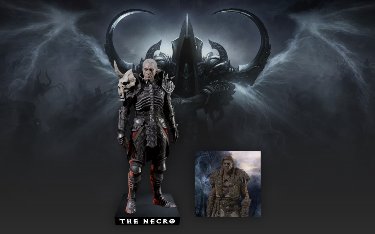
Create a stunning 3D Card Hover Animation using HTML and CSS! 🎨✨ This effect makes cards smoothly expand, tilt, and reveal hidden details with a realistic 3D perspective when you hover over them, creating an eye-catching interactive experience.
We’ll use:
- HTML to build the card structure with images and captions.
- CSS to add the layout, custom styling, perspective, transforms, transitions, and hover animations that bring the cards to life.
This project is perfect for portfolios, gaming websites, product showcases, or any modern UI where you want your cards to feel more dynamic and engaging. Let’s build this awesome 3D hover animation from scratch!
HTML :
The HTML creates two character cards using the <figure> element. Each card contains an <img> to display the character image and a <figcaption> to show its name. The page links to an external CSS file that handles all the styling and hover animations, while the HTML simply provides the structure of the cards.
<!DOCTYPE html>
<html lang="en">

<head>
    <meta charset="UTF-8">
    <title>3D Card hover effect | @coding.stella</title>
    <link rel="stylesheet" href="./style.css">
</head>

<body>

    <figure>
        <img src="./Images/necro.png" alt="Necromancer">
        <figcaption>The Necro</figcaption>
    </figure>
    <figure>
        <img src="./Images/druide.png" alt="Druid">
        <figcaption>The Druid</figcaption>
    </figure>

</body>
</html>
CSS :
The CSS styles the page with a full-screen background, custom font, and a grid layout to place the cards side by side. Each card uses a ::before pseudo-element to add a background image, while the main image and caption are positioned using CSS Grid. On hover, the character image enlarges, the background tilts with a 3D perspective effect, its brightness decreases, and the caption flips up into view, creating a smooth and attractive 3D hover animation using transform, transition, filter, and perspective.
@font-face{ font-display:swap;
  font-family: "Exoct";
  src: url("./films.EXH_____.ttf")
 }

body {
  margin: 0;
  min-height: 100vh;
  display: grid;
  grid-auto-flow: column;
  grid-auto-columns: min(230px,35vmin);
  place-content: end center;
  gap: 50px;
  background:
    linear-gradient(#0000,rgb(50 50 50 / 88%)),
    url(./Images/Bg.png) top/cover;
}

figure {
  width: 100%;
  aspect-ratio: 1;
  margin: 0 0 60px;
  padding: 5px 20px 0;
  box-sizing: border-box;
  display: grid;
  grid-template-rows: 100%;
  cursor: pointer;
  position: relative;
  filter: drop-shadow(0 0 20px rgb(0 0 0/50%));
}
figure:before {
  content: "";
  position: absolute;
  z-index: -1;
  inset: 0;
  background: top/cover;
  transform-origin: bottom;
  filter: brightness(.9);
  transition: .5s;
}
figure:before {
  background-image: url(./Images/necro-back.png)
}
figure + figure:before {
  background-image: url(./Images/druid-back.png)
}
img {
  grid-area: 1/1;
  width: 100%;
  height: 100%;
  object-fit: cover;
  object-position: top;
  filter: contrast(.8) brightness(.7);
  place-self: end center;
  transition: .5s;
}
figcaption {
  grid-area: 1/1;
  width: calc(100% + 40px);
  font-family: Exoct;
  color: #fff;
  font-size: min(32px,5vmin);
  text-align: center;
  place-self: end center;
  transform: perspective(500px) translateY(100%) rotateX(-90deg);
  backface-visibility: hidden;
  transform-origin: top;
  background: #000;
  transition: .5s;
}
figure:hover img {
  width: 130%;
  height: 255%;
  filter: contrast(1);
}
figure:hover::before {
  filter: brightness(.3);
  transform: perspective(500px) rotateX(60deg);
}
figure:hover figcaption{
  transform: perspective(500px)translateY(100%) rotateX(-30deg);
}
And that’s it! 🎉 You’ve successfully created a 3D Card Hover Animation using HTML and CSS. By combining CSS transforms, perspective, transitions, and hover effects, you can build interactive cards that feel modern and visually engaging. Experiment with different images, colors, and animations to create your own unique designs and make your websites stand out.
If your project has problems, don’t worry. Just click to download the source code and face your coding challenges with excitement. Have fun coding!
